HOME | DD
 martinacecilia — Ain't no easy way - colour 2
by-nc-nd
martinacecilia — Ain't no easy way - colour 2
by-nc-nd

Published: 2005-11-19 18:53:19 +0000 UTC; Views: 1688; Favourites: 31; Downloads: 229
Redirect to original
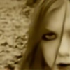
Description
second version of my last drawing... now inked and with neat colours.the other colouration is here [link]
Related content


Comments: 16


Marvellous! I love the sense of desperation, and the clearness of the lines--you really show emotion well!
👍: 0 ⏩: 0

Ok I LOVED the last one but this one.. geezz.. its so sharp and crisp. It reminds me of some damn good comic books I've seen...
I adore this.. good work! (to say the least!) lol 
👍: 0 ⏩: 1

^o^ thank you! you made me really happy because I'm excercizing hardly to colour comics book... and I'm happy I'm somewhat reaching my aim! ^o^
👍: 0 ⏩: 1
I'd say your WELL on your way to high class comic art!!
👍: 0 ⏩: 0


A me più di tutti in assoluto piace lo schizzo in bianco e nero, se poi devo scegliere tra le versioni colorate come gli altri anche io preferisco la prima, credo che si abbini meglio al tipo di soggetto e al disegno in generale
👍: 0 ⏩: 1
XD grazie! anche a me piace tanto lo schizzo.
comunque, fondamentalment questa l'ho fatta per esercitarmi con la colorazione fumettistica... non sono troppo convinta sia venuta meglio dell'altra... ma cred abbia i suoi pregi...
👍: 0 ⏩: 1
Ma ovviamente ha i suoi pregi ")
 (Smile)")
👍: 0 ⏩: 0

Great! The digital one looks nice and clean, but I also like the first version. You are a wonderful artist!
👍: 0 ⏩: 0

I'm loving the mid-ninties comic book thing going on here. Great colors and great linework ^^
👍: 0 ⏩: 0

I like the line work better here, but the color variation of the other one...
Still really good. she looks a little worried...
Mary Catherine
👍: 0 ⏩: 0

This one's so awesome; love the simplicity!
👍: 0 ⏩: 0

I think the old version is better. It looks like a cartoon. Of course nice too, because of the outlines.
👍: 0 ⏩: 0


I prefered the other version. There was sucha search for various colours and gradations. Though that one is pretty too because of the neat outlines.
👍: 0 ⏩: 0