HOME | DD
 martinhoulden — ::Face Off 2008::
Published: 2008-05-24 13:09:39 +0000 UTC; Views: 1424; Favourites: 31; Downloads: 28
Redirect to original
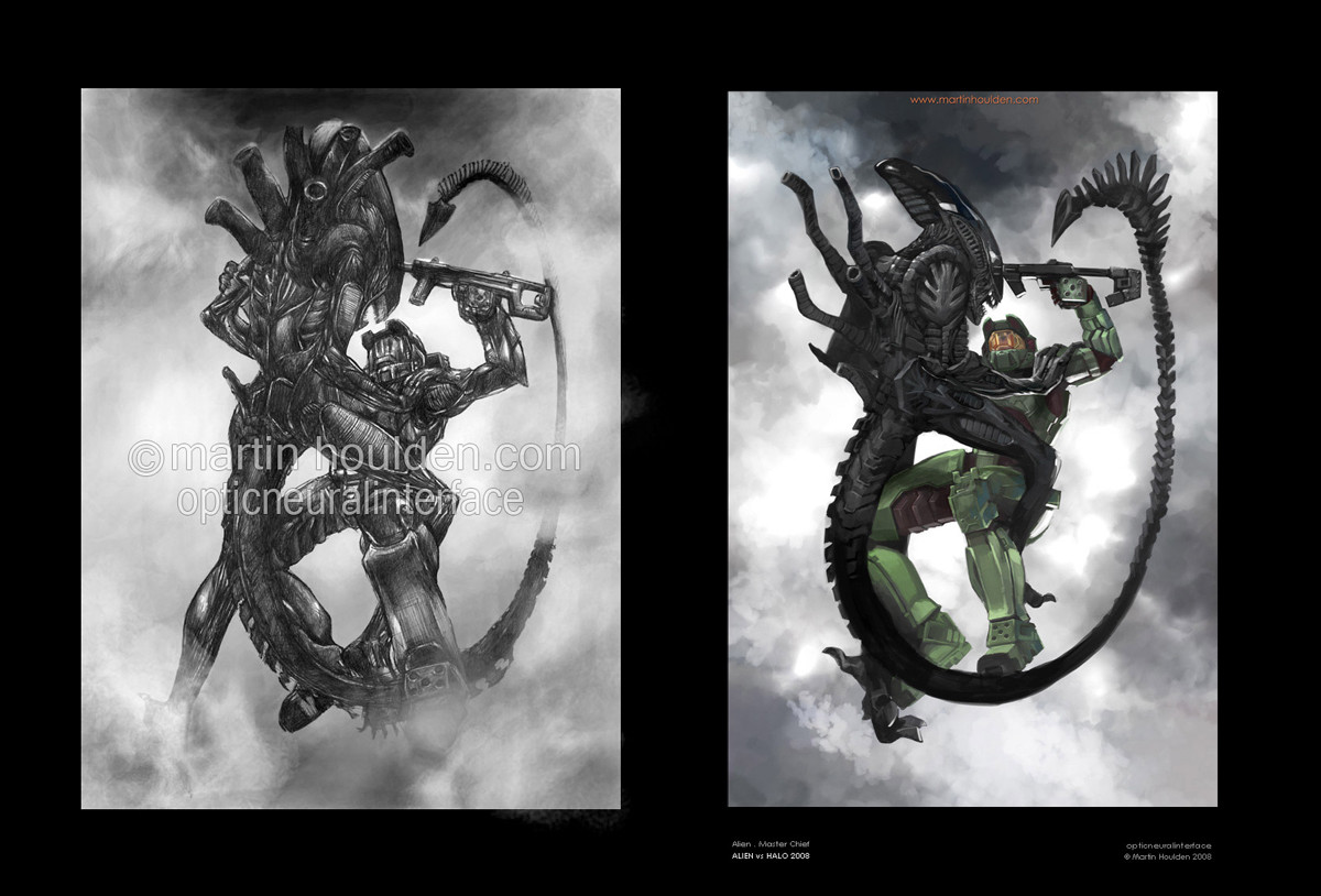
Description
new:[link]
old:
[link]
Related content


Comments: 17

Hmm, frankly that's a great mindset to go for in your job, right? The 'Rather do 5 pictures in 50 hours' jig. Since the creative department's looking at tonnes of different things to choose from so having more material concepts at the same time is the thing to go for.
But anyways, I detailed most of what I thought on this comparison in my previous comment on the piece itself, so! *Tips hat to you* Have a good day, milord.
👍: 0 ⏩: 0

")

ooo i always loved this pic from you, and having both to see the difference is nice. Sincerely i prefer the movement and perspective of the first. it has a freshnesson it, an di love how master chief seem to be looking at the" eyes" of the alien, he is really challenging it.
The lightning-Shadowing of the second is better, you did an awesome job on that. The second is really good, i love the way you color.
👍: 0 ⏩: 1

yeah it was fresher. its always gonna be a balance in art to try and get it between detail and freshness. shucks!
👍: 0 ⏩: 0

damn this is a cool concept man i luv it, i can the the improvement
👍: 0 ⏩: 0


you did a great job on the rendering it! Love it!
But you know what? I prefer the alien's pose in your old drawing! It really towers over Master Chief and shows how much of a badass the alien really is. Also, the left (from viewer) leg's posture makes for a much better balancing of composition. See how that leg forms a straight diagonal center line going right up to the tail and crossing the focal point which is the 2 heads almost connecting? This is extremely effective and I miss that in your new version!
The head design in your remake is better (so is the general shape design of everything, but the old up-down axis/position of the head really brought out the dominance of the alien.
Just my crits!
👍: 0 ⏩: 1
yeah ... when i originally started drawing it, i kept the leg the same for that very reason - but the foot just looked naff stuck out that far, all splayed. In the old one i kinda hid the foot, but i didnt want to on this new one!
I do like the dominant pose on the old one. Even when i was making the picture, i knew that one argument i would get a lot would be the comparison in pose - and that the old one was more dominant. I guess i wanted to bring it back a little so it was more evenly balanced, and that the chief didnt quite seem so on the weaker side.
Thankyou sire  (Smile)")
👍: 0 ⏩: 1

I think it's really cool to go back and re-work your old stuff, especially as it's the one most love. You're truly a rough-necked guy. Balls bigger then Jupiter.
Many parts of the new version are improved and your style shows more obvious. One part that I like better in the old version is that the Alien's legs are longer and not so much out of focus. I think it helps the Alien to look fiercer and more intimidating.
Hope I made sense and that you still know I love both pieces equally.
Cheers mate
/Robert
👍: 0 ⏩: 1
yeah youre right ... i didnt like the legs on the new one ... but then i didnt like the legs on the old one, hehe. So i thought itd be a part that i'd try and change, but still cant get it to work!
cheers
")
👍: 0 ⏩: 0


Your style has definitely evolved in the past 4 years, everything seems to be a lot cleaner and precise, even your 30 minute speed paints and sketches. I know how much you obsessively draw and it's definitely paid off.
I know the feeling of your best piece still overshadowing your brand spanking new work. It kicks your confidence and you don't feel like you're getting any better.
I've enjoyed watching you progress over these past few years, trying other things and then switching to mostly digital work.
You can achieve more in 6 hours than I could ever hope for in 20 and that's always been the case. It only makes me thrive to better myself just as you do.
👍: 0 ⏩: 1
nawh, with this i definately feel the new one is better!
and thanks! I dont think i'll ever have a style im evolving to, i think its just a more general thing. In this instance, i wanted to clear up the details - so thats what i did. But if i was redrawing the concept from scratch i would change quite a lot
👍: 0 ⏩: 1
We're all contantly evolving. You have answer for everything, you!
👍: 0 ⏩: 1
like you wouldnt believe!
👍: 0 ⏩: 0
