HOME | DD
 MasterOkiAkai — FA C Minerva Valsing

Published: 2006-07-07 14:57:58 +0000 UTC; Views: 4833; Favourites: 66; Downloads: 237
Redirect to original
Description
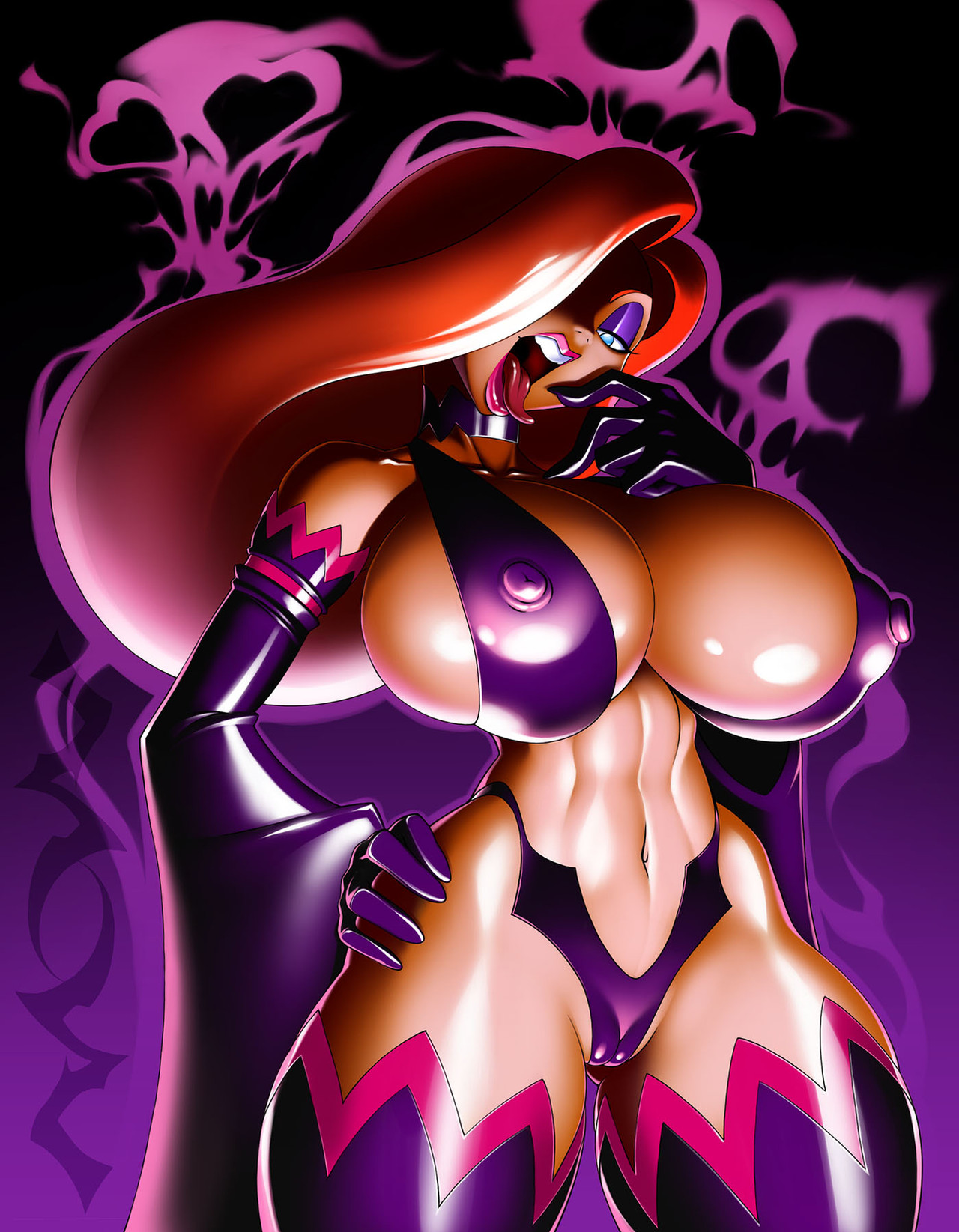
Fan Art CommissionCharacter: Minerva Valsing (Cursed)
Created By:
My first attempt at TFJTs "Living Clothes" series
Related content


Comments: 17


Huh, i have to say that I prefer BSM's version, but i also must say that i have no taste whatsoever
 (Smile)")
👍: 0 ⏩: 0


Dude....obscene use of blacks! >: [
On the background and in the shading, really makes it looks super cheap.
Shading with blacks should be avoided like the plague man, as it makes any tone look dull, boring, and lifeless. Using a thin purple or dark blue would have been tons better on the eye and would blend better with the rest of the pallete. As for the background a actual background would have been way more effective/complimentary to the subject, and would have put the given the thing more context. Likewise I'd strongly advise you use a pale yellow white instead of a pure white to highlight things....its like shading with blacks
furthermore, I'd reccomend that you avoid using the "airbrush" settin to render your work, instead using the hard round, with low flow&opacity to shade and render and maybe using various texture brushes to spice up the things like clothes, armour, smoke trails etc. Trust me Moa, it'll really boost the coolness of your lines and make your colored work a lot stronger.
: D
👍: 0 ⏩: 1

At first I was trying to figure out what you were babbling about because I use black all the time, but even more I did NOT use them like i normally do.
Then I took a look at my layers and saw what you meant, and i gotta agree, you're right about that. Not so much the shading with black part (if we were actually painting then yes, you'd be absolutly correct).
Let's see, the purple and the blue, you're right, the yellow instead of white, right again.
I never used the airbrush function.
If there was supposed to be textures on this persons character, there would be, but more importantly...I don't have any more than the default textures to work with, so that'd be pushing a little too hard. If I was soft brushing it, the brush texture would have been nice, but that's not what the job was.
Now as for a background, perhaps, I actually had planned on putting a little something there, but when I tried to, it just cluttered the image. A background is not always necessary nor does it always add strength. I tried it, i couldn't make it work, so I dropped it and kept the focus on the figure, simple and strong.
Now you are correct, washing out the colors isn't exactly a good idea, unless of coarse it's the actual POINT of the image. But by the same token, richer colors aren't always in your best interest either.
Now, I'm about to post a comparison image, on the left is what I just did, on the right is the version with your corrections.
Your version does have improved colors, however, since the theme of the image i am being paid to do is dark and ghosty, the slightly washed grey look compliments the surreal orientation of the image. So there's both of our opinions on the matter.
You know me, I'm not going to sit here and say "i'm right you're wrong now shut it" NO, that's not me. What I'm gonna do is, let ThunderfoxJT decide which he likes better. At that point it's not a question of who's right and who's wrong about this or that technique, it's a question of an image that suits the buyer, which is far more important than rules or techniques. Wether that's a good or a bad thing, i don't know...
👍: 0 ⏩: 1
Just suggesting man...just suggesting
I'm not saying your using the airbrush, I just stated the airbrush comment because whatever methods you employ in your rendering end up looking like you did, and that detracts in my book. okay : D
Moving on....
The armor is nominally fine, however blondie is now out of sync, in which case the prior skin tone was a better choice. HOWEVER, what I meant is that actual color you chose to apply as the shades was a bad choice. It had too much black in it. As for the new hightlights...you went to far into the yellow, what I meant was a white thats off white with a thin amount of yellow in it. For a lack of a better words, lightbulb light white (even though lightbulb light is really orange, though what I'm getting at is a natural light-white)
From my understanding; the artist knows best...even though I've seen heated arguements over that topic....your choice however...
side note...this would make a not so bad tee-shirt, although it would be ridiculously expensive to print
👍: 0 ⏩: 1
I follow what I call the "3 point" conversation format in these kinds of discussions.
Which SHOULD go like this:
point 1: Viewer Question on the piece
point 2: Artists Answer to question
point 3: Viewer Suggestions or comments
But Usally goes like this
point 1: Viewer Comments
point 2: Artists Rebuttal
point 3: Viewer Defense
AFter which the discussion should usually end.
We are having a HELL of a time printing here where I am. So many people want to print my pictures as posters or shirts and there's nowhere here that does it! Then I found out t-shirts DID end up getting printed but I was uninformed (NOTE it was NOT infringement of any kind or anything, I just would have liked to have GOTTEN one ya know?)
👍: 0 ⏩: 0

Awesome picture! I love the pose and the coloring.
👍: 0 ⏩: 0


Wow, very, very cool- I do love the blues and purples around the armor and the ghosty-looking chick.
👍: 0 ⏩: 1
ok good, but what about them do you love?
👍: 0 ⏩: 1
Okay. From MY interpretation of the picture (and no knowledge of the actual characters/anything like that,) the ghosty chick is a spirit, and she's retreating from a suit of armor she /probably/ doesn't need anymore. The blue and purple flames make it look a little more surreal, for lack of better word- it just enhances her "Hey, I'm a spirit." look.
👍: 0 ⏩: 1
ok i see, so let me ask ya, do you think the effect would have been drastically different if I had used a yellow instead of a purple?
👍: 0 ⏩: 1
Yellow is definitely has a more "energetic," light feel to it, so yeah, it probably would be drastically different- less surreal, a little bit more (no offense or anything- yellow is cool,) "Dragon Ball-Z Power up!"
👍: 0 ⏩: 1
HEHEH yeah i think you're right, plus I'm pretty sure it'd have washed the whole damn image out too.
👍: 0 ⏩: 1
Yeah, and then it wouldn't be as pretty anymore... Ah well.
👍: 0 ⏩: 0
