HOME | DD
 matrix7 — .::Pyronic Dreams::.
Published: 2004-01-05 19:28:10 +0000 UTC; Views: 322; Favourites: 1; Downloads: 109
Redirect to original
Description
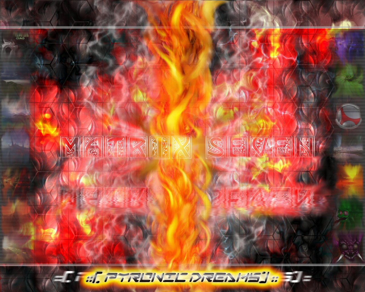
FULL VIEW A MUST! There is so much detail in this it isn't funny and you can't see any of it in the thumbnail.==========
This is a result of about 30+ hours worth of work during my Christmas break. Just a couple of ideas I had rolling around and decided to get down before I forgot them.
If I had to pick a theme for this pic I guess it would be "Inspiration". I have these fits of ideas that come rapid-fire in total detail and I have to scramble to get them all on paper, but then I have days where I don't get anything at all (hence my sporadic submitting). Anyhow, a white-hot flash of ideas, then gone again. Reminded me of a flame when I thought about it, that's why I have some of my previous works along the edges there.
I know the center is a little busy. Any ideas would be hot (no pun intended )
::[Matrix7]::
Related content


Comments: 12

I was looking at this again today and there are some things that I'm not sure I noticed about it b4 the last comment... there's so much going on you really have to look a couple of times
I don't think I mentioned how much I like the backgrounds textures/patterns. The vent-like things running down each side is very cool. I still like the idea of making those strips wider and your past work behind them could be bigger that way too, but still faded like they are. I also really like that hexagon pattern. I still think there's too much flames and smoke in that same area. I still love the font used on Matrix Seven (should be "Studio 7 Designs" maybe?) and I like the watery reflections very much, but I think it would be better right up against the bottom of it with no gap. There is a curvy 3d-ish pattern in there in the area of the hexagon pattern that tries to be noticed. I like it, but it gets kind of lost. I'm not sure how you would make these elements come together better, but it would be well worth it to work on this some more in my opinion, as I think it is very cool and has much more potential. Either way you did a good job with it as it is.
Hope that helps - I'm looking forward to your new stuff.
")
👍: 0 ⏩: 1

I REALLY wish my old hard drive hadn't crashed and I had the source files of this stuff again. Lost ost of this stuff and all my terragen stuff years ago unfortunately
👍: 0 ⏩: 1


Pretty cool man. Like the subtle hex laid in there.
Fire! Fire! Fire!
...had to say it. >:}
 (Cool)")
👍: 0 ⏩: 0

Looks like there are manymany layers in this one. Yea the center area is kinda busy and kinda makes the matrix7 text a little hard to read. The bottom banner looks great though.
👍: 0 ⏩: 1
Thanks ya! There were about 40-50 layers if I remember right at one point, but I merged and condensed until there were about 15 or so. I looooooves layers!
Thanks for the comment bro. If I can get my internet working at home I will take a stroll through your gallery, Ive been slack on my commenting lately because of work. Thanks again!
👍: 0 ⏩: 1
its ok works mroe imortatnt! Although Da does seem like a second life
👍: 0 ⏩: 0

Sweet jess and the orphans. Its great stuff. The hexagon design you have in the background has inspised me to do something so thanks for that. The flame look great but im not sure that all the red flames coming off the side was a good idea. Maybe a little less fire. Top banana
👍: 0 ⏩: 0
I like the pillar of fire. I'm wondering how you did that... I mean I know what you used to do it, but the technique... hmmm.
Unfortunately, I don't like the pillar of fire agains that backdrop. Not enough contrast against the flames you already have, and the colors don't seem to compliment each other very well either. Also I noticed that you added even more Ulead fire effect in the BG... I think I liked it better with fewer.
I do like the font you used
A suggestion... maybe you should make the visions of your past work along the sides a little bigger - then you wouldn't have so much space to fill in the center. As for the center - why not create some sort of clean symetrical design against the chaotic BG - I'm thinking solid black - it would really bring the piece together IMO.
👍: 0 ⏩: 1
Cool, now THAT is a comment  (Smile)")

Thanks for the comment buddy, see you later!
👍: 0 ⏩: 0

Wow. Very colorful and creative! I can see all of the little pictures on the sides and I thought that was neat. +1 fav.
👍: 0 ⏩: 0