HOME | DD
 mattcrap — MajorCityLineUp -partial 12

Published: 2007-06-05 22:27:59 +0000 UTC; Views: 1769; Favourites: 30; Downloads: 20
Redirect to original
Description
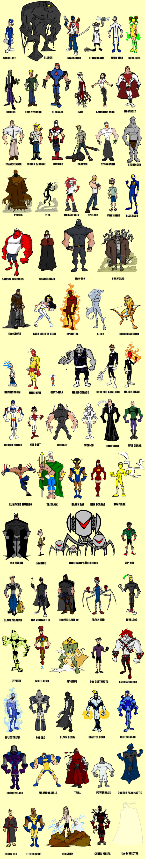
MajorCityLineUp entry 12newest additions to the bunch:
Splitstream twin brother of Splitfire, muta-human water/ice powers
Roborg iron man-ish archetypem, a man in a robotic suit type deal
theBlackDerby pulp style vigilante from the 20's/30's
BlasterBold one-note joke, 1970's super suit...from the future
BlueScarab one-note joke, proportionate inability to be crushed like a scarab
Related content


Comments: 41

Is there a connection between Red Scarab and Blue Scarab?
👍: 0 ⏩: 0

Wow......what an assortment,i just love then^.^!!!
👍: 0 ⏩: 1
no problem......ill be back and forth^.^!!!
👍: 0 ⏩: 0


me too- they call me SoggyDraws
👍: 0 ⏩: 0


WOW! man i wish i could draw like you. Your too good, we must stop you before you get too powerful!
👍: 0 ⏩: 1
ha! you're probably overstating things a bit....I probably just need to be stopped!
")
👍: 0 ⏩: 0

Just curious, is Amok Asunder's name inspired by Amon Amarth by any chance?
👍: 0 ⏩: 1
No, but damn that'd be a cool Tolkien tribute.
All the Nifelhiems just have two negative words (sometimes spelled funky) as a first and last name.
Amok Asunder
Vyle Lyar
Plunder Gore
that sorta thing
👍: 0 ⏩: 1
Oh, cool beans.
When do we get to see the other two?!
👍: 0 ⏩: 1
probably only if the book ever comes out....all the Nifelheim look pretty much the same, bleach white skin with red armor stuff
👍: 0 ⏩: 0
NuclearConvoy [2007-06-06 02:47:04 +0000 UTC]
By one-note do you mean they'll only show up once?
👍: 0 ⏩: 1
yeah, mostly they just have a single reference or "poking fun" that they're used for.
👍: 0 ⏩: 1
NuclearConvoy In reply to mattcrap [2007-06-07 05:31:38 +0000 UTC]
Well, they are the most obvious homages...
👍: 0 ⏩: 1
i don't know- i think my FF tribute is even worse (as far as being WAY too close to the original models)
👍: 0 ⏩: 1

he's definitely a cool one...any time you've got 2 nickle plated .45's, that's good biz
👍: 0 ⏩: 0


I love all of your designs here. Even though some seem like parodies, they all seem well thought out. I'm really diggin' these!!!
👍: 0 ⏩: 1
i hope they come off as OBVIOUS parodies and it doesn't look like I'm trying to pass them off as original....because that's the intent.
I have a small core of "original characters" who interact in a world that's an amalgam of Marvel&DC.
Alot of my stories work around how my characters deal with a world like the ones we read about from the Big2.
👍: 0 ⏩: 1
That's cool...and yeah, they are obvious parodies, but, i didn't want to make a wrong assumption. You know what they say about assuming.
👍: 0 ⏩: 1
yeah, i do- my buddy Umption is a real dipshit
👍: 0 ⏩: 0

i am slowing down....but not done yet- hopefully soon
👍: 0 ⏩: 0

I want to read the The Blue and the Bold comic.
Man, I can't imagine redrawing all these characters every time you add a row.
 (Wink)")
👍: 0 ⏩: 1
as you can see from some of the changes in quality...SOMETIMES a little less goes into a particular drawings, so it evens out
👍: 0 ⏩: 0

