HOME | DD
 matthiasmuth — Dynamics.Gaming
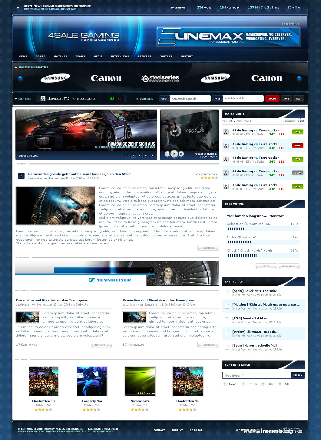
Published: 2009-06-11 17:53:59 +0000 UTC; Views: 13932; Favourites: 84; Downloads: 249
Redirect to original
Related content


Comments: 99


favlove favlove favlove favlove favlove favlove favlove favlove favlove favlove favlove favlove favlove favlove favlove favlove favlove favlove favlove favlove favlove favlove favlove favlove favlove favlove favlove favlove favlove favlove favlove favlove favlove favlove favlove favlove favlove favlove favlove favlove favlove favlove favlove favlove favlove
👍: 0 ⏩: 1

Ej du rockst dir aber auch was zusammen verdammt...
Richtig dickes Lob und sorry xD (siehe Avatar xD)
hoffe macht dir nix aus sonst änder ich es
👍: 0 ⏩: 0


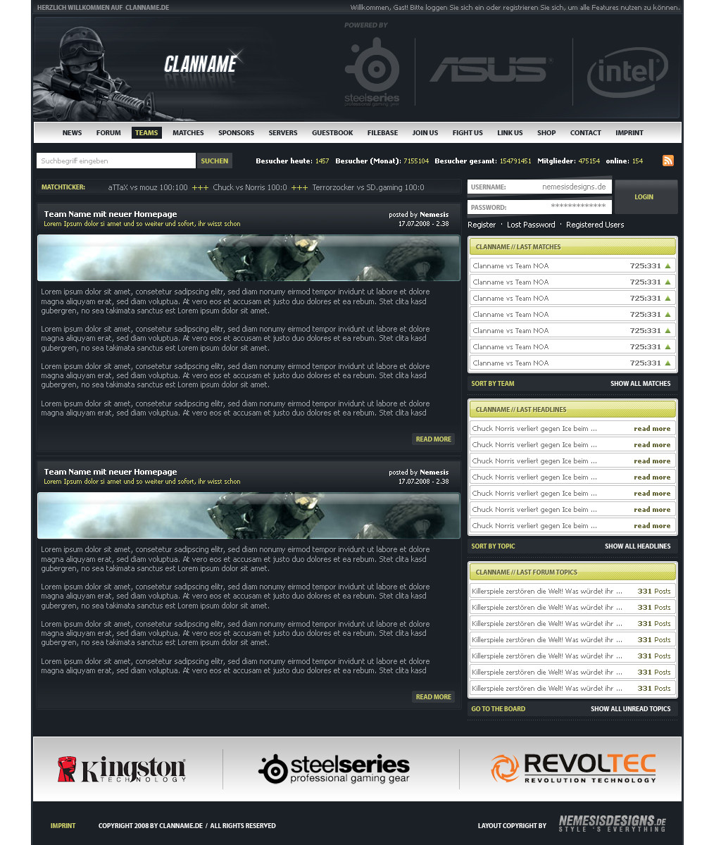
danke
mit c4d rendern und filtern
👍: 0 ⏩: 0

gibt genug seiten, wo man die erwerben kann
einfach mal googeln
👍: 0 ⏩: 0

wie heißt der font den du benutzt sieht immer klasse aus
👍: 0 ⏩: 1
hab doch doch geschrieben ^^
👍: 0 ⏩: 0
wie heißt denn der font den du in jedem deiner werke verwendest ?? der ist echt cool auch in bold !!
👍: 0 ⏩: 1
ich nehme eigentlich immer unterschiedliche ^^ also ich wechsel immer so zwischen swis, helvetica, calibri oder klavika
👍: 0 ⏩: 0

lol grad erst gesehn ich zieh mich aus? xD wusst ich gar nich aber glaub da würde dreamie^^ nur neidisch werden ")
👍: 0 ⏩: 0


also sehr schöne saubers und professionelles design hut ab...finde auch nichts zu bemängeln..farben sind super gewählt und macht einen top eindruck...
10 / 10
👍: 0 ⏩: 0


kannst du mir das mal schicken ?
ICQ: 483832206
Wäre nett
👍: 0 ⏩: 0

looks hot bro love the new content area nice job
👍: 0 ⏩: 0


Wenn du die obere Leiste noch ein bischen verschönerst bekommste nen fav
👍: 0 ⏩: 0

Jetzt wer ich wohl doch anfangen clandesigns zu faven.
Der MouseOver ist echt klasse, dezent und mal was anderes.
Content is auch super, und das mit dem Esl-Ticker ist auch eine super Idee, nur würde mich ebenfalls interresieren wie du dir das mit der Umsetzung vorstellst
gReEtZ
👍: 0 ⏩: 0

Geil! ... bis auf den Mouseover in der Navi, der will mir irgendwie nicht gefallen.
Aber dennoch ein 
👍: 0 ⏩: 0

sehr hübsch - nur footer und die oberer infoline sollten nach meinem geschmack sich noch ein wenig mehr vom hintergrund abgrenzen, ansonsten
👍: 0 ⏩: 0

Richtig so.
Genau das was ich gestern kritisieren wollte hast du geändert.
Das mir der Header nicht gefällt liegt an mir, geschmackssache  (Smile)")
Die sponsorenleiste ist richtig gut, der eslmatchticker ist eine neue sehr gute idee, wird bestimmt jetzt öfter in den nächsten designs auftauchen. Wie hast du dir das vorgestellt mit dem code, soll das automatisch eingebungen werden oder manuel?
Naja egal.
Der rollover ist total mein geschmack, zwar nicht so auffällig, aber dafür was neues, klein aber fein.
Bei dem search, sollen da links 2 statt 1 pixel sein? sieht einwenig komisch aus
")
👍: 0 ⏩: 1
alles was du siehst, soll so sein  (Wink)")
👍: 0 ⏩: 0


Ich bin das Design einmal überflogen, habe nichts festgestellt, dann hab ich es mir "Scroll für Scroll" angesehen und muss sagen: "Du achtest echt auf jedes Detail" !
Perfekte Arbeit.
👍: 0 ⏩: 1

ja, das sehe ich genau so! Wirklich sehr saubere Arbeiten.
👍: 0 ⏩: 1


Na also, das da vor war nicht schön aber das ist schon wieder viel besser!
Aber News sind zu groß und Header immernoch zu langweilig.
👍: 0 ⏩: 0

wie heißt die font inner Navi & im Footer?
btw. kleiner Rechtschreibfehler, es heißt imprint nicht "imptint"
👍: 0 ⏩: 2
sry tippfehler ^^
die font heißt klavika
👍: 0 ⏩: 1

| Next =>