HOME | DD
 matthiasmuth — Firmenlayout Nr.1 Update 1
Published: 2008-05-18 10:45:58 +0000 UTC; Views: 2224; Favourites: 7; Downloads: 50
Redirect to original
Description
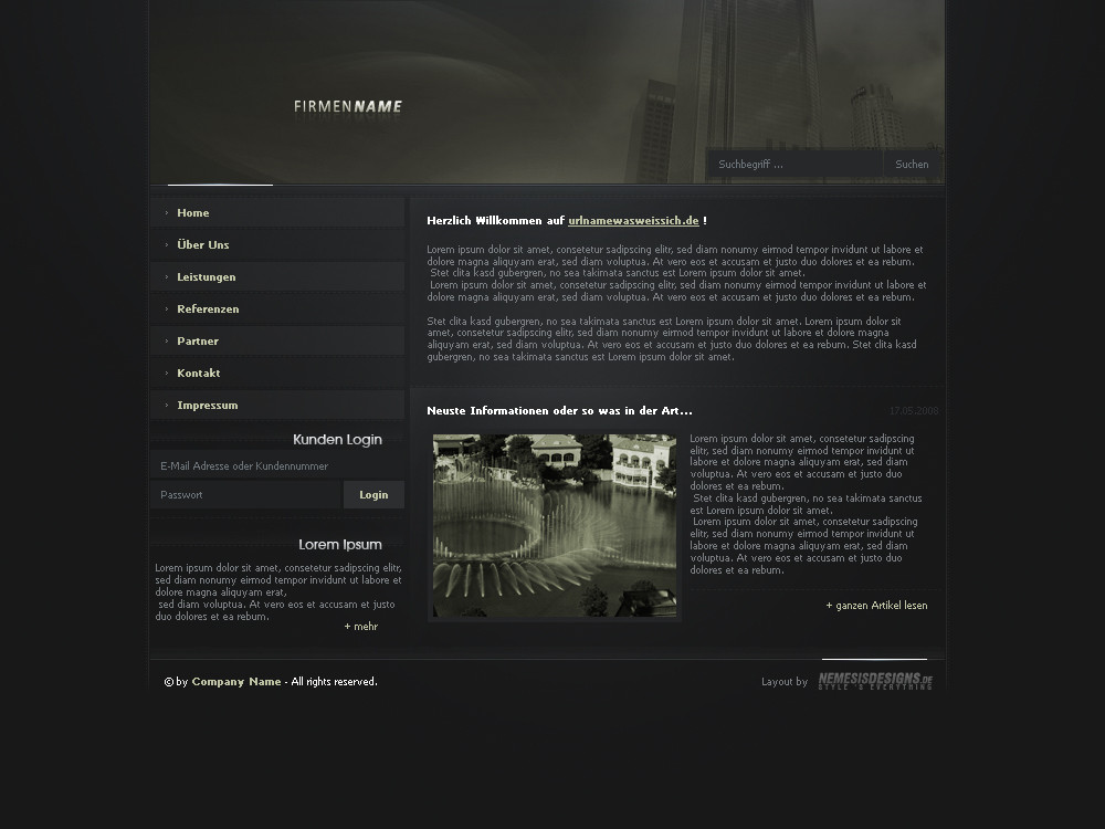
German:Hab hier mal etwas rumprobiert, ist mein erstes Firmendesign. Hoffe es gefällt euch
 (Wink)")
Freue mich über Comments und evtl. Favs
")
English:
I tried a few new things, this is the first company design i made. I hope you like it
I am very glad about comments and favs
mfG Nemesis
Related content


Comments: 42


ich finds bisl blaß ansonsten aufbau etc sau nice!!
👍: 0 ⏩: 0


gut designed , nur wie schon zum 100 mal ,sry ,
zu dunkel
aber gut gemacht nemesis
👍: 0 ⏩: 0


also vom aufbau und der idee isses sehr gut
aber bei dieser farbwahl würdest du nich viele interessenten finden (ausser Dr.McKay der würde es glaub ich gerne haben^^)
beim nächsten mal solltest du auf alle fälle was helleres mit mehr farbe machen
👍: 0 ⏩: 1

Aufbau: Sehr gut
Farbwahl: Gut
Kontrast: schlecht
Suchbuttons: unpassend
Gesamteindruck: cool
👍: 0 ⏩: 1

Wie schon erwähnt wurde viel zu dunkel. Ansonsten aber Aufbau und schlichter Stil absolut passend. -> Heller machen

👍: 0 ⏩: 0

lol ne wie kommste da drauf?
👍: 0 ⏩: 1

gibt so viele nemesis-designs ")
👍: 0 ⏩: 1
also ich hab bis jetzt nur einen gesehen ^^ außerdem schreibt man meins ohne bindestrich
👍: 0 ⏩: 1
Ja, trotzdem nemesis ist nemesis und oft verwendet
👍: 0 ⏩: 1
es gibt nur EINEN richtigen
👍: 0 ⏩: 1

hübsch, aber überhaupt nich als firmendesign geeignet...
hauptsächlich wegen dem dunklen grün
👍: 0 ⏩: 1
wie willsten die farbe im header sonst nennen?
für mich ist das ein tiefdunkles moor-grün.
👍: 0 ⏩: 1
also für mich ist das blasses ocker-gelb
👍: 0 ⏩: 1
gelb, willste mich verarschen? ^^
👍: 0 ⏩: 1
willste mir erzählen, dass dein pipi grün is oder was?
👍: 0 ⏩: 1
ganz bestimmt nich, aber das da im header is für mich sumpf-grün ^^
👍: 0 ⏩: 0

mh finds auch zu dunkel
ein firmendesign sollte doch eher hell und freundlich wirken
aber der rest sieht gut aus
👍: 0 ⏩: 0

etwas dunkel ... aber ok ... also mir gefällts ... für welche art von Firma soll das denn sein ?
👍: 0 ⏩: 1
ich habe keine ahnung ^^ war nur so zum training
👍: 0 ⏩: 0

du kennst ja meine Meinung
Aber ich hab noch was der Firmenname is viel zu klein  (Smile)")

👍: 0 ⏩: 1
stehst du etwa auf große...
namen oder was???
👍: 0 ⏩: 1

Vom Aufbau find ich es auch ganz ok,
aber zu dunkel ist es auf jeden Fall.
Da fehlen die Kontraste.
Muss auf jeden Fall Farbe ins Spiel
👍: 0 ⏩: 0


viiieeel zu dunkel! Ansonsten vom Aufbau und den Design-Elementen ganz nett, aber wo sind die Farben?!
greetz der-lukas
PS: #1
👍: 0 ⏩: 1
ja dass es zu dunkel ist, hab ich schon mal gehört ^^
und der bg ist leicht blau, im header etwas stärker und das helle gelb als highlight in der navi zb
👍: 0 ⏩: 1
lol ja schnell mal verändert
👍: 0 ⏩: 0