HOME | DD

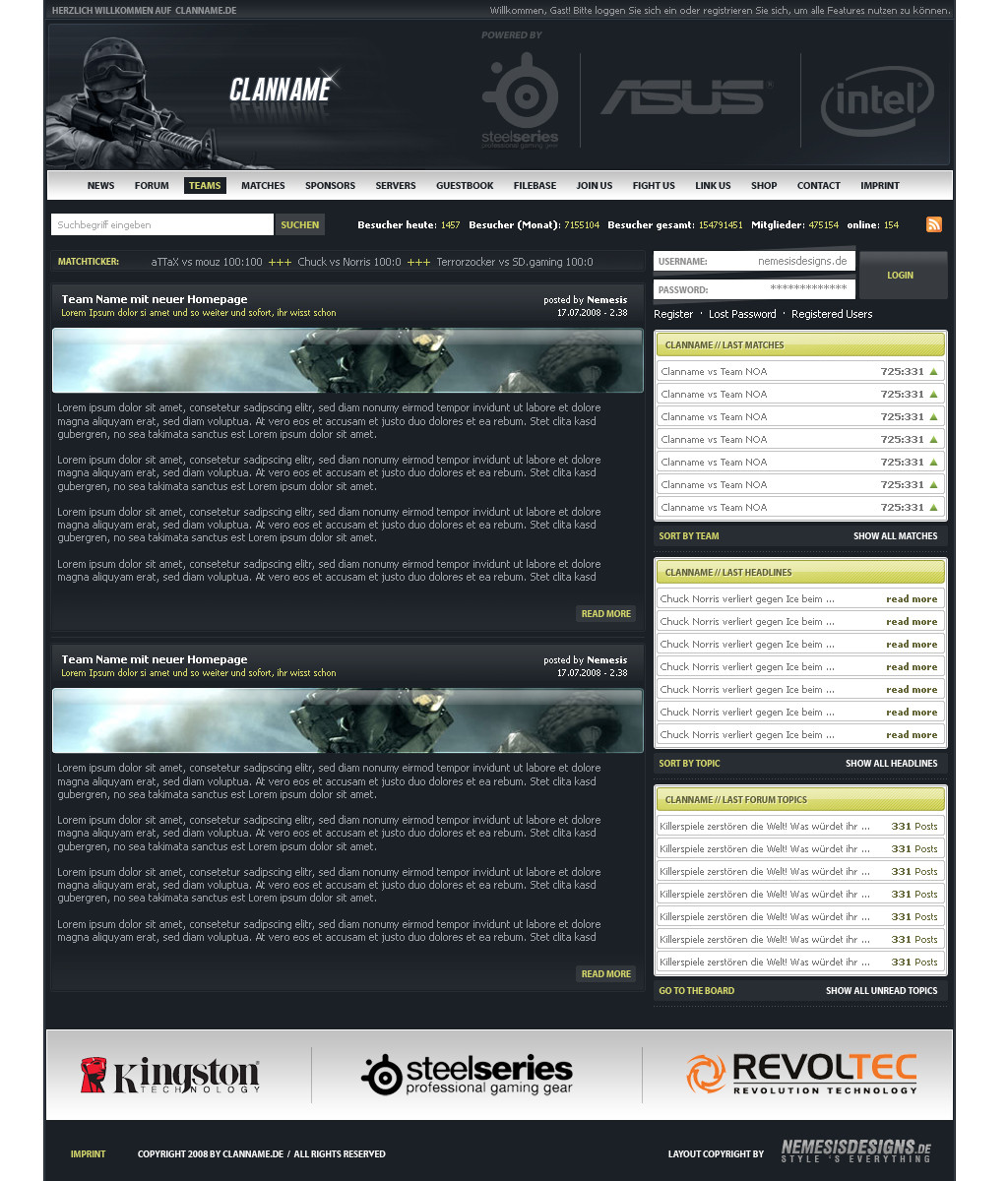
matthiasmuth — Nemesisdesigns v6.1 Update

Published: 2008-10-03 16:08:37 +0000 UTC; Views: 3125; Favourites: 15; Downloads: 93
Redirect to original
Description


Related content
Comments: 47

razr-designs [2008-12-05 12:11:32 +0000 UTC]

seeeehr schlicht!

aber trotzdem bombe!

👍: 0 ⏩: 1

matthiasmuth In reply to razr-designs [2008-12-05 14:14:00 +0000 UTC]

danke

👍: 0 ⏩: 0

AssazOx [2008-11-30 12:50:32 +0000 UTC]

sieht doch gut aus ^^

weita so

👍: 0 ⏩: 0

e-w-d-a [2008-11-30 11:30:11 +0000 UTC]

attraktiv

👍: 0 ⏩: 0

EnzuDes1gn [2008-11-30 10:30:31 +0000 UTC]

looks ok man well done

👍: 0 ⏩: 0

p4n1c [2008-11-29 22:55:33 +0000 UTC]

schaut nett aus D

👍: 0 ⏩: 0

yo0ku [2008-11-29 22:22:14 +0000 UTC]

nice work, das pink rockt voll. Weiss garnicht was ihr habt

👍: 0 ⏩: 0

Tobias-3rr0r-Kohlbau [2008-11-29 18:19:27 +0000 UTC]

gefällt mir

👍: 0 ⏩: 0

Y2Quake [2008-10-06 10:28:45 +0000 UTC]

finds kooL. Hat Style

weiter so...

👍: 0 ⏩: 1

matthiasmuth In reply to Y2Quake [2008-10-06 10:29:30 +0000 UTC]

danke

👍: 0 ⏩: 0

Torsten85 [2008-10-04 12:10:21 +0000 UTC]

Sieht toll aus...geht das on?

👍: 0 ⏩: 1

matthiasmuth In reply to Torsten85 [2008-10-04 12:13:48 +0000 UTC]

ist doch on^^

👍: 0 ⏩: 1

Torsten85 In reply to matthiasmuth [2008-10-04 12:41:16 +0000 UTC]

lol achos ^^

👍: 0 ⏩: 1

matthiasmuth In reply to Torsten85 [2008-10-04 12:43:41 +0000 UTC]

jo

👍: 0 ⏩: 0

schuetzthomas [2008-10-04 09:00:32 +0000 UTC]

das pink würde ich in grün verwandeln was du im head schon benutzt hast.
ansonsten ganz gut

👍: 0 ⏩: 1

matthiasmuth In reply to schuetzthomas [2008-10-04 09:33:13 +0000 UTC]

dann siehts so eintönig aus

👍: 0 ⏩: 1

schuetzthomas In reply to matthiasmuth [2008-10-04 11:30:48 +0000 UTC]

aber das pink passt nich

👍: 0 ⏩: 0

qantip [2008-10-04 07:32:02 +0000 UTC]

I like it ... realy nice

👍: 0 ⏩: 0

kaylaross [2008-10-04 04:16:28 +0000 UTC]

Really nice and simple. Good job.

👍: 0 ⏩: 0

elemeNt-XY [2008-10-03 23:13:17 +0000 UTC]

Geil, meine Farbe, dieses Pink! <3

👍: 0 ⏩: 1

matthiasmuth In reply to elemeNt-XY [2008-10-04 00:53:21 +0000 UTC]

👍: 0 ⏩: 1

elemeNt-XY In reply to matthiasmuth [2008-10-04 14:51:22 +0000 UTC]

👍: 0 ⏩: 0

Anjaloo [2008-10-03 22:42:47 +0000 UTC]

1) Das Logo ist zu mittig. Meiner Meinung nach gehört es weiter links, so, damit es zum Text passt und eine Linie ergibt.

2) Die Grafiken als Text-Überschriften sollten raus. Da gehört ein h1 bzw. h2 hin. Da kannst du ja auch die Größe ändern und einen dotted-border machen.

Viel Spaß noch!

👍: 0 ⏩: 1

matthiasmuth In reply to Anjaloo [2008-10-03 22:48:23 +0000 UTC]

danke für deine kritik

zu 1) ist denke ich geschmacksache, hatte es erst auch weiter links, hat mir dann aber nicht so gefallen, also hab ichs wieder etwas mittiger gemacht (obwohl es immer noch einstück weiter links ist)

zu 2) hab weiter oben schon mal geschrieben, dass es 1. keine standart font ist und 2. eine kantenglättung drauf ist, also fällt das mit den text überschriften leider weg...

👍: 0 ⏩: 0

SevenClips [2008-10-03 22:03:47 +0000 UTC]

looks good

👍: 0 ⏩: 0

dreamline-gfx [2008-10-03 21:59:27 +0000 UTC]

nice farben von colourlovers?

👍: 0 ⏩: 1

matthiasmuth In reply to dreamline-gfx [2008-10-03 22:33:19 +0000 UTC]

ehm ne? was is colourlovers?

👍: 0 ⏩: 1

dreamline-gfx In reply to matthiasmuth [2008-10-04 08:44:26 +0000 UTC]

meld dich icq denn erklär ich dirs (:

👍: 0 ⏩: 0

yo0ku [2008-10-03 19:39:09 +0000 UTC]

colles ding

👍: 0 ⏩: 0

philbstv [2008-10-03 17:52:15 +0000 UTC]

Ich finds ganz nice!

👍: 0 ⏩: 0

wnB91 [2008-10-03 17:09:54 +0000 UTC]

Mir fehlt irgendwie eine navi ^^ Aber ansonsten isses schön schlicht

👍: 0 ⏩: 1

matthiasmuth In reply to wnB91 [2008-10-03 17:24:29 +0000 UTC]

jo wollte eins ohne navi ^^ sollte alles auf einen blick drauf sein (bis aufs impressum)

👍: 0 ⏩: 1

wnB91 In reply to matthiasmuth [2008-10-03 18:42:30 +0000 UTC]

Joar aber so fehlen halt die Informationen... Webdesign ist ja ein ziem. weitschweifendes Gebiet (das mal zum Willkommenstext). Und wenn du mehr schreibst wird das ganze halt auch mehr Text auf einer Seite Da würd ich doch lieber wen. leistungen und Portfolio getrennt auflisten. Naja ist meine Ansicht

👍: 0 ⏩: 1

matthiasmuth In reply to wnB91 [2008-10-03 21:40:03 +0000 UTC]

wenn man sich die arbeiten anguckt, sieht man ja, welches gebiet gemeint ist

👍: 0 ⏩: 0

RomiSh [2008-10-03 17:09:46 +0000 UTC]

ganz hübsch

👍: 0 ⏩: 0

MReiser [2008-10-03 17:08:21 +0000 UTC]

1a
gibt nichts zu meckern (ok, der rosa streifen hätte meiner meinung nach auch grün gehört, aber ist mal wieder geschmackssache )

👍: 0 ⏩: 0

inGraphics [2008-10-03 16:46:57 +0000 UTC]

Sieht cool aus, aber auch nix besonderes

👍: 0 ⏩: 0

termi1992 [2008-10-03 16:44:21 +0000 UTC]

findsch hübsch

👍: 0 ⏩: 0

EnzuDes1gn [2008-10-03 16:38:23 +0000 UTC]

nice new layout bruv

👍: 0 ⏩: 0

Kugell [2008-10-03 16:33:06 +0000 UTC]

gefällt mir auch,
irgendwas fehlt mir zwar, aber ich weiß nicht was :-D
in der Code Version würde ich mehr mit Schrift arbeiten^^ weil fast alles bilder sind

👍: 0 ⏩: 1

matthiasmuth In reply to Kugell [2008-10-03 17:04:43 +0000 UTC]

das einzige, was du glaub ich meinst, ist der footer
ansonsten ist ja nicht viel text, das im content muss aufm bild sein, da es 1. keine standart font ist und 2. ne kantenglättung hat

👍: 0 ⏩: 1

Kugell In reply to matthiasmuth [2008-10-03 17:12:49 +0000 UTC]

achso ok, dann entschuldige ich mich...
dachte die Font wär "Times New Roman"
auf die Glättung hab ich garnicht geachtet

👍: 0 ⏩: 0

k3n0bi [2008-10-03 16:28:24 +0000 UTC]

nice
Gefällt mir schön schlicht

👍: 0 ⏩: 0

sunDox [2008-10-03 16:24:21 +0000 UTC]

ich finds top

👍: 0 ⏩: 0

Mav3rixX [2008-10-03 16:14:33 +0000 UTC]

find ich nich so toll

👍: 0 ⏩: 1

matthiasmuth In reply to Mav3rixX [2008-10-03 16:18:47 +0000 UTC]

mir wäre sehr geholfen, wenn du das ein bischen weiter definieren könntest
ansonsten ist es halt geschmacksache

👍: 0 ⏩: 1

Mav3rixX In reply to matthiasmuth [2008-10-04 07:50:05 +0000 UTC]

die Idee mit den Streifen (oben pink unten grün)
find ich cool aber auch wenn es ein Portfolio is
find ich's zu schlicht..
Die Aufteilung im Content find ich zu großzügig
und ich könnt mir vorstellen dass man auch das ein
wenig interessanter gestalten könnte

👍: 0 ⏩: 0