HOME | DD
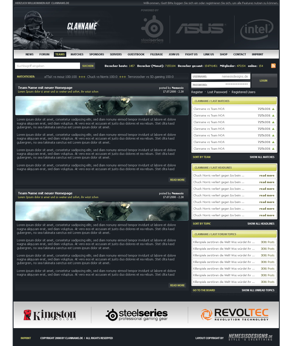
 matthiasmuth — Template 02

Published: 2011-08-21 14:42:30 +0000 UTC; Views: 11151; Favourites: 59; Downloads: 212
Redirect to original
Description
Related content


Comments: 33

Minimale effecte , schönbe anordnung ....... Top , krieg ich nen Discount für jeden like den ich bisher gemacht habe ? ^^
👍: 0 ⏩: 0

Oh man, this is great  (Smile)")
👍: 0 ⏩: 0


hey i really like your work
if you have time please contact me on my mail jonny.moller@gmail.com
i would like you to make a design for an community if you want.
👍: 0 ⏩: 0

Still not sold? I am very interested.
I have added you on MSN and sent you a mail.
Please respond soon.
👍: 0 ⏩: 0


Such an awesome work, i love the lime green on it, awesome layout too.
Only part i dont like is the sponsors area, but im not sure how it could be made better ")
👍: 0 ⏩: 0

It's really cool but the white part of the gradient background should be like a dark grey!
👍: 0 ⏩: 1

i had that first, but i thought it would be too dark then
👍: 0 ⏩: 1
Oh, well who ever buys it shall use it as they desire.
👍: 0 ⏩: 0

Gefällt mir
Hätte nur wie Thomi schon gesagt hat die Sponsoren in einem Gemacht.
👍: 0 ⏩: 0

Hab dir auch mal über ICQ getextet. Falls das Design noch zu haben ist bräuchte ich bitte nen Preis
👍: 0 ⏩: 1
bin erst am mittwoch oder donnerstag wieder zuhause, melde mich aber dann bei dir
👍: 0 ⏩: 0


Cooles Teil, aber hätte noch mehr Potenzial nach oben. Aber der Style ist cool.
👍: 0 ⏩: 1
wo hätte ich mehr draus machen können deiner meinung nach?
👍: 0 ⏩: 1
Ich finde die Navigation viel zu klein. Den Hintergrund hätte man noch!! schöner machen können. Eventuell mit Punktmuster und ein paar Lichtspielen,ähnlich wie es razr-designs mal gemacht hat. Die Sponsorleiste hätte ich nicht in einzelne Fragmente zerglegt, sondern eher als ein Balken gemacht und die Logos mit Trennstrichen getrennt. Ich hätte zudem die News und das dazugehörige nach links geschoben und Matches, Videos usw. nach rechts.
👍: 0 ⏩: 0


Find es echt nice nur alles ein bisschen klein :$ sonst Top
👍: 0 ⏩: 0


I added you on msn, I need info on its price. How much are you planning to sell it for?
👍: 0 ⏩: 0

Beim Login oben gefallen mir die Icons woher?
👍: 0 ⏩: 1
danke  (Wink)")
👍: 0 ⏩: 1

Dark layout is dark
I like it man .. but dammmmb thats dark lol
")
👍: 0 ⏩: 1

