HOME | DD

matthiasmuth — aCyra.eSports

Published: 2008-12-02 20:44:40 +0000 UTC; Views: 12769; Favourites: 70; Downloads: 223
Redirect to original
Description


Related content
Comments: 60

webzor [2009-12-14 23:25:52 +0000 UTC]

Very nice

Check out my deviantart : [link]

👍: 0 ⏩: 0

RpGrafix [2009-01-06 00:04:12 +0000 UTC]

bäh is das hässlig gleich ma faven xD <3

👍: 0 ⏩: 1

matthiasmuth In reply to RpGrafix [2009-01-06 01:23:23 +0000 UTC]

xDDD danke

👍: 0 ⏩: 1

RpGrafix In reply to matthiasmuth [2009-01-06 01:34:51 +0000 UTC]

hassu ma bock auf nen collab?

👍: 0 ⏩: 0

coc0r [2008-12-18 15:33:47 +0000 UTC]

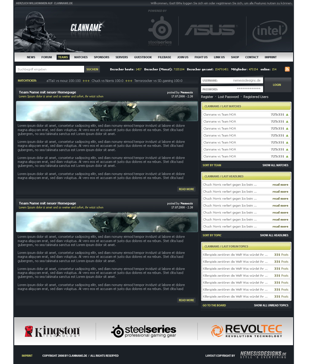
Sehr schön gemacht, aber du neigst dazu, die Typo ein bisschen zu klein zu machen Trotzdem, top!

👍: 0 ⏩: 0

luckystaar [2008-12-11 20:13:32 +0000 UTC]

TOP!

👍: 0 ⏩: 0

inGraphics [2008-12-07 02:38:32 +0000 UTC]

Was mir nicht gefällt : Die Navi
Was mir gefällt : Der rest

👍: 0 ⏩: 2

matthiasmuth In reply to inGraphics [2008-12-07 12:30:36 +0000 UTC]

danke cooles neues ava

👍: 0 ⏩: 1

inGraphics In reply to matthiasmuth [2008-12-07 13:11:58 +0000 UTC]

kein ding und danke
mich würde immer noch interessieren was das da unten für ein Font ist

👍: 0 ⏩: 1

matthiasmuth In reply to inGraphics [2008-12-07 13:22:52 +0000 UTC]

wo unten?^^

👍: 0 ⏩: 1

inGraphics In reply to matthiasmuth [2008-12-07 13:25:22 +0000 UTC]

tu doch nicht so na du weisst schon, da unten !

"Mich würde interessieren wie die Font heisst die du für dein Logo "nemesisdesigns" bei dem Footer benutzt hast."

x)

👍: 0 ⏩: 1

matthiasmuth In reply to inGraphics [2008-12-07 17:59:05 +0000 UTC]

arial black

👍: 0 ⏩: 1

inGraphics In reply to matthiasmuth [2008-12-08 01:24:30 +0000 UTC]

du verarschst mich doch

👍: 0 ⏩: 1

matthiasmuth In reply to inGraphics [2008-12-08 13:05:52 +0000 UTC]

ehm ne ^^ das acyra.esports ist in arial black und beim schriftzug auch

👍: 0 ⏩: 1

inGraphics In reply to matthiasmuth [2008-12-08 21:40:19 +0000 UTC]

verstehe, mit skalieren und so !?

👍: 0 ⏩: 1

matthiasmuth In reply to inGraphics [2008-12-08 22:00:41 +0000 UTC]

keine ahnung aber ich denke mal schon^^ weiß nicht mehr, was ich da alles eingestellt hab, auf jeden fall glaub ich die texthöhe bischen runter also etwas gestaucht

👍: 0 ⏩: 1

inGraphics In reply to matthiasmuth [2008-12-08 22:02:23 +0000 UTC]

dacht ichs mir doch

👍: 0 ⏩: 0

inGraphics In reply to inGraphics [2008-12-07 02:39:52 +0000 UTC]

PS : Mich würde interessieren wie die Font heisst die du für dein Logo "nemesisdesigns" bei dem Footer benutzt hast.

👍: 0 ⏩: 1

matthiasmuth In reply to inGraphics [2008-12-26 14:55:56 +0000 UTC]

arial black

👍: 0 ⏩: 0

razr-designs [2008-12-05 12:09:15 +0000 UTC]

waaah... das find ich geil!

der Header mit der einkerbung is bombe!

👍: 0 ⏩: 1

matthiasmuth In reply to razr-designs [2008-12-05 14:14:31 +0000 UTC]

gaaaaanz viele favs vom exmate ^^ danke

👍: 0 ⏩: 0

ImpactoX [2008-12-04 16:31:48 +0000 UTC]

Jo echt hat was, gefällt mir zwar nich so arg wie die übrigen von dir, aber trotzdem nice

👍: 0 ⏩: 0

AssazOx [2008-12-04 15:42:53 +0000 UTC]

alles roger digga

sieht gut aus

👍: 0 ⏩: 0

rivadaice [2008-12-04 13:43:00 +0000 UTC]

gefällt aber hab ich dir ja schon gesagt xD und hastes ja doch rund gemacht wa ^^

👍: 0 ⏩: 1

matthiasmuth In reply to rivadaice [2008-12-04 13:45:29 +0000 UTC]

jojo hab ich doch gesagt^^ kunde wolltes auch so

👍: 0 ⏩: 1

rivadaice In reply to matthiasmuth [2008-12-04 15:00:34 +0000 UTC]

^XD stimmt^^

👍: 0 ⏩: 0

le3d [2008-12-03 20:49:47 +0000 UTC]

Schöne Farben, guter Aufbau, standard und doch ausgefallen

fav wert

👍: 0 ⏩: 0

vNyL [2008-12-03 18:23:58 +0000 UTC]

dunkel fjdn besser <3
aber weiß ist auch gut

👍: 0 ⏩: 0

Zackarts [2008-12-03 17:51:18 +0000 UTC]

Nicht schlecht, aber für meinen Gemschak etwas zu dezent

👍: 0 ⏩: 0

FreddyderSpanner [2008-12-03 16:02:48 +0000 UTC]

navi daugt mir

👍: 0 ⏩: 1

matthiasmuth In reply to FreddyderSpanner [2008-12-05 20:10:01 +0000 UTC]

daugt?

👍: 0 ⏩: 0

Ja-Lie [2008-12-03 15:15:03 +0000 UTC]

Geilö...!

👍: 0 ⏩: 0

Tobias-3rr0r-Kohlbau [2008-12-03 13:18:36 +0000 UTC]

sehr sehr geil vorallem der header effekt ist sehr gut gewählt

👍: 0 ⏩: 0

schuetzthomas [2008-12-03 12:54:32 +0000 UTC]

sieht echt geil aus
welchen font haste bentuzt?

👍: 0 ⏩: 1

matthiasmuth In reply to schuetzthomas [2008-12-05 20:09:49 +0000 UTC]

name ist arial black, überschriften myriad pro und inhaltlicher text ist tahoma und arial

👍: 0 ⏩: 1

schuetzthomas In reply to matthiasmuth [2008-12-05 22:49:06 +0000 UTC]

danke

👍: 0 ⏩: 0

MalcolmFeth [2008-12-03 10:59:31 +0000 UTC]

I don't like this "tree style menu" on left
but design is really nice...

Quite easy to find different content boxes, high readability. Everything that should have a nice portal site

👍: 0 ⏩: 0

flyx2k7 [2008-12-03 10:58:11 +0000 UTC]

Wieder mal so ein geiles Design von dir... ich schwanke aber noch ob fav oder nicht :/
Dunkle Version gefällt mir persönlich einen Tick besser, aber die helle find ich auch gut.

👍: 0 ⏩: 0

k3n0bi [2008-12-03 09:45:37 +0000 UTC]

so hot!

👍: 0 ⏩: 0

aronarts-webmedia [2008-12-03 07:27:45 +0000 UTC]

Endgeil.

👍: 0 ⏩: 0

EnzuDes1gn [2008-12-03 01:40:28 +0000 UTC]

hmm content is great, as are side menus etc ................. but don't like the header or the nav

👍: 0 ⏩: 0

wnB91 [2008-12-02 22:40:01 +0000 UTC]

Sieht soweit ganz gut aus, wie gewohnt sehr schön clean und prof. von dir

Was mich stört ist das so wenig Farbe drin ist. Sonst einwandfrei; weiss ist besser

👍: 0 ⏩: 0

yo0ku [2008-12-02 22:06:11 +0000 UTC]

find die momentane von denen besser sorry
ne spaß, sieht in hell- wie dunkel gut aus :>

👍: 0 ⏩: 0

dioxyzone [2008-12-02 21:41:28 +0000 UTC]

awesome would like to know how to make this to

👍: 0 ⏩: 1

matthiasmuth In reply to dioxyzone [2008-12-05 20:07:54 +0000 UTC]

thanks bro im glad to hear this

👍: 0 ⏩: 0

der-lukas [2008-12-02 21:23:05 +0000 UTC]

schön und weiß besser! Rundungen leider pixelig, was mir einfach in den Augen wehtut, sonst hätts vll einen gegeben...

👍: 0 ⏩: 1

matthiasmuth In reply to der-lukas [2008-12-05 20:07:32 +0000 UTC]

soooo schlimm ist es ja nicht ^^ ist halt immer das problem mit dem pfadwerkzeug...
komm gib dir nen ruck

👍: 0 ⏩: 0

termi1992 [2008-12-02 21:09:20 +0000 UTC]

richtig geiler aufbau eh

👍: 0 ⏩: 1

matthiasmuth In reply to termi1992 [2008-12-05 20:06:52 +0000 UTC]

mal was neues probiert eh

👍: 0 ⏩: 1

termi1992 In reply to matthiasmuth [2008-12-06 05:41:53 +0000 UTC]

jo past^^

👍: 0 ⏩: 0


| Next =>