HOME | DD
 matthiasmuth — dazzit.de Prepage
Published: 2010-09-15 20:57:49 +0000 UTC; Views: 4606; Favourites: 28; Downloads: 136
Redirect to original
Related content


Comments: 32

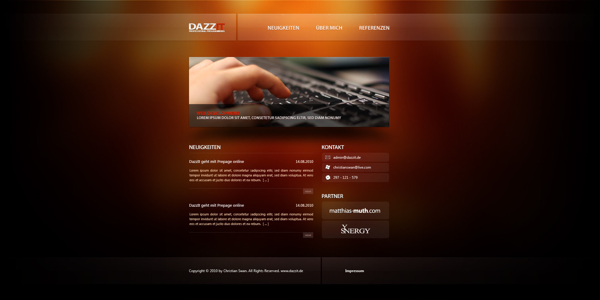
Ach ja, immer dieses trendy, blurry, shiny Backgrounds... find ich scheiße!
Setzt die Führung der Augen auf die Highlights im Hintergrund und nicht auf den Content.
Wenn es dir aber egal ist, dass das einer ließt, dann isses gut
👍: 0 ⏩: 0

 (Smile)")

Umm you need to fix the code bro
Warning: preg_match() [function.preg-match]: Compilation failed: nothing to repeat at offset 1 in /var/www/vhosts/dazzit.de/httpdocs/wp-content/plugins/wassup/wassup.php on line 3954
Warning: preg_match() [function.preg-match]: Compilation failed: nothing to repeat at offset 1 in /var/www/vhosts/dazzit.de/httpdocs/wp-content/plugins/wassup/wassup.php on line 3954
👍: 0 ⏩: 2
fair enough
... be sure to slap him for me then
👍: 0 ⏩: 1
pardon me, it just fixed itself after a quick browser refresh
instant fav now

👍: 0 ⏩: 1

Mhhh.. ")
👍: 0 ⏩: 1

Sooo endlich online
Hoffe, der Nemesis wird es hier auch noch reinschreiben
[link]
👍: 0 ⏩: 0


keine ahnung, hab nicht auf die uhr geschaut
👍: 0 ⏩: 0


I like the warm colors and the glass effect of the boxes. The spaces in the header and footer are kind of rough. You may make them round just to make it perfect in the design. Also the red in the WEB DEVELOPMENT subheader, is too red. You may make it a bit darker. Just a warmer red.
Good work!
👍: 0 ⏩: 0
Also ich find die geil
Ist online, wenn ich bald mal mit dem anderen Kram fertig bin -.-' Deswegen die PrePage..  (Wink)")
👍: 0 ⏩: 0

Schick auf jeden Fall, aber ich finde du solltest bei so kleiner Schrift kein Anti-Alasing verwenden. Die SChrift sollte so oder so etwas größer sein (Fließtext).
👍: 0 ⏩: 0


Ich finds total schick, genau mein Geschmack, schlicht und edel.
Würde ich gern mal online sehen. Sofern es mal wo online geht, wäre nice wenn Du mir mal ein Link zukommen lässt.
LG Blue
👍: 0 ⏩: 1
ich update es dann, dann bekommste wieder ne message
👍: 0 ⏩: 0

Mir persönlich ein wenig zu einfach,
sonst aber edel.
👍: 0 ⏩: 0
nice colors, and very minimal in style indeed
.... was a shock to see such basic work come from you though
")
👍: 0 ⏩: 1
why not? ")
👍: 0 ⏩: 1


Ist ziemlich schlicht, aber wirkt dennoch edel
Mag die Struktur und die einzelnen Elemente.. Navi is auch sehr cool ^^
Schöne Arbeit.
👍: 0 ⏩: 0