HOME | DD

matthiasmuth — sYnergy Gaming

Published: 2010-04-15 20:23:18 +0000 UTC; Views: 11057; Favourites: 50; Downloads: 246
Redirect to original
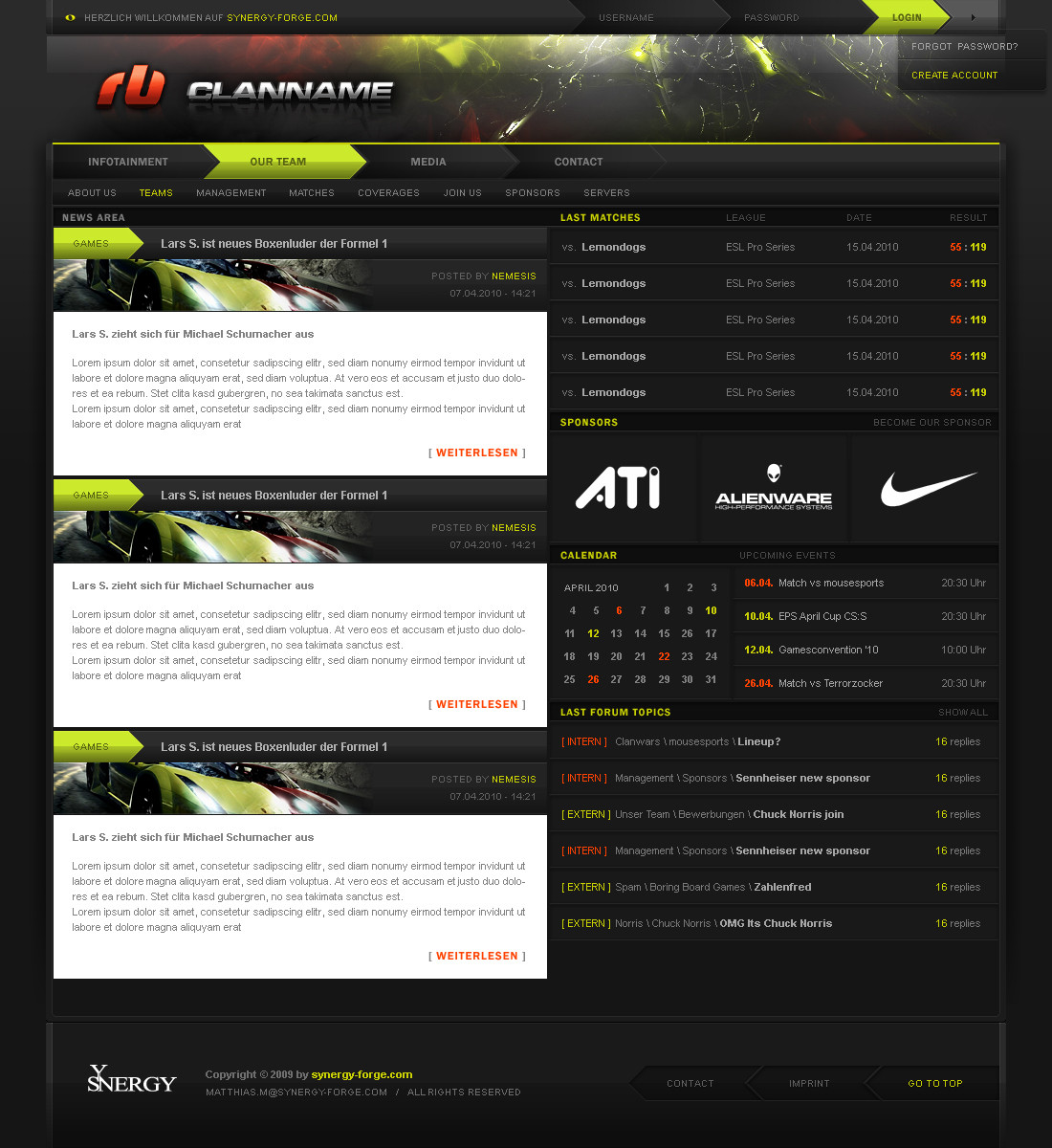
Description
Related content
Comments: 44

iT-Pixel [2013-11-08 14:57:40 +0000 UTC]

Nice desgin Bro..

👍: 0 ⏩: 0

metalartist2 [2013-04-30 23:57:38 +0000 UTC]

I really love the look of the site and it's sleek. Color scheme is hott! Wow is it online? Like up and working because I would like to click on the buttons.

👍: 0 ⏩: 0

AaronSmith87 [2010-07-05 20:28:11 +0000 UTC]

Very Nice design love it!

👍: 0 ⏩: 0

YcroneX [2010-06-14 17:02:51 +0000 UTC]

Wer son stockheader mag

👍: 0 ⏩: 0

sRussell08 [2010-04-21 02:54:56 +0000 UTC]

How much would it cost for you to make me a Website for my Gaming Community?

👍: 0 ⏩: 1

matthiasmuth In reply to sRussell08 [2010-04-21 11:14:24 +0000 UTC]

we can talk in icq or msn about this
icq: 292-020-046
msn: admin@nemesisdesigns.de

👍: 0 ⏩: 0

elemeNt-XY [2010-04-19 11:56:12 +0000 UTC]

Du hättest den Header vorm Upload noch ändern sollen. Ich mein, im Content passt ja allein schon alles, nur weil mein Name dort steht. Gay.

👍: 0 ⏩: 1

der-sebastian In reply to elemeNt-XY [2010-04-19 15:00:27 +0000 UTC]

obergay.

👍: 0 ⏩: 0

EnzuDes1gn [2010-04-18 02:06:32 +0000 UTC]

header is better now ... BUT lose the Red logo part, the chrome part is awesome, but that red part is not in fitting with your colors or design friend

👍: 0 ⏩: 0

Neo8gfx [2010-04-17 16:51:15 +0000 UTC]

Awesome work... Always !

👍: 0 ⏩: 0

JonasSeegers [2010-04-17 16:46:58 +0000 UTC]

Das ist ein Rückschritt, finde ich. Der Header raubt deine persönliche Note, so ein 0815 Lichteffekte Mist, ich weiß, dass es ätzend ist für einen Clan einen Header zu gestalten, viel kann man da nicht wirklich machen, aber das ist so ein krasser Stilbruch, das passt alles nicht wirklich zusammen, Logo und Schriftzug gefallen auch nicht. Ich fand das Design vor dem Update richtig nice, nun gefällt es mir nicht mehr so gut :/

👍: 0 ⏩: 1

iSHOKZ In reply to JonasSeegers [2010-04-18 18:15:19 +0000 UTC]

muss ich leider zustimmen

👍: 0 ⏩: 1

pixxelkoenig In reply to iSHOKZ [2010-04-19 10:45:01 +0000 UTC]

ich auch

👍: 0 ⏩: 0

edumicro [2010-04-17 15:00:41 +0000 UTC]

Great as always.

👍: 0 ⏩: 1

matthiasmuth In reply to edumicro [2010-04-17 15:06:07 +0000 UTC]

👍: 0 ⏩: 0

termi1992 [2010-04-17 11:35:36 +0000 UTC]

Der Header versaut leider das ganze Design.. Wenn du dort nen richtig guten Header hinbekommst so wie bei deinen anderen Designs dann wer das ein richtig gutes Layout!

👍: 0 ⏩: 0

pixxelkoenig [2010-04-17 11:17:27 +0000 UTC]

naja sieht aus wie die ganzen andern clandesigns

👍: 0 ⏩: 0

DxDesigns [2010-04-17 02:18:25 +0000 UTC]

Wow very nice done!

👍: 0 ⏩: 0

waseemarshad [2010-04-16 20:42:29 +0000 UTC]

Perfect!

👍: 0 ⏩: 0

TheMoONko [2010-04-16 16:34:40 +0000 UTC]

wow, it looks really great...

👍: 0 ⏩: 0

VDvoltec [2010-04-16 14:45:08 +0000 UTC]

Eigentlich schön gestaltet. Allerdings fehlt ein eyecatcher im Design

👍: 0 ⏩: 0

Moev [2010-04-16 14:35:09 +0000 UTC]

i love the color xD

👍: 0 ⏩: 0

Andasolo [2010-04-16 14:21:07 +0000 UTC]

Man ist besseres von dir gewohnt. Header will mir garnicht gefallen, obwohl der Rest schon ziemlich frischen Wind bringt.

👍: 0 ⏩: 0

qlstR [2010-04-16 13:39:37 +0000 UTC]

dicki schicki

👍: 0 ⏩: 0

icns [2010-04-16 12:17:08 +0000 UTC]

Schöne Arbeit

👍: 0 ⏩: 0

pSHR [2010-04-16 12:08:39 +0000 UTC]

bis auf den head, sehr geil finde ich!

👍: 0 ⏩: 0

EnzuDes1gn [2010-04-16 11:44:26 +0000 UTC]

not your best for sure, the title fonts are quite hard to read in this style and color , darker would be nicer imo

Main layout logo should also align to the left more too, it's off balance where it is right now I think.

Colors as always are great, but I think the header banner bg, could use more work bro, you normally make those uber sexy, but this one doesn't really fit with your design

👍: 0 ⏩: 1

matthiasmuth In reply to EnzuDes1gn [2010-04-16 13:49:40 +0000 UTC]

thanks bro, good aspects!

👍: 0 ⏩: 0

JonasSeegers [2010-04-16 10:07:16 +0000 UTC]

finds sehr nice

👍: 0 ⏩: 0

SasMaNkO [2010-04-16 08:46:09 +0000 UTC]

glaub das ist für den anpasser en schweres stück oder? wegen dem kalender und so...

aber ist mir en tick zu dunkel...
obwohl der kontrast im gesammten stimmig ist...

wann released du dein neues design?

👍: 0 ⏩: 1

matthiasmuth In reply to SasMaNkO [2010-04-16 13:48:20 +0000 UTC]

linus meinte, es wäre kein problem mit dem anpassen

dauert noch ne weile

👍: 0 ⏩: 0

usaholes [2010-04-16 00:13:27 +0000 UTC]

this shit is FIRE man! good job

👍: 0 ⏩: 0

luxxxoR [2010-04-15 23:54:49 +0000 UTC]

its really nice, simple and pro! but if they got more sponsors, how they do? just wondering

👍: 0 ⏩: 1

matthiasmuth In reply to luxxxoR [2010-04-16 13:30:52 +0000 UTC]

maybe scrolling to the side

👍: 0 ⏩: 1

luxxxoR In reply to matthiasmuth [2010-04-16 20:24:21 +0000 UTC]

ok ^^

👍: 0 ⏩: 0

h1xndesign [2010-04-15 22:56:35 +0000 UTC]

mir gefällt es sehr sehr gut

👍: 0 ⏩: 0

Wonder-Design [2010-04-15 22:04:44 +0000 UTC]

schick, schick!

👍: 0 ⏩: 0

Plexum [2010-04-15 21:48:54 +0000 UTC]

Really nice

👍: 0 ⏩: 0

z3rx [2010-04-15 21:39:04 +0000 UTC]

finde den hell-dunkel kontrast im Content bissl zu krass
aber nice design!

👍: 0 ⏩: 0

Hotbutton [2010-04-15 21:03:51 +0000 UTC]

Amen ...

👍: 0 ⏩: 0

k4rotte [2010-04-15 20:36:45 +0000 UTC]

leider nicht dein bestes! Aber ich denke da findet sich 100% nen Käufer Da deine Design immer 12/10 sind, ist das leider nur ne 9/10 (:

👍: 0 ⏩: 1

matthiasmuth In reply to k4rotte [2010-04-15 20:38:00 +0000 UTC]

hehe ok hab schon seit ein paar wochen eins fertig, das auf den releasewartet das gefällt dir bestimmt besser

👍: 0 ⏩: 1

overcrock In reply to matthiasmuth [2010-04-16 11:59:38 +0000 UTC]

welches denn?

👍: 0 ⏩: 1

matthiasmuth In reply to overcrock [2010-04-16 13:33:47 +0000 UTC]

bulls

👍: 0 ⏩: 0