HOME | DD
 MatthiasUtomo — 100th Deviation - EVOLVING PAINTING

Published: 2013-05-15 18:00:12 +0000 UTC; Views: 6898; Favourites: 176; Downloads: 101
Redirect to original
Description
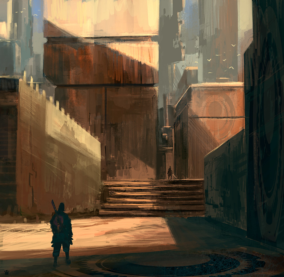
So this is my 100th deviation and I thought I should do something different with it. You may ask yourself why I am uploading a white picture. Thats because the painting will take place there, its going to be kind of a "tamagotchilikeevolvingpainting"
 ") So, I will paint frequently on it and update the deviation everytime. I dont know if its going to be good or the worst painting in the history of deviantart, lets see^^
So, I will paint frequently on it and update the deviation everytime. I dont know if its going to be good or the worst painting in the history of deviantart, lets see^^ Thank you to all of you who liked my work and supported me with all the nice comments, that really helps so much, love you folks
Always open for suggestions and criticism concerning the painting
 (Wink)")
-------------------------------------------------------------------------------------------
Changelog: v.1.1: -some thumbs, still not sure what to paint
v.1.2: -made another sketch yesterday and liked it more, goodbye thumbs

v.1.21: -Struggling with composition
v.1.3: -Added a few more horseman. Do you think the image is balanced? Should I go on with this composition?
v.1.5: -Started a linedrawing
v.1.52: -Perspective grid, more linedrawing
v.1.6: -Draaawiiiing
v.1.7: -Urrgh anatomy is hard. Apart from that: Sunny days are back

v.2.0: -Phewww lines are done, hope they are as usefull as everyone says = P Trying to get some readable values now. Not sure if I should stay with the lighting from the left or if it would look cooler with a lighting from the right. Might have to paint another version and try it out.
v.2.1: -Added a Castle/town
v.2.1732: -Made the canvas larger, hope my Pc can handle that = /
v.2.2: -Painted her face now for hours and Im still not sure about her expression+viewing direction+features like scars. Will leave it like that for today

v.2.3: -ugly green/blue incoomiiing, take cooveeeer
v.2.4: -lighting
v.2.5: -some more colors
v.2.6: -more colors on the colors and armor on the horses. Agh have to balance those colors, they are quite good in not getting balanced

v.2.7: -changed the composition, what do ya think^^
v.2.8: -last one before detailing
 ( I hope oO)
v.3.0: -painting. not quite satisfied with the shapes on the right =3
v.3.1: -lalala ...going to get something to eat, painting makes hungry : )
v.3.2: -needed a break on this one, but now im back on track and I dont know what to do more than ever
Something bothers me on that right side ")
v.3.3: -version after 3.2

v.3.4: -little update on the painting
v.3.5: -green sword n stuff. Are the colors a bit dull or is it just my screen oO
Related content


Comments: 145


Wow. Awesome!
Gefällt mir ausgesprochen gut! Diese Überlagerungen, echt super gemacht!
👍: 0 ⏩: 1

Danke, freut mich  (Smile)")
👍: 0 ⏩: 0

About the dull colors: It always happen to me. If you are painting using a hihg quality, high contrast screen (like a modern cintiq, for instance), the vibrance of the colors is much higher, richer and more exagerated, so you tend to use less vibrant colors in the RGB scale. When you see it in another, less contrasted and less quality screen it looks duller. But if the values are right it's gonna look good (just less saturated/contrasted) no matter what screen, like your case
👍: 0 ⏩: 1
Yeah my screen was quite saturated. Came to the same conclusion and reduced the saturation a bit on my screen.
But your right, maybe I should better worry about the values instead of the saturation= P^^
👍: 0 ⏩: 1
To me it's actually a good thing. It forces me to use values more carefully. i tend to use an oversaturated and vibrant pallete, and the change tames it down, so it's okay with me
👍: 0 ⏩: 0
ooooh ist das cool geworden! es sieht nun wie ein geschütztes tal aus, mit einer art schutzwall drum herum. allerdings finde ich, dass du auch rechts vom "tor" die bögen in der wand fortsetzen könntest - die, die links hinter den gebäuden zu sehen sind. sonst wirkt es etwas arg unsymmetrisch für ein so großes gebilde...vielleicht ist es aber auch die bergwand - keine ahnung ^^ auf jedenfall bin ich gespannt, was da rechts noch hinkommt. das grün-türkise licht erinnert mich an minas morgul in hdr
das entwickelt sich echt super! klasse! ich bin weiterhin gespannt.
👍: 0 ⏩: 1
Hey supi danke für die vielen Anregungen und Tipps
👍: 0 ⏩: 0

If you feel the colors are dull, I recommend viewing the file on another machine, you could use a higher saturation to draw attention to one part of the image.
👍: 0 ⏩: 1
Thanks alot for the tipps^^ Dont have another machine at the moment, guess I have to compare the saturation with photographs or other art
👍: 0 ⏩: 0

Das Bild ist so großartig, dass es mich gar nicht mit Depressionen zurückwirft, sondern einfach staunen lässt *__*
👍: 0 ⏩: 1
Danke
👍: 0 ⏩: 0
Danke
👍: 0 ⏩: 1

du haust doch ein Teil nach dem anderen raus,
du bist einfach ein vielbeschäftigter Mann!
👍: 0 ⏩: 0

very very perfect masterpiece!! superb picture!! love it

👍: 0 ⏩: 1
Oh thank you so much
👍: 0 ⏩: 0
Interesting idea, looks good so far!!
👍: 0 ⏩: 1
Thanks mate!! I know what you mean, looking at the great works out there can make you feel very small=3
But I think that its just a matter of time, just paint alot and have fun and take the increasing skill level as a side effect
👍: 0 ⏩: 1
I agree!! I draw best when I get caught up in drawing without worrying about the results too much- just putting all my effort into drawing as well as I can, but not thinking beyond that .^^ That way it is fun, I want to do it, and with time my skill improves almost without me thinking about it.
👍: 0 ⏩: 0

this is actually a pretty awesome idea! cant wait to see how this evolves q:
👍: 0 ⏩: 1

Ruines are yummy!! ))
The right side a little bit empty...
👍: 0 ⏩: 1
Thanks mate^^! Yeah the right site is kind of a problem area =/ guess I will put some leaves there.
👍: 0 ⏩: 0
Das wird ja - wer hätte es gedacht - immer besser. Hut ab, es ist großartig!
👍: 0 ⏩: 1

WOOOW! 
👍: 0 ⏩: 1
Tried many things out and I think this kind of works the best. At least I wasnt smart enough to find something better^^ Thanks glad you like^^
👍: 0 ⏩: 0

This is so amazing :3 I love the detail you're putting into it ^-^
👍: 0 ⏩: 1
Thanks alot!
👍: 0 ⏩: 1
You're welcome ^-^ I'm certainly excited to see the finished product even if it takes a year
👍: 0 ⏩: 1
Aww cool, I try to be as fast as I can^^
👍: 0 ⏩: 1
Well you're doing very well ^-^
👍: 0 ⏩: 0
Wow! I've apparently missed a few versions! What if you did some rocky ledges with trees on them that have big twisty roots hanging over the side? Or you could do some kind of creek/waterfall there.
👍: 0 ⏩: 1
Hey thanks for the ideas
👍: 0 ⏩: 1
You're welcome! This is fun, I'll definitely have to do it someday! One of the things I've been reading about is how to use the lines with your painting to point the viewers eyes toward the focus point.
👍: 0 ⏩: 1
If you do it, tell me so I can contribute
👍: 0 ⏩: 0


Wow that's some awesome progress! nice atmosphere
")
Yeah the right side...the horse and the hill are too similar/ close together. I tried a few things but that spot is hard to work with: i42.tinypic.com/2cnbdz5.png (moved people across, added trees) i39.tinypic.com/23wk2vs.png (just shifted the dark areas)
👍: 0 ⏩: 1
Thanks so much Jane! Once again your overpainting saves my life
👍: 0 ⏩: 1
No problem! Another easy trick you can use to check your values is convert it to black and white, squint your eyes a little to see if you can still tell the shapes apart and if the distance looks good
👍: 0 ⏩: 1
Thats a great one! a couple of weeks ago I read about it in the demo pages of "alla prima" and was totally fascinated by this approach oO
👍: 0 ⏩: 1
Awesome! I've known it for a while (though I don't remember from where) but it's something I need to do more often lol. That and flipping my images to check for mistakes.
👍: 0 ⏩: 1
Me too, I tend to forget all the theory while painting
👍: 0 ⏩: 0

Man it looks really good now! Maybe add some smaller ruins in the right background too?
👍: 0 ⏩: 1
Thanks! Yeah had something like that in mind too^^ But its so hard to find the right shapes=/ Guess I have to experiment around with it for a while.
👍: 0 ⏩: 0

die schwarzen Linien bei den Figuren vorne stechen zu sehr hervor finde ich- sonst siehts schon sehr plastisch und professionell aus!
👍: 0 ⏩: 1
Danke fürs Feedback Alex! Ja die schwarzen Linien werde ich noch übermalen. Die nerven schon ein bischen^^
👍: 0 ⏩: 0
| Next =>