HOME | DD
 mattnagy — The Senior Collegiate Pack
Published: 2006-06-17 23:57:31 +0000 UTC; Views: 6397; Favourites: 46; Downloads: 1757
Redirect to original
Description
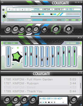
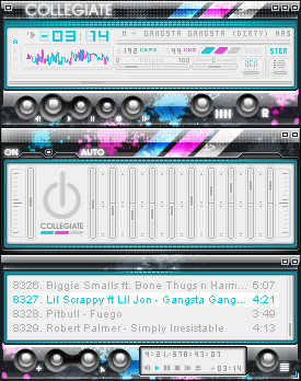
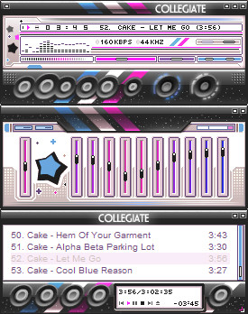
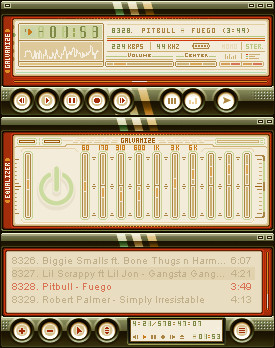
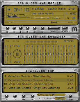
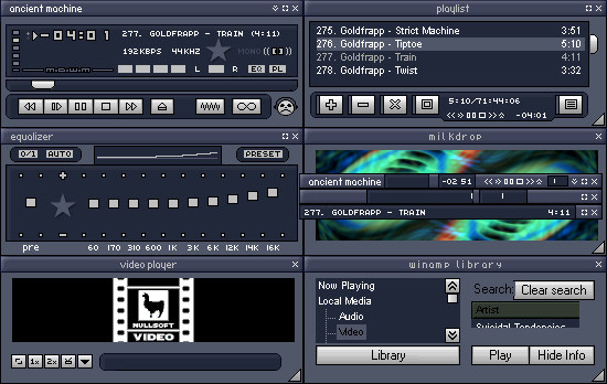
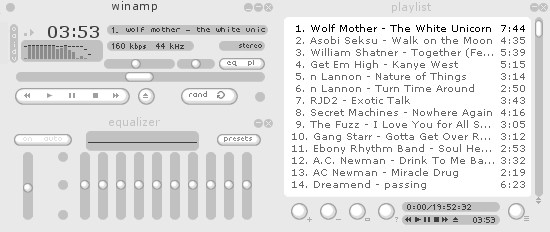
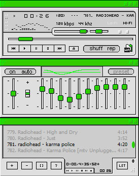
The Senior CollegiateIn this release, I have tweaked the playlist and the media library. Other things have been adjusted/fixed. The shuffle/repeat bug that was in the original Collegiate has been eliminated.
Of course, the other edit has been the colour changes. I feel this colour is more geared toward a male demographic. A lot of people strayed away from the pink and purple in the original release. I have fixed this little confliction that caused many to appreciate the original, but not want to use it.
I hope you all enjoy the final release of The Collegiate .
Update
I have submitted a second version per ~nobeak 's request. He did not like the stars in the skin. So I have submitted another version for his liking. So now, in the pack, there is a Standard version, without stars, and the original, entitled Rising Star.
I hope you all enjoy it.
--
"The Senior Collegiate Pack" Copyright © 2006 Matthew Nagy (blueslaad). Do not copy or redistribute this art without prior consent from the artist. Free for personal use as a media player.
Related content


Comments: 55


I like them both.  (Smile)")

👍: 0 ⏩: 0

 (Wink)")


Go for black and red and silver man. Those always rock.
But this rocks. Too bad i don't have internet for a few days at home...
")
👍: 0 ⏩: 1

Ooh, silver and red would work nicely. Thanks for the tip.
👍: 0 ⏩: 1
you're actually thinking about doing it? Whoa, I'm definately grabbing that then, keeping my eyes peeled.
👍: 0 ⏩: 1


Nice and shine, but here some picking - buttons too small for insets.
👍: 0 ⏩: 1


")


This would be the fattest skin if the stars were'nt there. Just not feeling the placement of them and the actual style of the star....But yeh , remix this without the stars and upload it
👍: 0 ⏩: 1
Try the download again, I edited the skin, there are two versions now.
👍: 0 ⏩: 0


Thanks a lot, I appreciate it.
👍: 0 ⏩: 0


I'm not sure what I think about the grey in the playlist and media library... But other than that, this is just excellent.
What was the bug with the shuffle/repeat buttons in the original, by the way?

👍: 0 ⏩: 1
Well, the drop shadow was too large for the dimensions of the shuffle button. So, when the button is inset, the main window bitmap still displays the dropshadow from the offset button. And, the end of the shuffle button (right) didn't match up with the beginning of the repeat button (left), so it would show a piece of the repeat button when selected, but would change when the shuffle button was selected. My fault really, didn't see it when I released it. Small bug, nothing to cry about, but I decided to fix it in the final release.
There was some other small glitches that didn't really take away from the skin, but I fixed those too.
Thanks for the comment.
👍: 0 ⏩: 1
Ah. Well, it's hardly noticeable... I was actually looking for the bug after I read the description here, and I couldn't see it.
Oh, and I like the new version of the skin. Looks kinda cleaner than the star version, while the star version looks more "celebrational" (is that a word?).
")
")
👍: 0 ⏩: 1


Great skin, the first version is also great. Nice job!
👍: 0 ⏩: 1

(^-^) The Pink & Blue was awesome, but for some reason, this one is just more appealing, even though I'm a girl. I really, really like this one. Great job, as expected from a master such as yourself!
👍: 0 ⏩: 1

I really like this and I'm using it currently. It's exceptionally clean, usable despite not having text or symbol labels on buttons. This is really a gem and it's the first I've changed my WA skin in 2 months.
👍: 0 ⏩: 1


| Next =>