HOME | DD
 mattnagy — Urban Development

Published: 2003-10-10 02:28:11 +0000 UTC; Views: 13204; Favourites: 87; Downloads: 3335
Redirect to original
Description
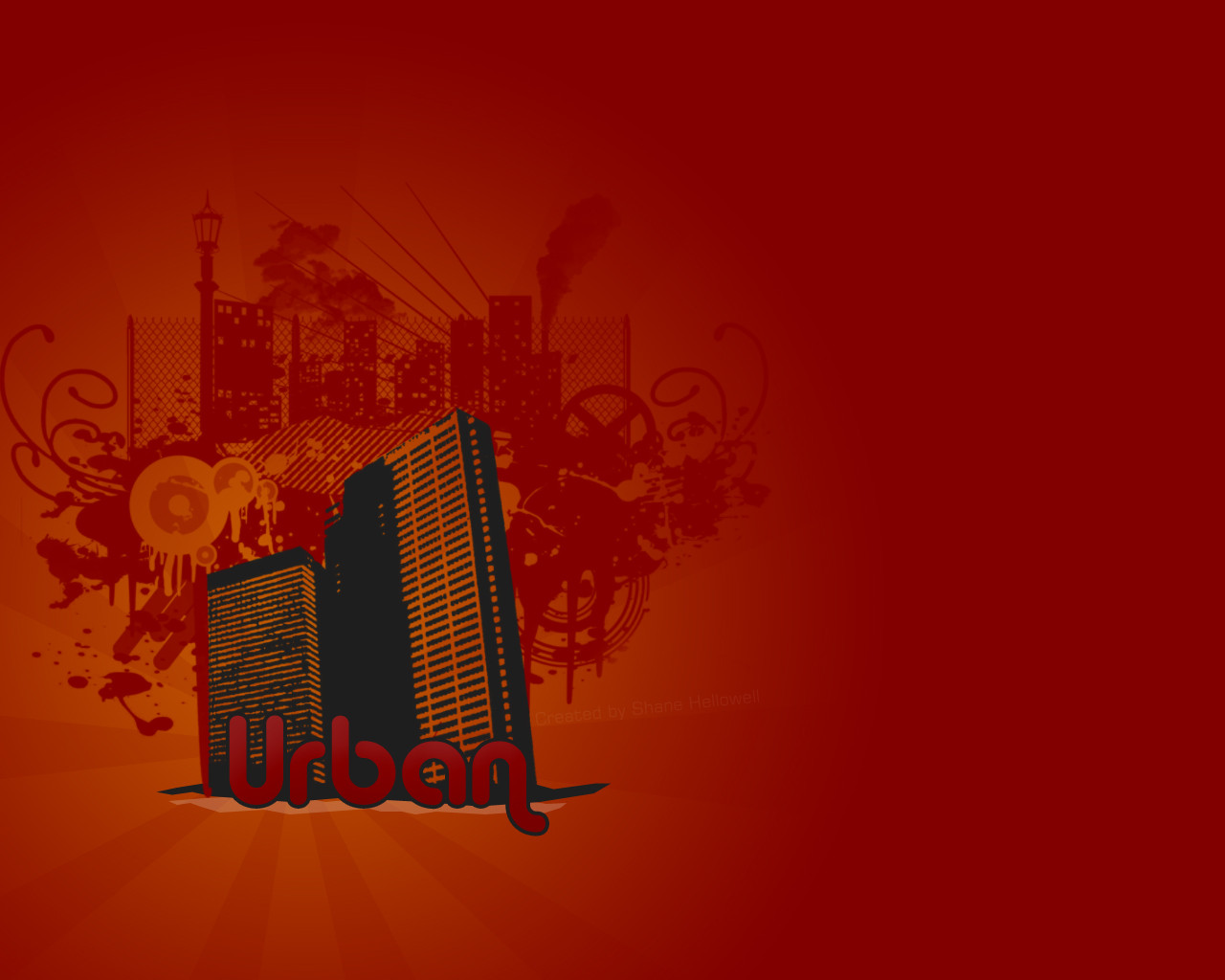
'Urban Development'A miscellaneous logo design
Full View it to get the full effect.
Thanks.
--
"Urban Development" Copyright © 2003 Matthew Nagy (blueslaad). Do not copy or redistribute this art without prior consent from the artist.
Related content


Comments: 37

 (Smile)")


")


Really nice logo there ...The color tones you use are great ... !!!! nice work ....
👍: 0 ⏩: 0


i'm gonna be kinda a meeny ...
but i mean well and want to maybe create a disccussion.. so no offence please...
the cityscape is cool .. and the design looks cool too
but...
it feels like a button ..
an image that would be on a website to indicate a transfer
to the page connected with urban development
what i'm saying is that the look of it is good .. but if you really intend on "logotype/signage" you need to put
more thought into the subliminal/subjective/perseptual messeges that the design sends.
if you have some of those in mind for this i do apologize and would love to hear them ..
if not it would be cool to generally talk about how to approach this as a pro "logotype/signage"
cheers
-ofer
👍: 0 ⏩: 0


 (Wink)")

what do you mean by vector style that term is new to me....it looks pretty cool to me....simple but cool
👍: 0 ⏩: 0


very nice, love the simple approach. and yea, i think the font's great for the piece too
👍: 0 ⏩: 0

wow! i like it..so stylish..
you're good designer,blueslaad!
👍: 0 ⏩: 0

Love this. Neat effect, like that 007 thing... great!
👍: 0 ⏩: 0

I could say... VERY nice vector styled logo
I love tones and neat design in it
👍: 0 ⏩: 0

wow thats a pretty damn fine logo. nice colours and design!
👍: 0 ⏩: 0


hey i need help abaut my logo. i can't find anybody who is willing to make logo for me can U help? markal
👍: 0 ⏩: 0


very nicely done, ...but umm "urban development"...hmm *wonders*
👍: 0 ⏩: 0


Nice work. If it were mine i'd sling the city further down but that is about it. The font works IMHO.
👍: 0 ⏩: 0

looks really good just the font i think should be changed.
👍: 0 ⏩: 0

dude... tha's phat as hell... kind of a round ad sticker... love it.
👍: 0 ⏩: 0

this is very neat.
i like how it is a monochrome production but has a sort of diversity among...its odd to explain, but obvious to see (at least for me).
👍: 0 ⏩: 0