HOME | DD
 mavhn — ...and they lit up the sky
Published: 2009-01-04 13:56:15 +0000 UTC; Views: 6370; Favourites: 219; Downloads: 162
Redirect to original
Description
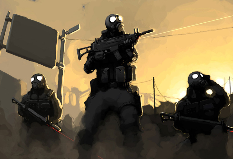
.guns.gas.dust.masks.fire.slight issue with compostition (might be a little too weighted to the left) and a little too clean but overall fairly happy with this.
oh hope the colour looks alright using a laptop while ive been traveling around europe and the screens a little wierd.
Related content


Comments: 29


Looks like my band when we're on stage. Singing(growling) through a gas mask is a bitch.
👍: 0 ⏩: 1

haha nice do u set everything on fire?
👍: 0 ⏩: 1
Well we have the swat suits, gas masks, green fog, girls dressed up as zombies on stage and fake fire pots since most venues dont allow pyrotechnics. We're the closest thing a band has come to to bringing a zombie apocalypse on stage and on an album. It's fun as hell.
👍: 0 ⏩: 0

badass, they look like Spetsnaz or something. Nice work mate
👍: 0 ⏩: 0


I am loving your feel. The light and the dark = very bold graphic.
👍: 0 ⏩: 0

I dig the simplicity of this piece: nice floaty brushes, effective composition and lighting. Good work!
👍: 0 ⏩: 1
thanks heaps mate, trying to improve as much as i can.
👍: 0 ⏩: 0

a small graphic novel/comic would look great in this style
 (Smile)")
👍: 0 ⏩: 1
ooh id love to do something lik that
👍: 0 ⏩: 0

I think this is my fave of your works thus far, it is strong not only compositionally, but the contrast and minimal color use make this an outstanding piece.
👍: 0 ⏩: 1
thank you, i think i struggle most with composition and colour so having made a better go at those two apects has made this one of my better works, still long way to go tho. cheers for the comment
👍: 0 ⏩: 0


Great !
(And I really like how the sign unbalances everything. Feels heavy...)
👍: 0 ⏩: 1
thank you, appreciate the feedback
👍: 0 ⏩: 0


Great brushwork. I see your point about the composition. That sign is too prominent I think. The colors look good on my samsung monitor, and I must say I didn't notice any balance issues before I read your comment.
👍: 0 ⏩: 1
yeah i've been looking at this image way too much, i like the sign so i wanted to add something to the right to balance it out a little but couldnt think of anything. i was meant to reduce the size of the sign but ended up not bothering, spose it looks ok as it is. cheers for the comment mate.
👍: 0 ⏩: 0

