HOME | DD
 May-May-Meow — Color Palette - part 1

#orange #yellow #colorpalette #schminckehoradam
Published: 2018-02-06 10:50:30 +0000 UTC; Views: 374; Favourites: 23; Downloads: 2
Redirect to original
Description
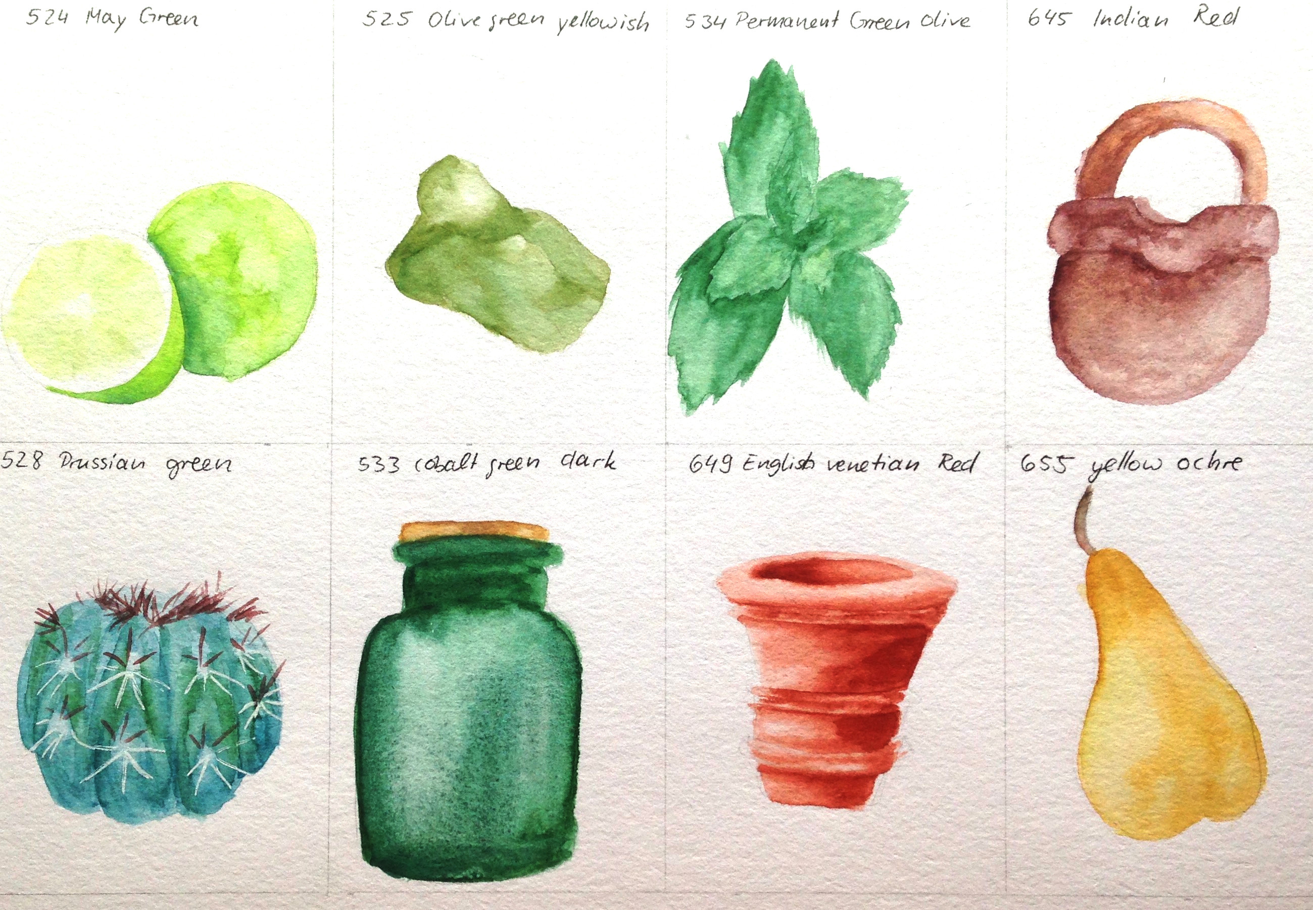
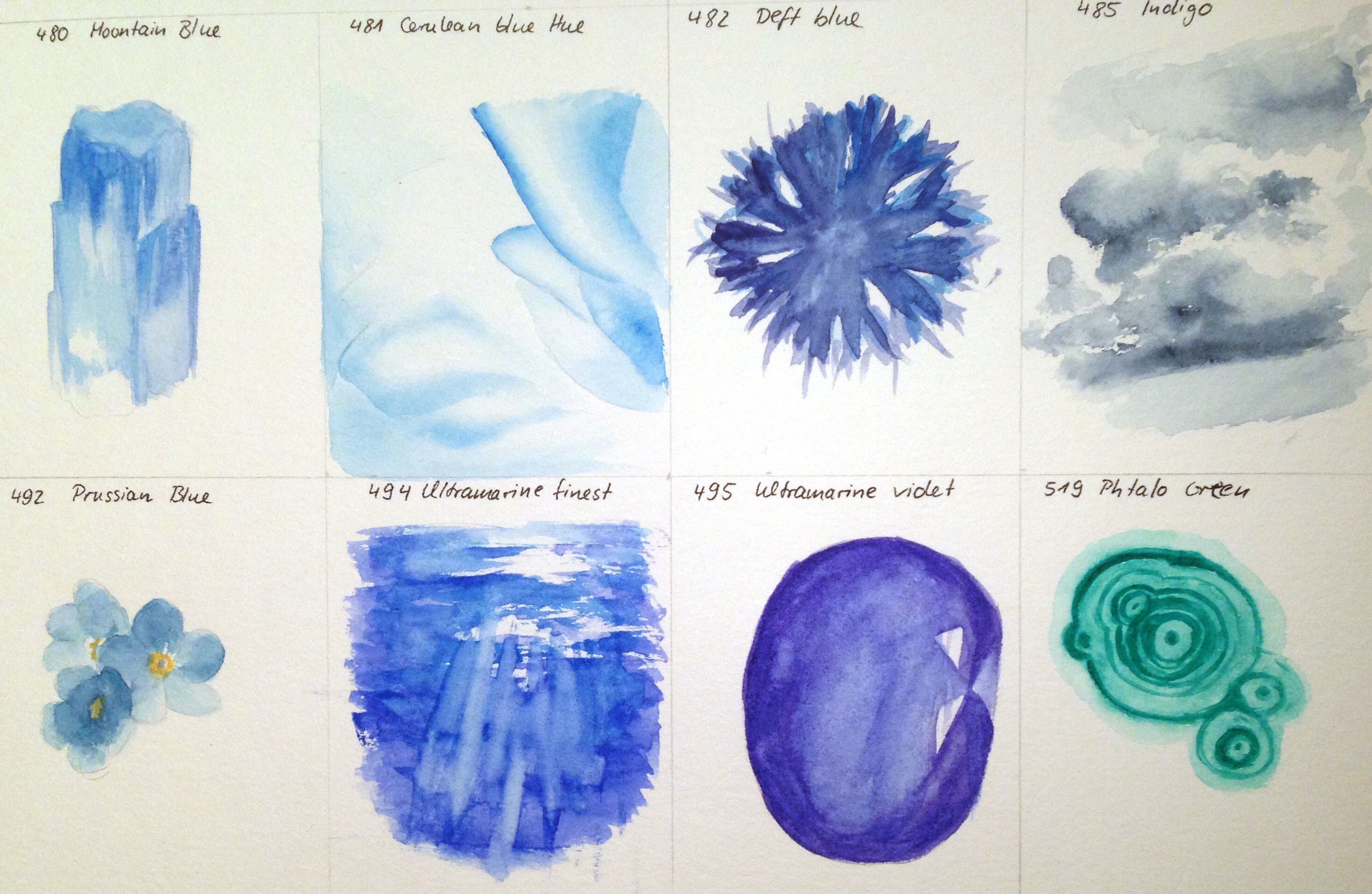
background:These pictures are meant to get me acquainted with my new Schmincke Horadam watercolors. I looked up pictures which are mostly one color so that I could then explore the color and see how much range it has (washes only).
I added of course accents of other colors too when there was a need of that.
added shades:
for 209, translucent yellow: sepia brown
for 213, chrome yellow deep: translucent yellow
for 218, translucent orange: translucent yellow, permanent green olive
for 221, Jaune brilliant dar: burnt umber
for 249, cadmium red light: Jaune brilliant dark, translucent orange
for 352, magenta: permanent olive green, may green
for 214, chrome orange: none
for 215, lemon yellow: cobalt green dark
material: Schmincke Horadam watercolors in the mentioned hues
size per picture: ~7x5cm
colorcard of additional hues
reference pictures with the assigned hue:
209 Transparent Yellow
213 Chromium Yellow Hue Deep
218 Transparent Orange
221 Jaune Brilliant Dark
349 Cadmium Red
352 Magenta
214 Chromium Orange Hue
215 Lemon Yellow
more color palettes:
Related content


Comments: 26

Soo, I finally have time to comment on the other color palettes ^^
I decided to again leave a sentence or two about every drawing, from the top left color to the bottem right one :3
#1: I think you did a good job at displaying the structure of the golden stone. I mean, the colors aren't really matching but I think this one was more about the contrast and imitating the roughness of it on paper and you ROCKed it! xD
#2: You did a good job a making it look transparent like the ref. The gem in the ref looks a little bit less round and has more sharply cut edges I think. It's still really cool :3
#3: You're so right, the orange fades so beatifully :0 It's so prettyyyy
#4: First of all, I love the motive! You also did a great job at coloring, it looks just like the reference ^^ The propertion is a little bit off, the top part of it looks a litle bit too small to me when I'm comparing it to the ref. But I can't stop looking at it, because the coloring is so accurate and I believe this must've been difficult :3
#5: They're amazing. Like really good. Can't realy say what to improve on tbh ^^
#6: You also did a great job at drawing these; I love how you simplyfied the flowers like that, I can still see pretty well that the flowers on the ref and the flowers you painted are the same, and there's still enough details in it. I don't really know, it's flawless and probably my favourite on this page ^^
#7: Again, a really accurate painting ^^ One thing to maybe improve on: Whereas in the other paintings I believe I tend to tell you to add more contrast, I think less contrast would come closer to the original photograph in this one. The fruit flesh isn't that much lighter from the outside if you look at it closely :3
#8: I really like how you also made the highlights on the gems kind of pop out in your pinting too ^^ And the color is pretty. I'm not sure if that's because the reference has a dark background or because the color is so light, but I believe this would look SO AMAZING if there was a dark background. Like, maybe you could repaint it someday and add a dark background, this would be so cool ^^
Hope I could help you a bit :3
👍: 0 ⏩: 1

you're so right, it's not nearly as pale as the original picture >< really irks me too :/ the texture is nice though ^^
sharp eyes you've got :3 i think you're right and i hadn't noticed yet at all 
one of my absolute favorite colors in the set 
really?
to me the outer red edge of the inner fruit part looks too red XD I wish I would have lifted of fmore color from that area
yes ")
couldn't agree more >< not happy with this one either. you pinpointed precisely why that is  (Wink)")
it would!!! but then it would alter the perception of the color which is bad as it's a reference. I hate that I really shouldn't add a dark-green BG >< if it was any other pic I would have done so in a heartbeat!!! you make such suggestions 
👍: 0 ⏩: 0

Oooh the magenta is just so wondeful! QwQ So pleasing to the eyes~~
👍: 0 ⏩: 1
But I gotta say, not sure how to use it yet
👍: 0 ⏩: 1
Aah I think you've used it well here already
👍: 0 ⏩: 1
I mean aside from the pure shade of it
👍: 0 ⏩: 1
Aah well that's true, then I can imagine it can be more troublesome OwO" But I guess you'll have to take courage and just mix it with everything till you find what it works with
👍: 0 ⏩: 1
I'll be buying a book (A5) made with watercolor so that I can explore and document the countless mixes
👍: 0 ⏩: 1
aah that's a good idea too!
👍: 0 ⏩: 1
I just need to wait to get to it XD and it'll be so bloody expensive ;-; *cries*
👍: 0 ⏩: 1
yeah there are those two things! Q_Q Fudge you books for being so amazing but expensive >W>"
👍: 0 ⏩: 1
Found an older one I still had ^^ not watercolor paper per se but it's sturdy enough to be of use ^^
and then there's the super thin stuff for practices XD lol
👍: 0 ⏩: 1
Well that's good though!
Hahah yeah, good thing that there is paper for all kinds of situations
👍: 0 ⏩: 1
will upload a lot of that stuff as scraps eventually XD
👍: 0 ⏩: 1
Aah I'll stalk you there then soon in that case X'D
👍: 0 ⏩: 0
thank you ^^ I fully 'blame' the colors :3 they're perfect

👍: 0 ⏩: 1

Ahaha the colors may be the stars of dah show but
the artist's skills also take a big part of a role in there~~ >:3 xDD
👍: 0 ⏩: 1
^^ true enough :3 when both meet it's just gudd XD
👍: 0 ⏩: 0

The magenta colours looks very deep and rich.
I also love the cadmium red light.
👍: 0 ⏩: 1
magenta is great for mixing shades ^^ and for flowers obviously XD haha
👍: 0 ⏩: 1
Yes, it is!!
What kind of flowers are those? (If you know) they're super beautiful!
👍: 0 ⏩: 1
en.wikipedia.org/wiki/Lythrum_…
the german name is way catchier, I swear XD
👍: 0 ⏩: 1
I don't speak german but my mother does and agrees
Ooh in Spanish it is called "frailecillo" (little friar), it's a funny name.

👍: 0 ⏩: 1
the german name translates roughly to 'bloody little willow' XD
not
👍: 0 ⏩: 1
