HOME | DD
 mayshing — 2Masters-facing the enemy

Published: 2011-10-13 03:27:46 +0000 UTC; Views: 3973; Favourites: 171; Downloads: 48
Redirect to original
Description
See progress here: [link]Time: 3 hours
Tool: photoshop CS3
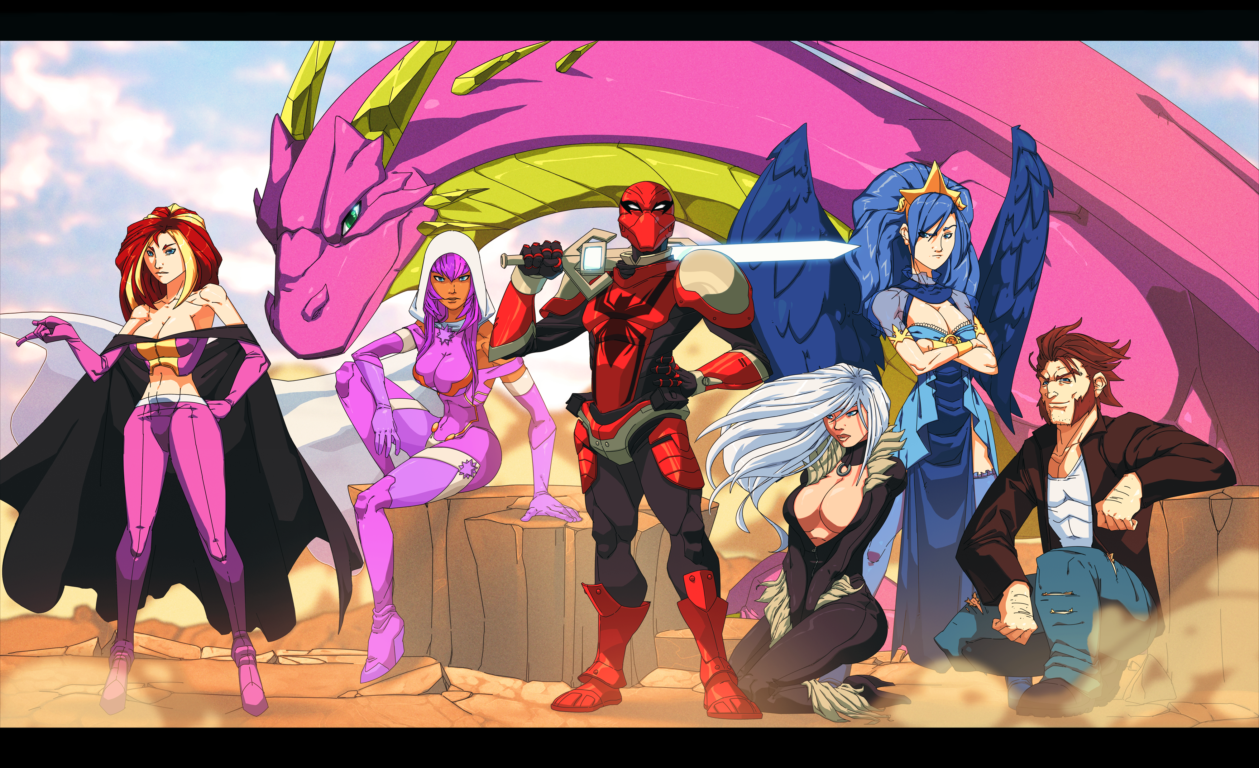
Concept art (cover art) for my third volume of 2Masters. A bit early since i am still working on book 2. lol
 2Masters book 1 is on sale
 | Read on 2Masters site | Vote comic | Tumblr | facebook page | twitter |
Related content


Comments: 46


I really like the dramatic tension in this and the composition is gorgeous. Although, personally I feel that it would be better if the foreground figure was darker (like the arrows) or the creature's armor was darkened, so he could easily be separated from the mounted figure. I find that they kinda mesh together a wee bit. Just my two cents though.
👍: 0 ⏩: 1

kk.  (Smile)")
👍: 0 ⏩: 0


thank u. you have good work on animation too.
👍: 0 ⏩: 1

This is beautiful XD I miss DA so much~~ -stretches- ok, time for my fingers to get back to work~ I love that knight, in my opinion he is your best creation ")
👍: 0 ⏩: 1
ha, thanks. I am glad to see u come back commenting. ^^
👍: 0 ⏩: 1
well i'm gonna start adding more art to my DA soon. My scanner broke.... sadly... so i'm gonna try to go full digital. wait see me come back commenting? o_O why does that sentence sound weird.....
👍: 0 ⏩: 0


Wow.
The scale here is staggering. The enemy is so HUGE and intimidating!
👍: 0 ⏩: 0

Grat work, the guy on the horse looks really mighty!
Truly epic piece!
👍: 0 ⏩: 1
owo thanks for checking back. I will probably do more of this type of styles in the future. ^^
👍: 0 ⏩: 0


Wow, just amazing. I'm awed by looking at this.
👍: 0 ⏩: 0

Oh sheesh. This is amazing. Simply amazing. I am mind-boggled by how amazing this is. The detail! And I absolutely love the glow effects on the spirit sword. Man, I need to head over to this comic and get myself back up to date! Thanks for posting this lovely and masterful piece of artwork, Mayshing!
👍: 0 ⏩: 1


very impressive, some more detail and perhaps more contrast and you would be one of the better painters on deviantart. nice work
👍: 0 ⏩: 1
i am considering that, but its a cover so I don't want to move too much away from my original manga designs (manga designs are easier to keep in less details) I will try doing other ones later that has greater level of details.
👍: 0 ⏩: 0

the character looks like Cloud from FF...except his sword is lightningy
👍: 0 ⏩: 0

")
👍: 0 ⏩: 0

I'm going to be the mood killer and be the one to ask, which way is the windblowing because you have two different capes fluttering in two completely different directions..... SORRY!
Anyway, besides that, I love the picture to peices. You tell a great story with this alone, I agree with other statements that have been made. Blondy looks like he's in some deep trouble lol. Great peice, great job, just a tad confused but otherwise- all-in-all a wonderful peice!
👍: 0 ⏩: 2
but the window is weakly blowing toward the white cape, not the brown one, the brown one is in air due to the follow up action to the blonde (jeremy) charging toward the warrior on the ride.
👍: 0 ⏩: 0
good point. I have a defense about that. The two are coming from completely different direction as well, if its at the moment when the blonde guy just stopped the secondary action will make sense as it comes slower to move to another direction. XD
👍: 0 ⏩: 1
lol, okay. That actually makes sense, guess I shoulda thought that one through a bit more because he does look like he had just stopped. Thanks for the clarrification hun. Have a great day!
👍: 0 ⏩: 1

*insert epic intimidating as well as awe inspiring music*
Is there no other way to emphasis *LOOM*!? I love the angle! Nice perspective and I love the detail on the arrow fletching!! You got some great change in perspective, using foreground and background wonderfully. Just wonderful proof that you know what you are doing and you're a professional!!
Jeremy is ready for WAR!
This is seriously going to be the best cover, hehee.

👍: 0 ⏩: 1
hopefully better covers are to come.
👍: 0 ⏩: 1

This is so epic! D= the way you drew the angle the guy on the horse looks like he means serious business. The atmospheric perspective on the picture is great too.
👍: 0 ⏩: 1

downright awesome! Sucks to be the blonde guy. Looks like his head is going to get cut off.
👍: 0 ⏩: 1
awesome is the word i look for.
👍: 0 ⏩: 1