HOME | DD
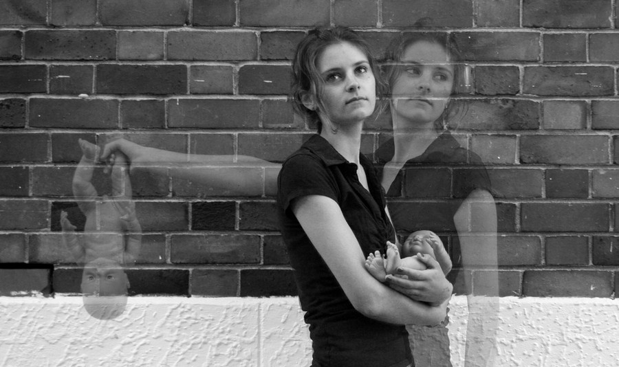
 Mebob — Box

Published: 2009-02-20 09:30:39 +0000 UTC; Views: 1450; Favourites: 26; Downloads: 1
Redirect to original
Description
Photography+edit: MeModel+Makeup: The ever-beautiful Tegan [link]
All comments will be greatly appreiceited, this is not stock, but if you chose to cristise my work, back up your cristisms, one word cristisms don't tell me much, nor help me improove
")
Thanks ^^
featured : [link]
Related content


Comments: 16

This looks so sad..
I like the style of your work & it's obvious you can take great photos, but I just personal don't like this photo.
👍: 0 ⏩: 1
I'm unsure how to answer that. It's just not my cup of tea.
👍: 0 ⏩: 0

Lovely, strong image. The dress is wellchosen, as it doesn't interfere with the concept, even adds to it, makes her look innocent. Her make-up and expression are fabulous. I do feel like the arms could be a tad lighter, they tend to draw too much focus now. However, I do like the shot!
 (Smile)")
👍: 0 ⏩: 1

Thanks ^_^
I agree with the fact that the arms draw too much attention away from the face, however, i think that darkening them and lightening the face might be a better solution than lightening the arms
👍: 0 ⏩: 1
Did I say lighter? Geez. I meant darker. I'm such an idiot, sorry! I think I've been browsing through too many galleries..
👍: 0 ⏩: 1
")

this is another great work, i just hope you don't mind if i give you a friendly advice, try not to edit the eyes so much and make them too white or change their natural contrast, the difference is noticeable. I hope you don't mind me saying this. It really is a great work
👍: 0 ⏩: 1
Thanks for the advice (and compliment ^_^
Although the eyes havn't actually beene dited other than some lightening along with the rest of the image. Although the area around the eyes, and her skin were ehavily photoshoped (and her eyes kept almost as they were in the rawfile)
Thanks ^^
👍: 0 ⏩: 0

I like the rawness of the image. I think the point of the image might've been a little more clearer if there had been more light on her face, this way it doesn't stand out as much as it should.
Other than that great image and very emotive.
👍: 0 ⏩: 1
Thanks, and aye, I see what you mean, her arms are lighter than her face.
👍: 0 ⏩: 0

Ooooooooooooooh I do like this one
If I were you I would try using a lower ISO, but that's just me. You probably have a reason for using 1600 though?
👍: 0 ⏩: 1
Thanks ^_^
And aye, I had to use a high ISO to compansate for the lighting
👍: 0 ⏩: 1
Ah yes I thought so.
You can get a pretty low iso if you use a really big aperture
👍: 0 ⏩: 0

i like this aaron!
and i totally didnt notice i was sitting on that dead leaf..
maybe subconciously i was like "i dont want to sit comptely in the dirt.. ill sit on this leaf!"
👍: 0 ⏩: 1
Thanks, its a shame the lines of the leaf arn't at a slight more angle tho
👍: 0 ⏩: 0