HOME | DD
 mechanical — reverseorder

Published: 2001-03-19 18:10:32 +0000 UTC; Views: 522; Favourites: 1; Downloads: 165
Redirect to original
Description
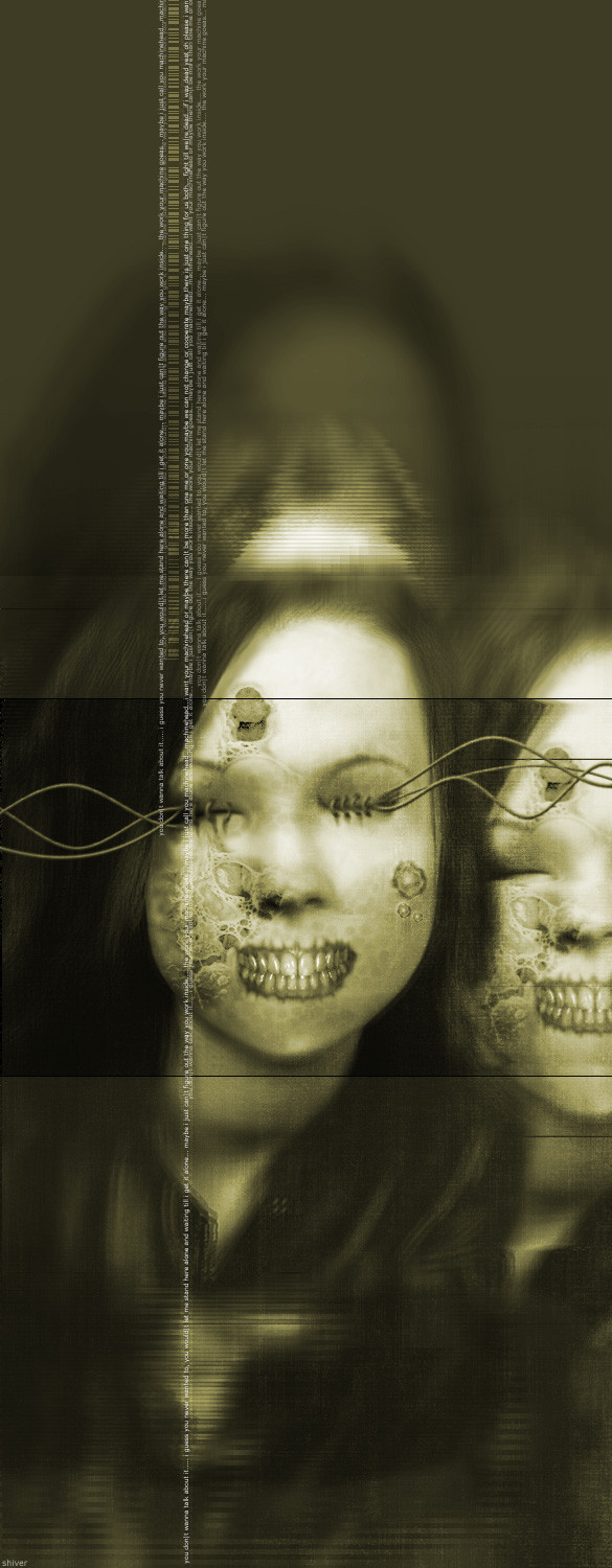
photo from istockphotos.comRelated content


Comments: 12


very nice design... likes this one too hehe
-----
PUBLIC SERVICE ANNOUNCEMENT
Support the artists that create photoshop brushes if you use them give them credit and a link in your description.
👍: 0 ⏩: 0


i like how your text tends to not interfere with the photos and other images that you use.. they are often the perfect supplement to your work.
_________________________
..::dspayre:.
It is not my desire to stray from the herd. It is my passion and purpose to set the pastures ablaze.
-----------------------------
👍: 0 ⏩: 0


love the photo subject, raw metal and welds are some things i've been thinking about doing a study of.
:anobody:
👍: 0 ⏩: 0

i love the feel to this
..:: ART|hive http://jamesmusgrave.cjb.net ::.
👍: 0 ⏩: 0

I think the picture speaks for itself....fantastic work
👍: 0 ⏩: 0

i love the angle of the shot (of whatever that is. looks like a corner of some metal thing. lol ). but in my opinion, the top and bottom "emptiness" of the borders is unnecessary. i'd take it out. of course, this is my opinion. heh.
[doobybrain]
👍: 0 ⏩: 0

yeah, there is nothing like raw talent to render any comments based on style useless. The treatment of the text is, in my mind, always the hardest part of any compositional work; here, it's pulled off without a hitch. My eyes /want/ to drag over this piece. The photograph was well selected as well.
kraft
----------------------------
:: virgin to the wack rhyme ::
----------------------------
👍: 0 ⏩: 0

i agree.. this style is done alot, but you seem to do it alot better than most.. congrats
-- matteo --
https://www.deviantart.com
http://www.wastedyouth.org
👍: 0 ⏩: 0

For a style it seems we see too much of, I have to say this is one of the best pieces I have ever seen here.... I love the pallet choice, the placement of the poems.. the fonts used... Pretty much everything about it.. You seem to have a real knack for placement... Very nice
David Demski
www.DreamersGuild.com
👍: 0 ⏩: 0