HOME | DD
 mechanical — spoiled

Published: 2002-02-11 18:08:39 +0000 UTC; Views: 466; Favourites: 6; Downloads: 33
Redirect to original
Description
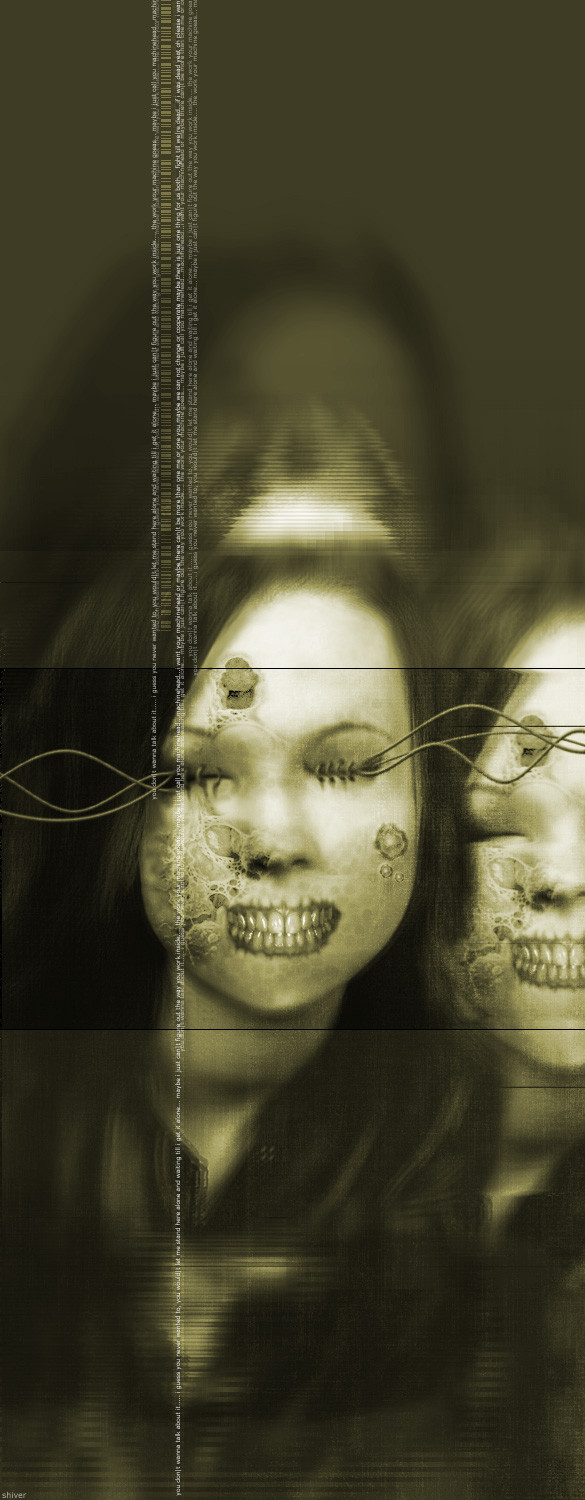
the original scan was sent to me by a friendwho forced some guy the's working with
to scan himself.
weird.
i had a little fun with the picture.
hope the guy doesn't mind.
Related content


Comments: 18

I love using a scanning bed for more than just scanning paper. I really need to continue my experiments in scanning, I stopped way too soon. As the others said above this is a suburb piece. Nice big grungy strokes sparingly added with some fine technical stuff and text for fine details. It all fits very nicely together. Cheers!
👍: 0 ⏩: 0

wow, i love this! and im not just saying that either
mad colours, mad composition, mad everything!! yet another awesome piece!!
and happy valentines day
-----
º¤~tùñä~¤º
👍: 0 ⏩: 0

great composition, my eye wanders all around the work. great flow.
-----
:: x0rcist :: https://x0rcist.deviantart.com/gallery ::breed:: http://www.breedart.org/
:: maY the sca|es fa|| from your eYes ::
👍: 0 ⏩: 0
pixelcatalyst [2002-02-13 05:40:46 +0000 UTC]
*adds to favorites*
-----
http://pixelcatalyst.plastiqueweb.com
👍: 0 ⏩: 0

oh wow how funny about the scan!! you made such an incredible piece of art with it! I love the color and the texture- its just so bizarre I gotta stare at it for awhile
-----
The path of excess leads to the tower of wisdom
-w. blake
👍: 0 ⏩: 0

Tight! I love your style, this is a great design. I got to check out your other work and keep an eye on ya. Nice!
👍: 0 ⏩: 0


Nice job.
-----
+Icon Deviance+
+Originality through supposed normality+
👍: 0 ⏩: 0

that's very nice . i especially like your composition here.
super stuff!
👍: 0 ⏩: 0

very excellent indeed, has a very cool texture.
-----
take me by the wrist: https://zep.deviantart.com
👍: 0 ⏩: 0

oh my.. i love this... "trendy" + grunge amazingly put together....
so very good!!! and the textures.. yum!
-----
°°°Two people are needed to make a good piece of art: the artist and someone else to hit him on the head with a hammer when the piece is finished.°°°
👍: 0 ⏩: 0

love the overall grungy texture, the lines, squares and dots remind me of colin of www.distortedperspective.com old work.
👍: 0 ⏩: 0

thats is very cool... so love the look of it...
-----
[-]
anything for you ... turn my castles .
[-]
👍: 0 ⏩: 0

Totally amazing, deserves DD. Possibly my favourite of yours yet.
-----
Simon
http://www.roadkillart.com
👍: 0 ⏩: 0

This is cool. You know, there are a lot of bands out there that could use the services of a designer like you. I mean, a lot of CD covers really suck, mainly because musicians with zero artistic talent insist on doing their own graphics. We need a service to hook up good amateur designers with amateur bands.
Let's make the world a better LOOKING place to live in!
-----
watchitman
Check out my band THE DARK AEONS: http://www.ampcast.com/thedarkaeons
👍: 0 ⏩: 0

--
Great piece of work... It reminds me of a bunch of different styles all smoothy brought together... I think the blue tone was done extremely well. It's one of those pieces that you could look at again and again and see something new in it.
--
👍: 0 ⏩: 0


lol nice stuff, I love the color and the composition.
-----
-mage
👍: 0 ⏩: 0