HOME | DD
 MechanicalRaven — Everything Rusts

Published: 2005-11-23 05:39:00 +0000 UTC; Views: 2164; Favourites: 34; Downloads: 138
Redirect to original
Description
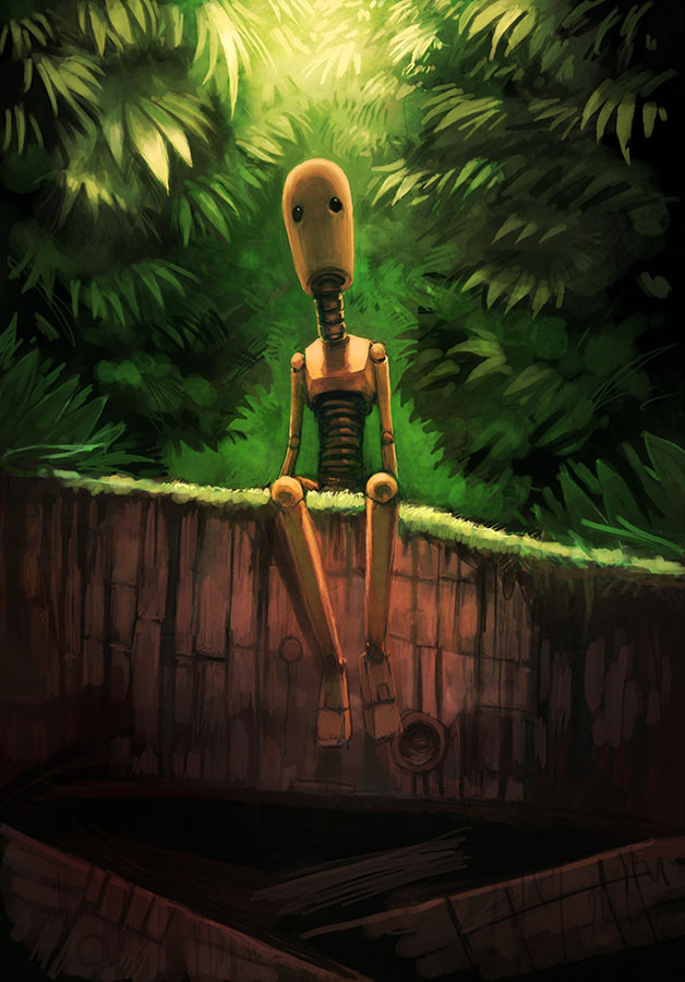
Finally something new eh?All things considered, I like how this came out, though I spent far too much time on it for what it is...
I had intended originally for a more complex, autumn forest-ey background but didn't like how that came out... and I thought this simpler one looked pretty nice on its own... didn't take away from the image, not too complex.
As usual, I appreciate comments and especially critiques.
Thank you.
Related content


Comments: 32


damn I wasn't sure which piece to comment on. Sometimes less is more and this is one of those sometimes. Any more background and I believe it would've swallowed the depression bot. I love this one especially the color shading on the metallic surfaces demonstrating light play. Well done. Oh yeah. Keep the sketch lines too. Our errors and under sketches are two things photoshop can't invade haha.
👍: 0 ⏩: 0

The first thought i had was, THIS...is killer! then i was like, no F*ck that, i'm not apart of you SYSTEM! ...then i was like...wait, the robot is the outcast here to this beautiful yet somber page of Autumn glory we understand. Maybe, he does not understand the shedding of these leaves to the tree. *ponder ponder* I like the background on this one the most out of any pic so far.
👍: 0 ⏩: 0

I love this piece man. I can take so much out of it, and yet I feel that I'm drawin too much. Over thinking if you will. This picture really kind of sums up the solitude I feel on a daily basis. The autumn background symbolizes a dark time of year. Plants and trees are dying, just about to restart their infinite lifetime of death and rebirth. This adds to the feeling of solitude. This is just my opinion of course. I love the work man, keep it up.
👍: 0 ⏩: 0

I absolutely love it. Your robot illustrations are absolutely breathtaking. I love the atmosphere you present in all the macabre imagery. Lovely, lovely!
👍: 0 ⏩: 0


i do like the simplicity, but i think the background is maybe a little too empty and stark... if you put in sillhouettes of trees, blurred around the edges, without much detail you could give the background more depth without getting super-complex. i would make any trees you add very muted, almost blended in but still suggest a forest, or trail or something.. i think the intensity of the gold color is making the space feel flattened, and breaking it up with a little more background might really make it feel deeper.
👍: 0 ⏩: 0

I really like your style of drawing, and a single tree really added to the lifelike feel and the suddle sadness of this picture, over all, I give it an 8.4094732147653700237504367092670902171057 403 out of a possible 9.56458205723705235432584, you been critqued!
Tom: YOU SO F*CKING ANNOYING, I WILL KILL YOU!
Your just on your period.
Tom: Mental illnesses don't have periods...
YOU LIE!
👍: 0 ⏩: 0

this is really sad, in a way. I love the colours. Really well done.
👍: 0 ⏩: 0
this is really sad, in a way. I love the colours. Really well done.
👍: 0 ⏩: 0

Wow, this is definitely one of your best robot pictures yet. The color palate is thematic, and works really well, and the composition holds the robot and the tree really well. I didn't get the sense that the robot was antagonistic towards the tree, but that he (She? It?) was comparing it.
My only critique of this is that the background feels a bit empty. You're right, it doesn't need a whole forest, but maybe some sort of path, or sillouette(sp) in the distance? Not really sure - I think it could benefit from some sort of background, though.
Anyways, very nice!
👍: 0 ⏩: 0

I really like the back ground on this. It looks like the sky is raining rust or something.
I always like the way you draw trees. They are like no trees I'v ever seen and seam to take on a life of their own sometimes.
The robot looks like it is kind of resentful of the tree or something. He has this hyper focused look on that tree. Almost as if he is hoping he can burn it down if he concentrates hard enough. But figures he can't, so he just crunches some leaves instead.
The leaves on the ground really caught my attention. I like that they don't really look like leaves lol. It looks as though they are just pretending to be fall leaves, like they are made up of newspaper and water colors and the tree is really just made of paper Mache and the only real thing in the picture is the robot itself. . . .
But any way,
HAPPY THANKS GIVING ~.^ <3333 !!!
👍: 0 ⏩: 0


i've always liked your works and themes. especially this one... nice!
 (Smile)")
👍: 0 ⏩: 0

my penix got rusty.
it broke off in your mom last night.
👍: 0 ⏩: 0

including my heart! aww emo tear.
this would make an awesome background for my work computer ... for autumn/fall/thanksgiving.
I've been trolling the galleries looking for neat backgrounds to awe my co-workers with... soon I will have them in my pocket yes soon my prescious... ::cackles::
")
👍: 0 ⏩: 0

")

a great composition dude. love the contrast between organic and linear shapes. its really cool.
👍: 0 ⏩: 1

LOVELY, Keith. I like the soft autumnal tones, great melancholy mood. I think you should put a gradient in the background however, same colours of course - it's just, right now, there's a very clear line between the two colours.
And I do like the single tree, it's lovely. Negative space is good if you work it in right.

👍: 0 ⏩: 1

Yeah, it is kind of abrupt I suppose. I'll need to fix that if I turn unlazy. Thanks.
👍: 0 ⏩: 1

i don't know if it would be comforting or depressing for a robot to see that it's not the only things that rusts. probably both. either way, this makes me feel all toasty inside.
👍: 0 ⏩: 1
I'm glad I could warm you up. Though alcohol could do the same thing...
👍: 0 ⏩: 0

I just like this pict for some reason... Lovely!
")
👍: 0 ⏩: 1
Thanks for taking the time to look at my work.
👍: 0 ⏩: 0

ooh nice, I like it. nice colours, a little sketchy, but looks good. nice style
👍: 0 ⏩: 1
Thank you. And the sketchiness is intentional. I think it gives my art a unique style and gives the pieces more "character" or something. Also gives you a little more to look at.
Thanks again.
👍: 0 ⏩: 1
oh yes for sure. I didn't say sketchiness was bad ")
👍: 0 ⏩: 0