HOME | DD
 MediaDesign — Tower Dock Icon

Published: 2008-05-30 10:44:15 +0000 UTC; Views: 31444; Favourites: 72; Downloads: 7968
Redirect to original
Description
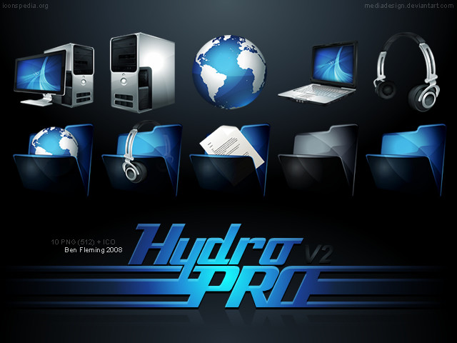
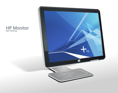
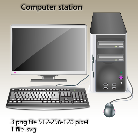
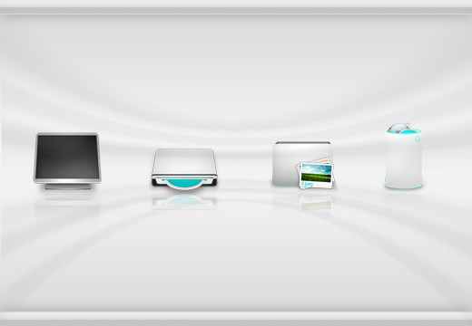
(redid the display picture)Two icons. We've got two brands here - the HP monitor, and the Dell tower. I think they go quite nicely with each other


You know the drill. Icons are free to use blah blah blah.
Related content
Comments: 46

GRACIAS POR EL APORTE ESTA BUENISIMO VERY VERY GOOD[link]
👍: 0 ⏩: 0

Very cool. I've seen this elsewhere on the web and I wondered who made it. You say "free to use," but I'd still like to ask permission for specific use. A non-commercial twitter bg just for myself. If not, still looks great on my icon dock.
👍: 0 ⏩: 1

Thanks mate, I have no problems with you using it for anything 
👍: 0 ⏩: 0

Hmm .. I was wondering if it's ok to use this picture in my school computer ??
of cours [ copyrights + ur name + and your site if you like ] ??
👍: 0 ⏩: 0

I love my computer, now i can have my computer inside my screen
👍: 0 ⏩: 0

i had once a pc like that one, not very proud of it. But great work with the icon's, bought back some great memories to me!
👍: 0 ⏩: 0

Looking for a HDD and ironically this is the computer i have
ill use this instead
👍: 0 ⏩: 0

Dude your icons are beautiful as usual!
Wot do you make these in? illistrator? they look Vector
👍: 0 ⏩: 0

And it's the exact same one as my friends computer.. also spooky!
👍: 0 ⏩: 0

Your insane realism scares me.
Heh. 
👍: 0 ⏩: 1

Thanks man 

👍: 0 ⏩: 0

Thanks mate, much appreciated
👍: 0 ⏩: 0

Sweet icon. Not bad for an OEM machine. I'll stick my my home-built Lian Li's.
I'm looking up that monitor ASAP!
👍: 0 ⏩: 1

Thanks man
The monitor is a HP w2207h 22 inch.
[link]
👍: 0 ⏩: 0

great icon i was just thinking of getting a dock, i'll be using a lot of yours icons, they're great
👍: 0 ⏩: 1

Thanks mate 

👍: 0 ⏩: 0

Nice. I'm sitting here comparing it my Dell tower. Spot on.
👍: 0 ⏩: 1

Haha thanks man. I used two images as resources, which is less than I usually use.
👍: 0 ⏩: 0

Why's the tower so fat? Ours isn't.. Is that bad?
👍: 0 ⏩: 2

The icon looks better fatter because if it was skinny there'd be all this blank space on either side of the icon, so in docks the icon spacing would be consistent. Of course I just made this up on the spot, but you know
👍: 0 ⏩: 2

Hahah nice work benny-boy
👍: 0 ⏩: 0
