HOME | DD
 Medvezh — Concept Detonator - RatRod
Published: 2008-03-20 11:31:18 +0000 UTC; Views: 6804; Favourites: 38; Downloads: 7318
Redirect to original
Description
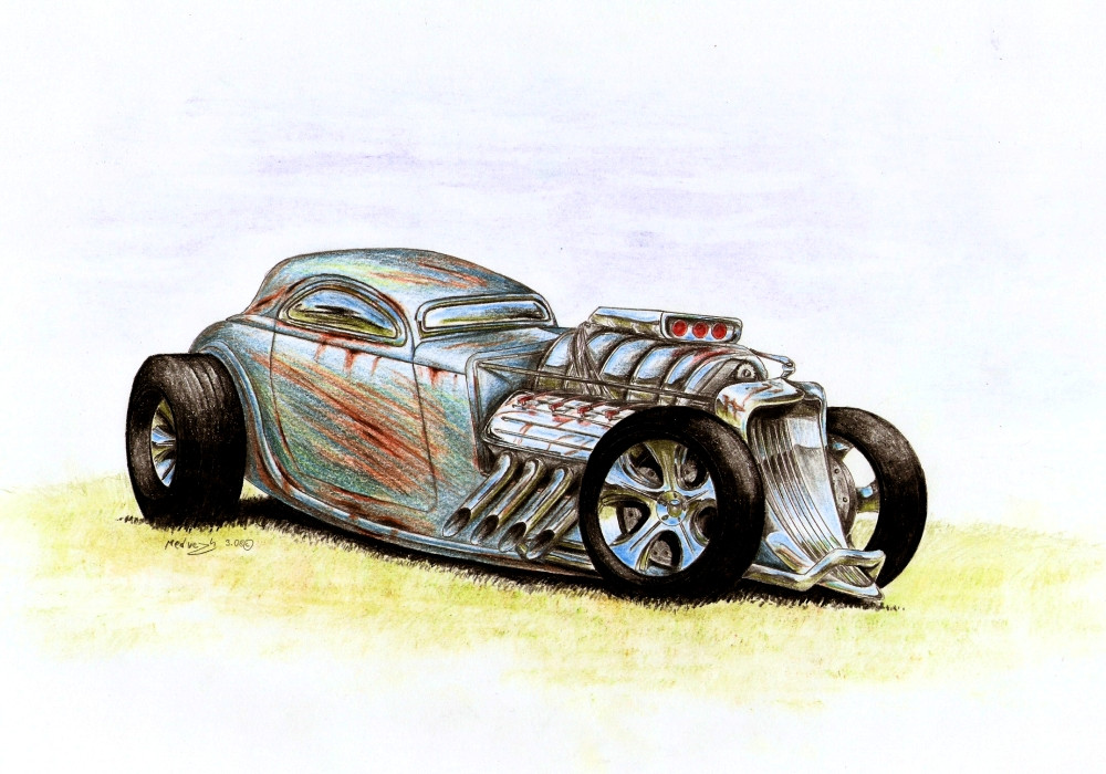
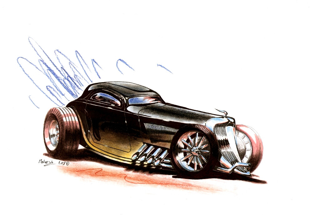
So my Detonator project is over, all four planned versions are done. Let me know which one you like most if you want (Smile)")
I know about one mistake - the bad, too wide shape of the engine blower.
[link]
[link]
[link]
Related content


Comments: 7


Top notch work. Great reflections on the wheels and nice touch "Rat-Rodding" the body color. I think the blower works for this style of drawing. Making something mildy out of proportion works for hot rods even if it isn't a cartoon. It portrays a sense of attitude ya' know. Just my opinion though. Take if for what it's worth.
👍: 0 ⏩: 1

Thaks a lot, I thought the whole blower is one big mistake D
👍: 0 ⏩: 1
Aw I think you're allright there but you're the artist.
👍: 0 ⏩: 0

looks nice
love the chrome wheels
not sure if i like the blower, looks off cause it slants down to the right
")
")
👍: 0 ⏩: 0

Lovely man, i like it! And B&W suits me the most.
You're a very good drawer!
👍: 0 ⏩: 0

kurna to je upe supa, vidim ze se v tom docela vyzivas  (Wink)")
libi se mi doslova a dopismene i kdyz ten bourak je trochu zrezlej
ale vypada ze by chtel porad zavodit
👍: 0 ⏩: 0