HOME | DD
 Meekochan — Sending chills...
by-nc-nd
Meekochan — Sending chills...
by-nc-nd
Published: 2006-05-15 15:06:15 +0000 UTC; Views: 763; Favourites: 7; Downloads: 34
Redirect to original
Description
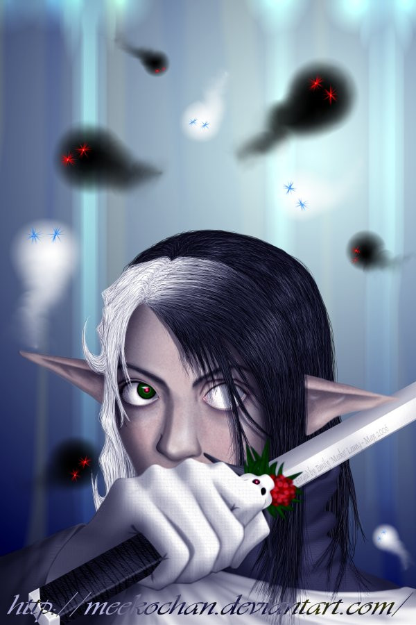
After finally 'finishing' this ......I couldn't think of a background to do for it...
So eventually I ended up with the above. I almost added blood but decided not to.
Anyway, I still need a background idea for a *real* background. Any suggestion?
Compared to the original CG ...
1) Varynn has longer hair. He had longer hair when he was younger, and since he doesn't look like a grown man here...
2) He's holding a sword now. Does the skull/rose emblem look familar? It should cause it's my Skull Rose design.
3) The glowing pink in his eye is just to match the atmoshpere of this pic. It's not a change permanent.
4) Ears were adjusted a little.
5) Added more shading. Very little though.
About this pic...
1) Those floating things are spirits.
2) The skull on the sword has an eye lit. It's not a permanent thing. The color can change, or the eye(s) don't light up at all. That's certainly not an ordinary sword that Varynn is holding...
3) Use your imagination to figure out where Varynn is...and/or what he's doing.
Anyone who finds the picture incomplete due to Varynn's left eye being completely white, or suggest me to add the iris and pupil, shall tragically get a taste of how deadly Varynn's sword is.
:: nods head ::
Sword detail / close-ups: [link]
Character Design: [link] and [link]
Other Versions:
Original Pencil sketch
Original color pencil drawing
-Winter 2005- Stay Warm
A Glimpse of...
Watch Your Back
Date: May 2006.
Done in Paint Shop Pro 6, Paint Shop Pro 8, and Photoshop CS 9(?).
Skull-rose design can be seen here .
Time taken: Lost count...
Related content


Comments: 20

Nice, I like this. Great shading, and I like how you've done the hair. Great work
👍: 0 ⏩: 0

This is amazing  (Smile)")

Otherwise, I really like the overall eerie feel and design!
👍: 0 ⏩: 0

I'm curious as to why his eye is pupilless, I must admitt.
A lot of your light source isn't reflected in the persona though. Whilst your attention to shading has obviously been quite deliberate, I fee like it's still missing that continuity of light. The hair, for example, should be a little shinier on the black side, and a little darker in places on the white (Just because hair is white, it doesn't mean if doesn't go quite dark in shadow). Also, do your ghouls emitt light at all? Many spirits of that nature are made entirely of dark or bright light, and maybe reflecting that would tie it better to the background.
Your ears are two different sizes, or your right ear is sitting a little too far back when people read the perspective in your piece.
Other than my nitpicking, it's a good piece, and I'd be proud of it.
👍: 0 ⏩: 1

The pupilless eye is just a character design to make him look not normal.
You're suggesting that I should add more highlights to the figure to balance with the heavy shading, right? I see what you mean and will work on it.
I'm confused about the emitting light question. I didn't add any glow to him. Also, the figure is an elf, not a ghoul. >_<
Thanks for your input. ^^
👍: 0 ⏩: 0

Very nice. Your details and shadings are spectacular. He feels like he's not quite part of the picture though, something about the outline of his... perhaps because you see no real(major) highlights on his clothes. Oh, is his ear supposed to be going in front of his sword? Spectacular anatomy. Nice piece.
👍: 0 ⏩: 1
Should there be more highlights on the clothes? Or a specific area?
His ear is in front of the sword because the sword is tilted. The hilt is closer to the viewer than the blade. I made the bottom of the hilt visible to show that angle. Is it not noticable enough?
Thanks for your input. ^^
👍: 0 ⏩: 1
I was trying to say that his outline looks a little strange... as if the background isn't really there, like it's a greenscreen. I was just thinking that a few highlights on his shoulders might help him blen better. Oh, yeah, I see the sword right now... Great piece.
👍: 0 ⏩: 1
Any area in particular about the outlines? Like around the ears? I just notice that I should fix that.
Anyway, thanks again. ^^
👍: 0 ⏩: 1
Yeay, the ears are one spot... and the transition between the sleeve and the glove. That's what I saw.
👍: 0 ⏩: 0

The shadowing the hand in front is very nicely done. I wouldn't tell you to change the eyes - they are great just the way they are now. Plus I love eyes that aren't quite.. normal. For the background I really can't tell any advice because I still don't know your character that well.
👍: 0 ⏩: 1
Thanks for the comment. ^^
I'm still working on my character's background, and don't have too much info to give about him. I'm looking for a general background (not a forest) that works with this pose.
👍: 0 ⏩: 0

Oooo I love the floating things... spirits (floating things almost suits them better, but in a good way). I especially like the little black one near Varynn's white hair. It seems to have personality. This comment is so random. Anyway, I love this piece overall. It has depth and strength and perspective. I adore it. +Fave.
👍: 0 ⏩: 0


lle creoso(urwelcome[in Elvish])
👍: 0 ⏩: 0

The white glove really does make the picture, especially with the contrast against the blood on the sword...I also like the streak of white in the hair ")
👍: 0 ⏩: 0

I really like how you did the hair. And the fact that it's only one eye makes it very interesting. Also love the colours. Great work!
👍: 0 ⏩: 0

I love this!!!! faved
the hand is a bit big though the rest is just so wonderful
👍: 0 ⏩: 1
Thanks for the fave. ^^
I think the hand looks big too, but I reasoned that the hand should be big because he's wearing a glove.
👍: 0 ⏩: 0

i think you did a good job with the colouring! tho where is the other eyes pupil
i really like that han, you did an exellent work on it
nice design on the sword too, not to much details.
")
👍: 0 ⏩: 0

i dunno why but for some reason, the fact that he's wearing a white glove realy completes the picture for me... its most excellent Meeko, you've gotten very good at the whole shading thing
👍: 0 ⏩: 0