HOME | DD
 MeganeRid — Resting Point

Published: 2007-04-21 20:17:05 +0000 UTC; Views: 24318; Favourites: 677; Downloads: 962
Redirect to original
Description
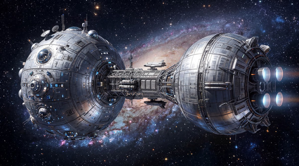
Well, this has been sitting inside my hard drive for a while so I think it's better for it to get finished lol ^_^;They are soldiers enjoying their night in the ruins of a city XD;
The other light sources are from their comrades
 (Smile)")
Thanks for viewing
Done with Painter, Photoshop
Related content


Comments: 128


signal beacon!!!! first thing i thought when i saw this pic lol
this is really nice did you paint or did you like draw in photo shop, im such a machine freak lol
👍: 0 ⏩: 0


Can you say somrthing about my lolpoorly skills? :3
👍: 0 ⏩: 0


You are so great with machinery, landscape and metal. And at setting and conveying a mood. Again, lovely work.
- Z
👍: 0 ⏩: 0


love the vehicle design. color and mood is nicely done as well.
👍: 0 ⏩: 1


I can already here the platoon seargent stomping around and gnashing his teeth: All those damn lights... no discipline... snipers... back when *I* was a private we were tough...
👍: 0 ⏩: 1
")


some crits: watch the perspective! while technically things can and do line up in that multi-layered way.. the technical difficulty in illustrating that with perfection values to communicate the distances and whatnot far outweighs the chance of connecting with the viewer if youd've chosen an 'easier' and more focused guide for laying out stuff on the same level... or at least with more distance in between to seperate the different planes and 'layers of Background info'.
Here, it gets a bit chaotic and I lost myself in the bg, with the sudden drop and changes in perspective(s), especially vertically.
Compositionally though, it works.. so technically Im not griping ")
All in all, I just adore the ambience and the fact its such a simple glimpse into what life might be like for a fighting force in that hellish place. Reminds me of my some training in army haha
👍: 0 ⏩: 1

Hey, thanks for the crits!
Yeah, this is one of 'draw draw draw, think later', should try to put more effort next time
")
👍: 0 ⏩: 1
hey no worries, pay it forward
Im really inspired to make a piece like this one soon! ill note ya about it when im done XD
👍: 0 ⏩: 1
cool, can't wait to see it
I need to start painting too once I'm done with my finals heh ;_;
👍: 0 ⏩: 0

Very awesome, the overall texture and especially of the background are very nice.
👍: 0 ⏩: 0


This is so well-drawn! From a distance, it looks like a toy model x_x
👍: 0 ⏩: 1


not inspired by any game actually, but thanks
👍: 0 ⏩: 0


looks a lot like Gears of War to me. Great work
👍: 0 ⏩: 0

Thats a good design, and theres a good atmosphere in the scene. However, I would say that the vehicle, particularly at the front, looks a little flat. I think there could be a slightly stronger contrast between the armour plates, and you can always use colour to define form as well as tone. By this I mean that perhaps the fire should cast an orange glow onto the front, and there could be a slight blue tint on the back reflecting the moonlight. One more thing I could suggest is to try and avoid using pure white in a picture, as it should always be slightly tinted with a colour. Even so, I think this is a great picture, and its got some real potential, but I think that its a bit too monochromatic. Still, nice work, well done
👍: 0 ⏩: 1
thanks for the critiques
👍: 0 ⏩: 0

i love the way yolu draw machines. they look so cool. love the colour scheme btw
 (Wink)")
👍: 0 ⏩: 0

very cool one.. i would love to see more details too... if you ever come back to it...
👍: 0 ⏩: 1
")


oh shit that's so sick lookk at those shadows and the details and the clours the shades of grey really do something for me, this is really good. Keep up the good work.
👍: 0 ⏩: 1
| Next =>