HOME | DD
 MegaPhilX — New StageSelect Design-Colors

Published: 2010-06-20 02:08:48 +0000 UTC; Views: 16040; Favourites: 116; Downloads: 110
Redirect to original
Description
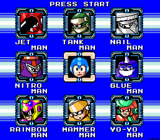
Okay, I'm going through a few re-designs of the old graphics. Especially the introduction sequence of the game but I felt like re-visiting the graphics and design of the Stage Select Screen.I've always felt it was too blue and too... you know ... unoriginal. So I made this re-design.
I re-designed the frames to be less messy and I obviously competely remade the background.
What do you guys think?
Like the colors? Like the overall idea? Which one do you prefer? This or the old one? Do you have other suggestions?
EDIT: (Aug 20th 2010): The last version was bothering me for a while so I made this simpler version.
I don't own the MegaMan series. It belongs to CAPCOM.
Please ask me before using any of my pictures.
Related content


Comments: 95


I can already tell that there are going to be so many gay jokes about Rainbow Man.
👍: 0 ⏩: 0

Maybe the ONLY great fan Mega Man game i'll be playing
👍: 0 ⏩: 0


New colors are badass, Phil. Also, gotta love how TankMan's now sporting a "Don't you screw with me first boy, I'll END you" look. XD
👍: 0 ⏩: 0


This would make a cool game for the Wii Virtual Console
 (Smile)")
👍: 0 ⏩: 0


Just a quick question... Can you make sprites for Compute Woman in my game? If you will, I'll make sure to get a pic up asap
")
👍: 0 ⏩: 0

I can never figure out why Mega Man's frame always depicts him looking constipated, but I guess that doesn't matter.
This looks awesome man. Totally lookin' forward to the game!
👍: 0 ⏩: 1

LOL
I've always wondered why too.
I'm just using the traditional picture. I COULD draw a new one but I guess this one has some nostalgic value ( :
👍: 0 ⏩: 0

I think you should use this design with classic blue coloring. That would look nice IMO.
👍: 0 ⏩: 0

Nailman, Glueman, Tankman and Rainbowman.
I dont like them nor they attract me at all, you need some new ideas for RM's, although the plot is quite interesting
👍: 0 ⏩: 0

I saw it on youtube....*shrugs* intersting stuff guy....i've had some interesting ideas in the past for a mega man/x game to....a couple actually....
👍: 0 ⏩: 0

You must use Nes color palette if you want nice old school color.
👍: 0 ⏩: 0

as a new megaman fan and fan of your project, awsome design for ur new stage select
👍: 0 ⏩: 0


I found another fangame with a boss renamed due to Megaman 10
👍: 0 ⏩: 0
I like this one better, the old one looked too standard, but I saw one fangame (I think it was Megaman 72) which changed the stage select colors to red and gray when playing as Protoman, and black and yellow when playing as Bass
👍: 0 ⏩: 0


Honestly, I like the old one better, Phil. This one just seems overdone. Plus Blue just feels right...
👍: 0 ⏩: 0

less megaman-ish than the previous one, but it sure is more awesome
👍: 0 ⏩: 0


Neat redesign, even though it still bothers me that none of the usual "blue" presentation tradition is followed. The top and middle rows of pipes being aligned into an "infinity" loop is a nice touch, as well.
👍: 0 ⏩: 0

Seems there is already a Glue Man in existence, my friend.
👍: 0 ⏩: 0


This is good stuff. It reminds me of Megaman 5. I like Jet Man + Yo-Yo Man's avatar.
👍: 0 ⏩: 0

looks cool, but the backround isnt what a megaman stage select would look like
👍: 0 ⏩: 0
I like this one better, the colors were too generic last time.....
👍: 0 ⏩: 0


español
me gusta .
yo tenia agreada de se vieran ELLOS en negro moviendo la Cabesa pastel o Ritm Por El , Cuando megaman lo mira UNO de ELLOS voltean Poco des un enojo Con mirarlo o burla , y Los Cuado seleccionan valianos Un poco Estilo de Michael Jackson o Elvis Su gritan y Nombre.
Pienso yo
Inglés
Me gusta.
Tenía que ser agresivo en negro verlos mover el pie Cabesa o ritmo , megaman ve cuando uno se volvió un poco más de él con la ira o burla, y portátiles seleccionadas se valían un poco de Michael Jackson o el estilo de Elvis y gritar su nombre.
Yo Campanilla
👍: 0 ⏩: 0

DWOO DWOO DWOO DANANANANA
DOO DEEEEDOO DOOOODEEEEE
Best Stage Select theme ever.
👍: 0 ⏩: 0

Yeah, this is much better. Is this finally order of robot masters? 'Cuz I saw Hammer man and Yoku man instead of Comet woman. Colors are cool!!!
👍: 0 ⏩: 0


| Next =>