HOME | DD
 megax88 — Redraw comparison
Published: 2012-02-05 14:49:42 +0000 UTC; Views: 1668; Favourites: 36; Downloads: 11
Redirect to original
Description
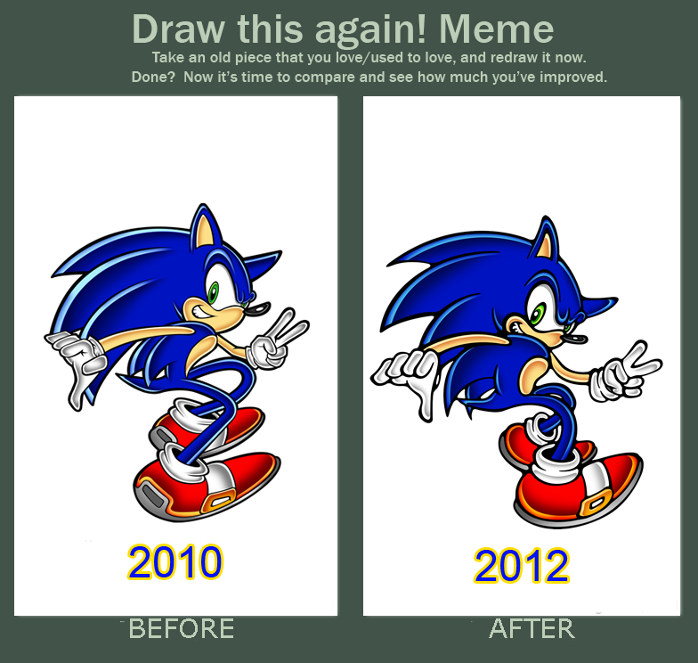
I was watching at some of my old works and decided to redo it i think its a good thing to some time look at what you used to do and do it again.Related content


Comments: 20


2010. The inking is a bit too thick in the 2012 one.
👍: 0 ⏩: 0


Wow, what a difference from two years! Thicker outlines, more badass look, more sleek and accurate looking limbs!
I love how you have improved!
👍: 0 ⏩: 0


To be honest I like 2010 than 2012. For me the 2010 version had some sort of Sonic style to it, the body and texture (espeically the bright colors) make the picture feel alive.
With the 2012, it seems that the picture is toned down, and has a darker feel to it in contrast to the 2010 version. Even though the 2012 version is more less wacky than the 2010, ea. the feet, arms, legs, and hands, Also the anatomy seems awkward the chest looks out of proportion, like the head and the belly part is way off, espeically when its meant to be looked at the front. The belly area if you look at some of the characters usually extents from the upper chest area to the lower stomach position. Last the borderlines of the 2012 version is too bolded, more than the 2010 one, which also makes Sonic look much darker than before.
Like the others I would much prefer the 2010 than the 2012, because of the colors, style, and the anatomy. I do know that some of these points may have been the reason why a lot of people chose the 2010 over 2012 version.
👍: 0 ⏩: 0

Can you tell why please ? ^^
👍: 0 ⏩: 1

because the old one looks better than the new : P
👍: 0 ⏩: 0

I personally think the lineart, coloring, and perspective looks better in 2010 as well...
The biggest improvement I see is probably Sonic's anatomy on the legs/shoes, but that's about it. Don't get discouraged though! Just keep practicing

 (Smile)")
👍: 0 ⏩: 0


remember the muzzle must be over the neck part , I like the 1st one...
👍: 0 ⏩: 1
Actually no i doesn't Have to it depend on the position there is a lot of official sonic drawing where it is behind like you can see on this artworks in that site [link]
👍: 0 ⏩: 1
yes but that if you are making the picture look like they are looking 'up' to him not from infront
👍: 0 ⏩: 0

I really like both, but to be honest, I think the one from 2010 is better....
👍: 0 ⏩: 0