HOME | DD
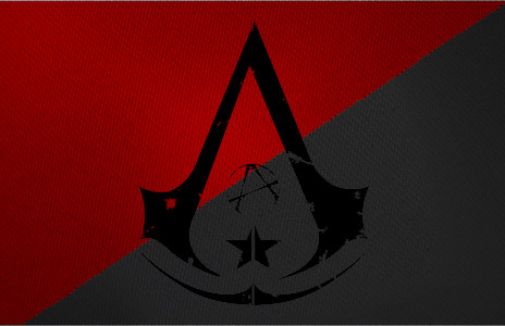
 MehranPersia — Netherlandish Assassin Symbol

Published: 2013-09-24 01:07:31 +0000 UTC; Views: 1733; Favourites: 23; Downloads: 8
Redirect to original
Description
this is the new and improved AC symbol for Netherlands I really hope you like itas requested Netherlands I hope you like it
thank you for all your support , favorites and comments so far
You Are AWESOME
------>www.facebook.com/AssassinsCree…
Related content
Comments: 15

Great job, gotta love your works, they are all patriotic and inspiring!
👍: 0 ⏩: 1

thank you my friend, I'm glad that my work can represent the countries in a positive way
and I love your work, they are very exciting and full of detail.
👍: 0 ⏩: 1

Np^^, it really does, ty 2!
👍: 0 ⏩: 0

I like it but i am a little more critical. The two lions at the sides to much in my opinion just as the VOC insignia. And the 3 crosses in the sides are the sign of amsterdam. Not of the whole netherlands. But i still like it.
👍: 0 ⏩: 1

I don't have any information about these symbols I asked some one else
if you want you can suggest better symbols that represent this country more and I can upgrade it like the other ones
👍: 0 ⏩: 1

Well, it are all symbols that represent (some part of) The Netherlands. I just think its to much. In my opinion it would be better if you remove the crosses, the two lions on the sides and the VOC symbol.
👍: 0 ⏩: 1

then there would be just the coat of arms and the crown left
👍: 0 ⏩: 1

well the plane is to accessorize the assassin symbol with a country's good symbols as much as posible
👍: 0 ⏩: 1

Again, that doesn't make it better per se. And the crosses on the sides doesn't represent Netherlands, is of Amsterdam
👍: 0 ⏩: 1

Again, my plane is to accessorize the assassin symbol with a country's good symbols as much as posible
leaving it only a coat of arms and a crow will make it look less important then the others
👍: 0 ⏩: 1

Well, at least make the symbols right. Because the crosses are....wel you know
👍: 0 ⏩: 0

And i don't mean all the lions. Just the ones in sides that you barely see. The ones in the middle are fine.
👍: 0 ⏩: 0

Awesome! Thank you for taking the time to do this!
👍: 0 ⏩: 1

my pleasure
I'm glad you like it
👍: 0 ⏩: 0


