HOME | DD
 memexikon — PROTObyte Font
Published: 2004-01-14 01:32:00 +0000 UTC; Views: 6304; Favourites: 5; Downloads: 4174
Redirect to original
Description
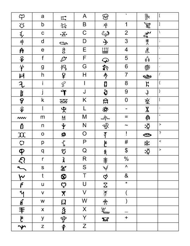
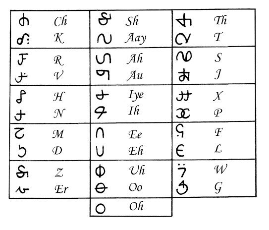
pictographs from Linear B, Indus Valley Script, Snake River, Cretan, Elamite, Iberian & a bit of CopticRelated content


Comments: 16


Can you zip it - I get an error when I try to download it.
👍: 0 ⏩: 0


 (Smile)")

How did you associate the indus valley script, then, being that it has never been deciphered? Awesome job, man
👍: 0 ⏩: 0

I took the liberty of moving your font to the newly implemented sections.
👍: 0 ⏩: 0

I have notes about most of the characters, I'll scan them for interesting tidbits & post em in the next couple days. My computer is currently on the fritz & Im reading here from my partner's computer. The new font Im working on is actually wilder, charcters taken from a fifteenth century Romanian apocryophal biblical ms., all created in a imaginary language.
👍: 0 ⏩: 0
Technically hieroglyphs are non-alphabetical characters that represent a concept rather than a letter of the alphabet. So for instance the early egyptian language is composed of hieroglyphs, or in modern day, japanese, chinese etc are hieroglyphic or ideographs as they are usually called now. All of the characters in PROTObyte are taken from very early proto-european languages (except for Snake River characters which are from a tribe in Wyoming about 600 years ago). These characters are largely alphabetic & for most of the main letters I tried to place the character with its modern equivalent. The picture of the axe is an "a" in the Cretan syllabary. Most early languages had between 14-20 characters. Most of them did not have a c,f,x etc. So the characters placed in those slots are far more sketchy. Also of course, any of the characters in the punctuation & number slots are not associated with those keystrokes.
mIEKAL
👍: 0 ⏩: 1

Excellent. Wonderfully done. And you are, as you of course know, dead on about your facts, and I'm certain that your research for this was impecable. What I enjoy artistically is how freeform, yet precise your characters are. This is something I have not seen the likes of here. Could you perhaps provide a closer look at a few of the more intricate characters?
Also, just wanted to add that your explaination was greatly appreciated. The work I liked in and of itself, but knowing what went into makes it all the more impactful. Nicely done.
👍: 0 ⏩: 1
I have notes about most of the characters, I'll scan them for interesting tidbits & post em in the next couple days. My computer is currently on the fritz & Im reading here from my partner's computer. The new font Im working on is actually wilder, charcters taken from a fifteenth century Romanian apocryophal biblical ms., all created in a imaginary language.
👍: 0 ⏩: 0

It does look like some sort of heiroglyphics ")
👍: 0 ⏩: 0


