HOME | DD
 Meorow — Link

Published: 2013-06-19 16:38:41 +0000 UTC; Views: 717; Favourites: 26; Downloads: 3
Redirect to original
Description
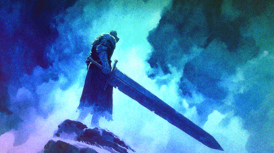
Guess who got into Zelda again?Yup! I've been spending my days playing Twilight Princess, listening to LOZ soundtracks, watching a Let's Player play Majora's Mask, and painting this. I plan to play Ocarina of Time next.
") I haven't played Zelda in years! Too long, I say!
I haven't played Zelda in years! Too long, I say! This is in the style of Twilight Princess, although I made it look a little more cartoony somehow. I'm actually kinda sort of proud of this.
Time: ~10 hours
Made with Photoshop Elements & CS4
Reference: [link]
Textures used: [link] [link] [link] [link]
Related content


Comments: 16

Things that I think you did very well here are: 1. Capturing the pose. You did very well with the pose of the character here. There is powerful movement in the piece because of this and the equipment/gear doesn't seem jumbled in there but flows well with the action that is being portrayed. 2. Detail. The detail you put into the equipment/gear is very nice. The different shading in the sword and shield, the folds of the clothing, the small details in the jerkin and belt are all very lovely in providing a sense of realism to the work. They are subtle but they add more of a flavor to the illustration. 3. Color blending. The colors you chose and how you placed them go very well together. Everything just flows nicely together and creates a nice soft image. Nothing sharply contrasts and throws off the theme of the tone of color you chose. It's a very peaceful image.
Things that may need improvement I believe are: 1. I am a little thrown off by the perception presented with the shading/blurring of the arm guard. It feels like it is blurred to give a perspective of being too close and is so, out of focus. However, the arm that comes down with the sword that would seem closest to us, is not. I cannot tell if this is purposeful or if it is just how the shading is but it kind of disrupts the perspective for me a bit. 2. Shading/highlighting/shadows. Adding layers to your lighting here would have been beautiful. I struggle with this myself, however, giving definition to the light source so that there are more highlights and casting shadows would add more realism and detail to this work. 3. Brushes. The brushing just behind Link is a little out of place to me. It almost looks rough. Softening it may have made it better, however, doing something similar to what you have closer to the right foreground for leaves might have been ideal.
Overall, I think this is a very lovely work. There is movement, detail and consistency with colors, it feels like there is action and things flow nice visually. However, more dimension would benefit this work and only improvement what you already have going. Keep up the good work!
👍: 0 ⏩: 1

Thank you so much for the critique! Though this work is pretty old now, I appreciate the feedback that you gave me.
👍: 0 ⏩: 0

There are some basic problems here.
For one, I really do not like the shading style of this piece. Not exactly critique, but you can still stand to improve it. One such thing you could do is to define what is what more. For example, if I were to overlap the glove with the belt, there would be no difference in color, and they would get lost in each other. Perhaps using lines as in lineart would fix the problem, but I think you were going for a more lineless style. Be careful, though. With the lineless style comes a lot of risks. You often run the risk of things blending into each other. The textures in this piece are not very well defined. The light source seems yet to be established. I honestly have no idea where your shading is going. You need to define your shadows more. Darken them to indicate the light source. Make sure, however, that the light source in question is consistent.
These are about all the problems I could find. Overall, this piece is pretty good, but there are a few flaws that get in the way of it being an excellent piece. Keep working on your shading, as right now, I feel that is your biggest issue.
I hope I have helped in some way, and if you want me to look at any other pieces, please let me know. I am more than happy to help.
 (Smile)")
👍: 0 ⏩: 1
Thank you kindly! c: I really appreciate the critique.
I agree with you about the necessary defining; I could have certainly done better with that. A definite light source coming from the background would have helped, I see.
This was one of the first times I've ever used textures like this, and I concur with you here as well. But really, thanks so much for this critique! Shading has often been my flaw, and I realize I ought to try and correct this!
If you'd like to critique anything else then by all means; I could always use the help, but I wouldn't want to force you into it.
👍: 0 ⏩: 1
You're welcome. And honestly, it's no big deal.
👍: 0 ⏩: 0

It's very close to the reference image you provide but this is an illustration and that is a rendered image from a videogame engine so maybe you could've improve your image to make it more enjoyable and personal. Thus I will give two critiques by the price of one
Comparing with the reference image you get very close, good job.
I can see the lack of some lights on Link which you could have done stronger.
Trees and leafs just behind Link shoul be more definite to give the effect of depht of the forest and because they are more definite in the reference image.
I think that overall it's a good work.
As an illustration I think you could've add more shadows and lights to give a better three dimensional effect to the character, the reference image is from a videogame and the engine wasn't so good with that so the image is pretty flat.
Also because of the low count polygons of the render engine some things are not so precise, for example the way he grab the sword is pretty unnatural, maybe you could have done that in a more realistic way, I know you're better than a render engine
There's a very low difference of values between background and character, as is in the reference image I know, and this prevent the character to stand out from the background. From the reference image seem that the light source is from up and a little behind the character so he shoul be darker than the background but this would make the background to stand out more than the character, so maybe a shift in the light source making the character lighter and the forest darker would have make the character to pop out.
So this could be a very good starting point to make something more yours and make you improve but at the same time is a good reproduction of the original image.
 (Wink)")
👍: 0 ⏩: 1
Thank you for the very full critique! I agree with just about everything here; I certainly have a lot to improve on. I'll keep in mind what you said!
👍: 0 ⏩: 0

Really like the stance and the suspended moment in action. Good balance between the detail and abstraction, though the shading could be a little more dramatic. Nice colour, vibrant atmosphere - makes the picture exciting. The only thing that is strange is how you cropped it - I think it's too tight, especially cutting the sword off like that. It should be still possible to maintain the focus on the character while giving it more space - but of course it also works as an intense close-up. Nice!
👍: 0 ⏩: 1
Thanks so much for the helpful critique! I'll keep in mind what you said for later.
👍: 0 ⏩: 0

Thanks!
👍: 0 ⏩: 1

You're welcome.
And mine too.^^ Well, that and Mario.
👍: 0 ⏩: 0

ffffffffffff. This is really good Meoooooor ;A; You're so great with colors dfsdfds
👍: 0 ⏩: 1