HOME | DD
 MetroUI — Windows Apps Remake
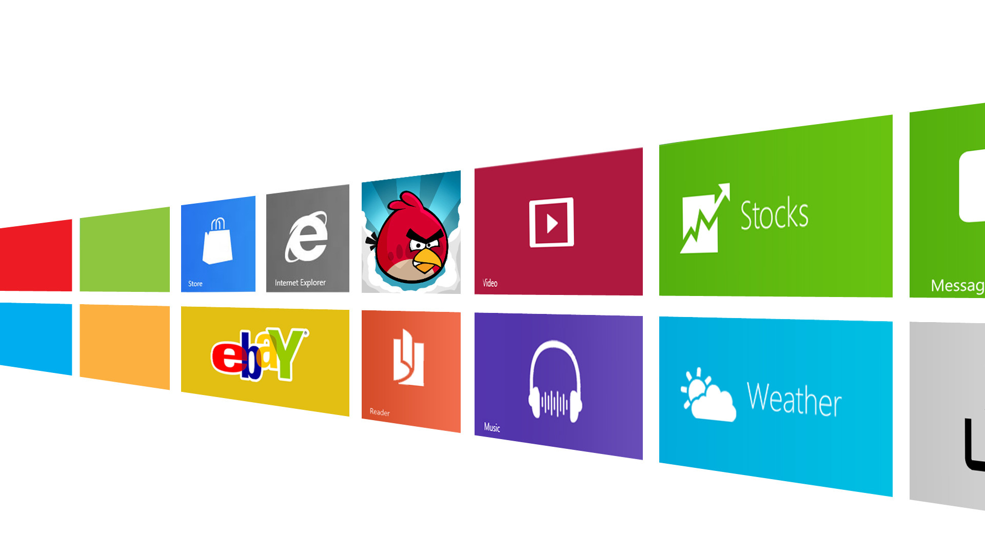
Published: 2012-02-15 21:06:30 +0000 UTC; Views: 15681; Favourites: 26; Downloads: 450
Redirect to original
Description
I don't like the new logo but is very metro.Maybe It's start to like me
")
Related content


Comments: 13

The original Windows color on the lower right pane was yellow. It's looking more like orange. What happened?
👍: 0 ⏩: 1

Microsoft had change palette, now it's more natural!
👍: 0 ⏩: 0

The perspective is wrong - Look at the angular difference between the tops of the burgundy media and green stock tiles.
Get the perspective right, and that will be a good start.
Even better: adding some reflectivity along the bottom (as though the tiles are sitting on a high-gloss plastic surface) would really put this over the top.
Good work though!
👍: 0 ⏩: 1
Yes, I want to remake it ^^
👍: 0 ⏩: 0


You should add a design to here: [link]
It's just for fun and you could win $295
👍: 0 ⏩: 0


Hey, that looks pretty nice actually, they should have that picture when you go into the Windows store
👍: 0 ⏩: 0

The unfortunate thing is the new logo is all blue. Your version here is a nice median between the old and the new. If anything you did a better job than Microsoft. And quite frankly i think most graphic artists thought of this logo a while now, but it took pentagram designs to botch it :S
👍: 0 ⏩: 0

I just noticed that the first 4 tiles on the left are in the shape of Windows new logo. Nice, discrete work!
👍: 0 ⏩: 0

i love your take on the new MS logo, yes it turned out to be true  (Smile)")
👍: 0 ⏩: 0


Well... that logo it's just a photoshop by a chinese guys, it's fake. But yeah, it's good
👍: 0 ⏩: 0