HOME | DD
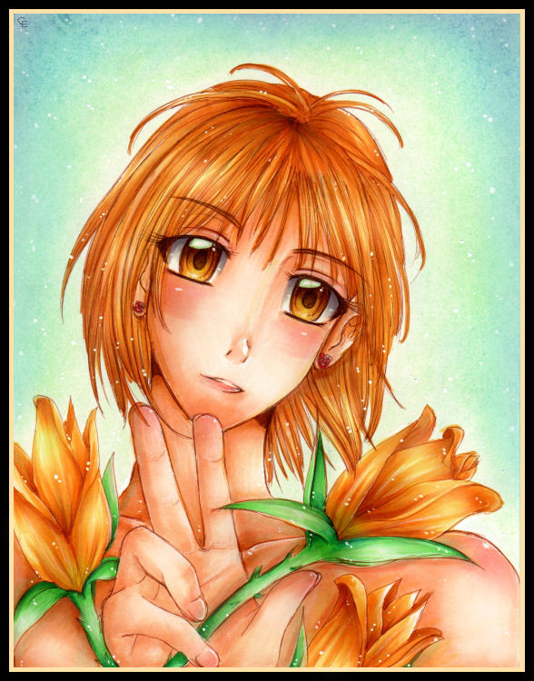
 Mew-Sumomo — .::Yellow Roses::.
Published: 2007-04-24 22:31:56 +0000 UTC; Views: 1720; Favourites: 55; Downloads: 51
Redirect to original
Description
 SUCH A CREATIVE TITLE. JE SUIS LE MEILLEUR.
Well, yeah. I haven't been submitting anything decent/anything actually in color for quite some time now, mostly due to the fact that I have a billion and a half works in progress.
 This was actually more for experimental purposes, which is why the coloring is rushed and the lineart is sketchy. Still, the outcome is pretty decent, except for A FEW THINGS LOL:
 The hand looks huge. I was supposed to have it holding out in front of her a bit but I need to learn how to accentuate depth with such a small, well, focus. The eyes are a bit crooked and they don't really look the same. (They're drawn differently.) The hand overall is badly drawn and to actually maintain that position is actually quite painful. I tried it and my hand hurt. The stem/leaves of the roses. It's all too unnaturally bright green. Her mouth is crooked. Her neck/head position is botched, as is her torso. Her right side of her torso (your left) is uneven compared to the other side. You can try to imagine that her left (your right) shoulder is going toward the viewer. It would make a bit more sense that way. Her eyebrows are crooked. Stupid facial position. I never drew a head tilted like that before anyway... The shading is off (behind the roses) and the reflected colors are done wrong. The white dots aren't visible on the screen because of the way I edited it. I forgot to sign it so I had to CG my sig in the top corner. Turned out pretty good.
...
 That feels much better. D:
I got to use my new Micron pen (01 brown, the tip of my 05 is shot because I used it too much) and my white gel pen, and the dots were done with a new brush I bought. It's thin, and I really needed a thin brush to use. Plus the make is discontinued so I bought it at a discount. I need to buy a new set of dry pastels though. I lost all mine, except for only a few colors, 3 of which I used here. (Yellow, green, blue.) I took the suggestion my friend had to make the BG bluish to add more contrast with the foreground. As you can see, I tried drawing roses... Recently I've been trying to branch out by using other elements in my anime/manga stuff. It's a slow process, but in the past month I have learned to draw trees, rocks, flowers (shown here), and some other stuffs too.
 Useful. lol. This pic is pretty simple, but I really needed to get rid of my block. I NEED NEW COPIC SKIN COLORS. D: They're all dying on me and all I have are dark ones. I guess I'll draw dark-skinned characters then. (LOL AN IDEA! ) I like the color combination here. I don't think I've ever used these colors together like this before.
  Aiight, so, enjoy!
MATERIALS USED: Micron 01 (brown), Copic sketch markers, Marvy white gel pen, white calligraphy ink (using a thin brush to apply rather than a calligraphy pen like I usually do), Prismacolor white charcoal pencil, dry pastel, all on bristol board. Touch-ups, sig, and border done on PSP X.
REFERENCE USED: [link] by *Giname for the drawing of the rose, and the coloring turned out quite similar, even though I wasn't looking at the original while I was coloring it. This guy is, like, a freaking Copic genius. Him and *toounit . Amazing. ;D
Related content


Comments: 38

hey do you remember me from a really long time ago? my account was jad-copics? maybe not. but this is pretty! although those arent roses, its still cute lol
👍: 0 ⏩: 1

Thanks!  (Smile)")

👍: 0 ⏩: 1
yes i definately have ahahaha
👍: 0 ⏩: 0

She didn't come out bad at all. Her facial expression and the hair are both pretty.
You even drew the roses that she's holding really well. Even though you've pointed out the errors in the artist's description, I see that you are improving.

👍: 0 ⏩: 0

This is very pretty! and I am very grateful for your praise!! 

👍: 0 ⏩: 0


I love the warm colours you've used for this piece. Really gives the piece a vibrant look to it!
👍: 0 ⏩: 0

i love this piece! its so soft and summery. the colours are wonderful too! i luvs <3
👍: 0 ⏩: 0


so beautiful! I love the pretty eyes, hair, and the hands! you have a lot of talent, this picture is just gorgeous

👍: 0 ⏩: 0

The flowers, her hair and skin are coloured so beautifully....it kills me..The use of cool colours in the background really makes the warmer colours used on her pop out and it looks lovely. The girl you drew look very pretty.
👍: 0 ⏩: 0


i really like the colouring here and her eyes are especially expressive. Youre right about her hands though, they seem a bit manly for such a girly character. great work overall though!
👍: 0 ⏩: 0

there is something about this,that I like (besides that fantasic coloring).
when I look at it ,it makes me all happy.well i can't really explain,but this is lovely
👍: 0 ⏩: 0


It looks like you put alot of effort into making this look really wonderful and the colors are brilliant, I sugjest though to not rush into applying color untill your underdrawing is perfect, because no matter how wonderful the colors look if the underdrawing doesnt look right it will throw off the entire picture. I really think your big problem here is that the neck is too long, and the body is disproportionate to the head, atleast thats what stuck out to me first thing. Just remember that not every drawing has to be finished, and your efforts would be better used if you spend more time on your underdrawing and its always ok to start over. ^_^
👍: 0 ⏩: 0

YOU are a freaking Copic genius, my dear.. ")
And, the whole face in general is very good! I dont think any bits are crooked! You're jsut being overly-critical! 
")
👍: 0 ⏩: 1
Copic genius?! ")

Trying new hand poses is a real pain, and, like I said, this was pretty much experimental. Hands are the most complicated part of the human body to draw next to confusing leg positions, which I'm torturing myself with as well. ")
👍: 0 ⏩: 1
Yes you are..
Yeah, I really agree with you about the hand pose thingy...seriously, it's so difficult to try out new poses for the hands and try to keep it less generic as well! O.O Ah..the perils we artists face.. 
👍: 0 ⏩: 0

I think it's a good pic. I like the colours in it and the flowers look cool ^_^ good job. So how do you do your lineart? Just with a black -or rather brown I think you said yours was- marker? You've learned to draw trees? Well done, I'm so crap at trees. I never know what to do with the trunk or branches. I really need to just look at real trees and stuff rather than trying to imagine them.
👍: 0 ⏩: 1
Thanks!
Well, actually the lineart here was done so poorly than I normally do it that I can't begin to rant about it.
👍: 0 ⏩: 0

i dunno for me the hand position is pretty easy although i wouldnt try it for, you know, HOURS or anything...
👍: 0 ⏩: 0

*slaps you* I'm sorry, but Mew Sumomo, you have got to stop being so hard on yourself!!! I'm really proud you watch you, and in my real life and in other places on the internet, I hate it when people don't see their real talent. You put all your work into this like everything else you do, and you should be proud about your art potential for other reasons, also. *coughyourjournalcough* >_<;; Please don't degrade your beautiful pictures. Even though I could see the imperfections, I still really didn't care because I could see the quality of the coloring.
*sigh* Summarizing that entire paragraph, what I'm saying is that art is your talent. Even though you might've made a few imperfections, don't throw yourself into a wall. You're very blessed with this! One day, I can see your signature on a photograph, or charcoal sketch. T_T Oy very, Mew Sumomo. Please stop beating up yourself, please. You have so much talent!!!
👍: 0 ⏩: 0

I'd say the main thing that stands out is the head+neck. This picture would probably have been served better by a more realistically styled or off-center pose for the head. Next time you should use a reference, even if it's your own reflection. Still pretty.
👍: 0 ⏩: 0


Awww....the prettyness!^3^
I love the soft orangy colors and the look in her eyes are so peaceful...it's like as if the flowers are giving off a pleasant soothing aroma!^-^
Wonderful and amazing job Mew-Sama!
👍: 0 ⏩: 0

i love the eyes and the hair. and the blinky white light things. very nice =]
👍: 0 ⏩: 0

of course you're the best!
i love the shading and colors.
👍: 0 ⏩: 0

the colors are magnificent
but as you have mentioned, the neck does look very awkward D:
but thats okay, we all learn from our mistakes :3
👍: 0 ⏩: 0

Despite all that I LOVE this because roses are amy favorite flower an my name
👍: 0 ⏩: 0

Lovely, the hand is kinda big, but that can be a style too. I didn't actually noticed until you mentioned it XD
I think the color of the stems go very well with the vivid colors of the flowers and the background.
you need to teach me how to color LOL
I seriously can't see what you mean about the eyes being different. And I tilted my head, the eyebrows look straight to me O.o
👍: 0 ⏩: 0

So beautiful! I love all the bright colors!
👍: 0 ⏩: 0

I think it looks nice. So much detail....Good job!
👍: 0 ⏩: 0


I wouldn't beat yourself up.
I still think that it's an awesome picture!
And I love the colours you used
👍: 0 ⏩: 0

i love the colores chossen for this ^^ good job sumono-chan ^^
👍: 0 ⏩: 0