HOME | DD
 mgilchuk — CS3Remix
Published: 2008-04-04 03:38:25 +0000 UTC; Views: 7198; Favourites: 48; Downloads: 1308
Redirect to original
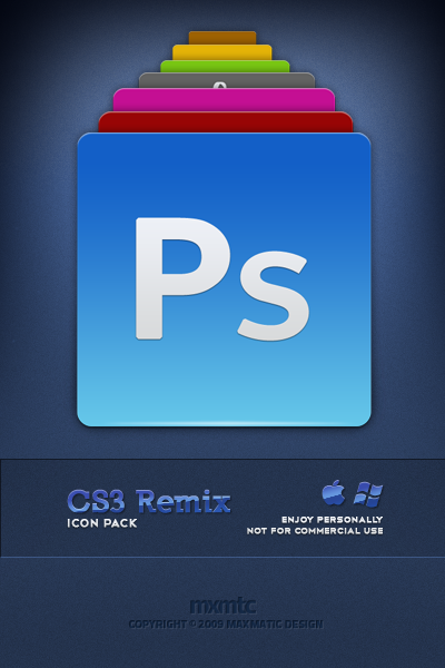
Description
UPDATE- Added smaller sizes
- Tweaked the contrast and brightness
-----------------------------------------------
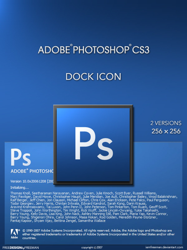
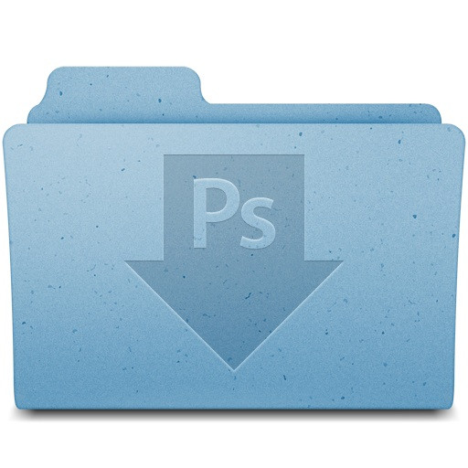
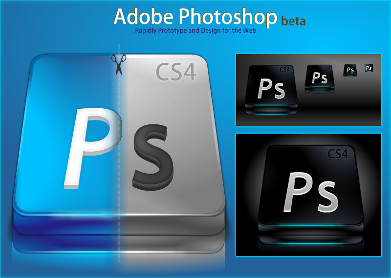
This is just a quick set I did for myself, thought I'd share it. Plus I've begun the process of "re-branding" myself, and wanted to get everyone's opinion on Maxmatic Design (notice my new logo
 (Wink)") )
) 9 Icons - PNG, ICNS + iContainer
Related content


Comments: 19

Great icons! Gonna use them right away
Any chance for "AE" and "Pr" icons?
 (Smile)")
👍: 0 ⏩: 0


yah these are a little "tamer". The other ones we're just too bright, plus I didn't make smaller sizes. These aren't perfect... but at least they have smaller sizes!
👍: 0 ⏩: 0
Thanks guys, certainly didn't bust my ass over these ones, just something quick and fun... Love 'em, or hate 'em...
👍: 0 ⏩: 0


real nice! the new logo is schweet as well...keep up the good stuff!!
👍: 0 ⏩: 0

nice job on these great touch on the colors! - being featured on jackrebel dot com!
👍: 0 ⏩: 0

Looks pretty cool, only the gradient feature goes a bit bright with the bottom of the illustrator icon.
👍: 0 ⏩: 1
I know dude... I'll re-upload later on today!!
👍: 0 ⏩: 0


")


Well, the icons aren't really my style, but they are done well.
I'm really liking the new logo. You should make up a full blown and maybe even color one for kicks. That would look pretty slick.
👍: 0 ⏩: 0

That right there, is a very nice icon set. And by the way dude, LOVE the new logo. I think you should definitely stick with it.
👍: 0 ⏩: 0