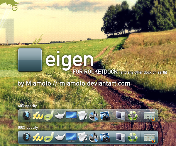
HOME | DD
 Miamoto — Unofficial deviantART Logotype

Published: 2007-11-29 09:59:15 +0000 UTC; Views: 12108; Favourites: 70; Downloads: 2619
Redirect to original
Description
Unofficial deviantART LogotypeVECTOR RESOURCE
In a recent conversation it came up that a vector resource for the dA logotype (the text part) was nowhere to be found on the site. I had ironically just finished doing the same stylizations to Trebuchet MS (editing the font's nodes) for a different project; it made perfect sense to submit the vector. This is pretty accurate right now, but I'm also pretty sure that it's not 100% accurate. So I need your input as to what parts are still misshaped, where there needs to be more/less spacing, etc. So once we get this thing 100% accurate it'll be an extremely useful resource, and if someone wants to eventually declare this the official logotype resource, that would rock even more.

The download is an .svg with a blank canvas with black typography. Once the logotype is completely accurate there'll probably be a .zip with an .eps, .svg, .png, and whatever else you guys want.

So yeah... INPUT!
UPDATE DEC 12 07: Edited based on all the comments so far.
Related content


Comments: 81

hello, i used you'r stock at Tribute to DeviantART. thank you very much
 (Smile)")
👍: 0 ⏩: 0


Hello, I used your logo for a piece here: [link]
👍: 0 ⏩: 1
And I also use it for this piece here: [link]
👍: 0 ⏩: 0

hello thanks vo share ..
i used this logo in this [link]
👍: 0 ⏩: 0


Wow do you think you could upload this tweaked version of Trebuchet for upload?
👍: 0 ⏩: 1

I didn't save the modified letters as a font, so it's just this vector version that's available.
")
👍: 0 ⏩: 1
D: oh well haha that's good enough. I'll just modify Trebuchet with your vector =]
👍: 0 ⏩: 0

I sorta kinda actually used this in a pic... If you're not okay with it then I'll take it down, but it gives full credit.
👍: 0 ⏩: 1
Oh, you're fine, I uploaded this so that people could use it.

👍: 0 ⏩: 1


oh man i totally couldve used this for an assignment last term lol.
👍: 0 ⏩: 0

I used your excellent work on this deviation [link]
It's a deviantART Zippo.
👍: 0 ⏩: 1
Nice, thanks for letting me know.
👍: 0 ⏩: 0

This is great! I'll be sure to credit if I ever get the chance to use it.
👍: 0 ⏩: 0


Ah... Wonderful work. If I had known about this before, I would not have gone to the trouble of making my own.
👍: 0 ⏩: 1
Nice, thanks. Yeah, a lot of people probably don't know about it... eh, fun.
👍: 0 ⏩: 0

Hey, I used your font in this deviation: [link] . Thanks for uploading!
👍: 0 ⏩: 0

at first: nice work,
but: i think that the leftern top of the "R" is a little bit to low, if you understand what i mean.
in my opinion the topper line of the "R" is a little bit more horizontal.
but don't bother, i will use it anyway because it's great work
*start-to-sing*
R-E-S-P-E-C-T
*stops-singing*
👍: 0 ⏩: 1

👍: 0 ⏩: 0


Looking good. I think the right side of the cross on the letter t in deviant needs to be just a little bit longer.
👍: 0 ⏩: 1
Aight, I'll look at that. Thanks.
👍: 0 ⏩: 0

what font did you use for the svg file? it looks like you used normal letters for bits of it (and i don't have the font).
here's how it displays for me in inkscape...
[link]
👍: 0 ⏩: 1
It's Trebuchet MS, which should come by default with Microsoft systems. Not sure about Macs. But an easy fix for me to do is to convert those normal letter objects to paths, so that it'll all be uniform.
👍: 0 ⏩: 1
the fact that i use linux might complicate matters.  (Wink)")
👍: 0 ⏩: 1


")
👍: 0 ⏩: 1
the curve looks a bit less "out" on the logo, while yours have a bigger "outer" curve...
👍: 0 ⏩: 1
Oh, yeah, I see ")
👍: 0 ⏩: 0
also the a's tail looks a bit too sharp, but it could just be the official one's very anti-aliased.
👍: 0 ⏩: 1
Yeah, I had noticed that too, but didn't change anything... I think I might round it out, then zoom out and see if it has the same anti-aliased look as the official one.
👍: 0 ⏩: 0
awesome work
i think the tail of the t touches the A at the baseline... i'm terrible at describing things, but the bottom left of A should meet the end of the t's bottom right, which isn't the lowest of the letter.
and the rest is mentioned already
👍: 0 ⏩: 1
Yeah, I'll see how it works out. Thanks
👍: 0 ⏩: 0

The loop inside of the "d" needs to be a smidge wider and there should be a slant on the top of the "n". Other than that it looks almost spot on. Great work.
👍: 0 ⏩: 1
Ah yeah, I think you're right about the "d". And yeah, that "n" definitely needs to be fixed soon. Can't believe I missed that the first time around.
👍: 0 ⏩: 1
| Next =>