HOME | DD
 MicahJGunnell — Shrugged issue 4, page 7
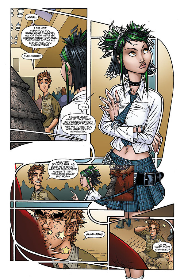
Published: 2007-10-08 01:12:27 +0000 UTC; Views: 5421; Favourites: 49; Downloads: 190
Redirect to original
Description
This is another page from issue 4, where I feel like I was really pushing my panel design in a direction I personally haven't seen before. I love this particular panel layout, and I'm planning to utilize it again in the future. I had a lot of fun with this page!Pencils: Me
Inks: Jason Gorder
Colors: Beth Sotelo
Related content


Comments: 19


love the "stained glass window" effect of these panels! In panel two, Kiori is coolnes personified, halo and all!
👍: 0 ⏩: 0

wow that panel design IS pretty unique. great stuff.
👍: 0 ⏩: 0

I like the flow from panel to panel, but I think I would have left out the halo around the girl in p2... breaks up that flow something fierce.
Still, it guides the eye nicely!
👍: 0 ⏩: 1

Whats up man? I remember you from the Optical Res boards back in the day...I just happened to come across you on here. Glad I did! Anyway, I can recall at the time I drew this I was debating whether or not to add the halo around the chick, and wasn't sure...In retrospect I may indeed have made the wrong decision. Good call!
👍: 0 ⏩: 0

Man, I need to get on Aspen and pick up some of your books... I'm missin' out!
👍: 0 ⏩: 0

Awsome socks! I like the design woven into the panel. Kinda like mucha for narrative.
Though the design kind of distracts from the action in the second to last panel.
But it keeps the page flowing.
👍: 0 ⏩: 0

Very nice job! I believe you did a really nice job in demonstrating direction in your panel. I did indeed followed the design of the way you were wanted it to go.
👍: 0 ⏩: 0

Oh yeah, the page layout was nicely done, and the art looks great.
Cheers!
DWF
👍: 0 ⏩: 0

i freaking love kiori! she reminds me of myself in high school lol. but really, i really like what you're doing.
👍: 0 ⏩: 0

it's about time you started posting more of these. looks good man!
👍: 0 ⏩: 0

After seeing this page I will surely find ALL issues of Shrugged. I will have to get credit card first, though.
👍: 0 ⏩: 0

Awesome, I bought this issue some time ago... i really love shrugged. <3
I love the style and how you do the panels, very original ")
👍: 0 ⏩: 0

The panel flow and the negative spaces kind of remind me of graffiti art. Sweet page, man.
👍: 0 ⏩: 0


Again, really nice work. And tell Beth she'd doing a fantastic job!
👍: 0 ⏩: 0

