HOME | DD
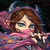 mich-spich — Absol coming from the darkness

#absol #darkness #lightandshadow #pokemonfanart
Published: 2016-08-17 09:25:34 +0000 UTC; Views: 566; Favourites: 34; Downloads: 0
Redirect to original
Description
Finally finished a pokemon drawing! It took me forever to think of a design to put in so it looks like absol is comming out of something. I tried to play around with the shading to give it the realism effect I always go for in my drawings. As always enjoy the drawing and if there is anything in need of improvement then just tell me, I appreciate all critiques. (Smile)")
Media used: colored pencils and sharpies.
Related content


Comments: 10


As soon as I saw this I wanted to favourite, I like the idea of Absol emerging from the clouds (or smoke). I love the shading and how the colours and shading becomes darker closer to the clouds, whilst the other side becomes very bright in contrast. A good combination of dark shading mixed with vibrant white sections that help ensure the other body parts remain defined and clear.
For improvement I would love to see a clearer photograph, but besides that the only part I think could do with improvement would be the clouds which I think some darker (or maybe even lighter) swirls moving within the clouds would help add more movement to the drawing.
This piece looks amazing, keep up the good work!
~critique from Inspiring Creation group
")
👍: 0 ⏩: 1

Thanks for the critique! This was a quick draw so I get many ideas for the smoke(they're just shapes but whatevs)
I know the photos can be crappy, for the future I will think of a way to make the photos clear.(probably by scanning)
👍: 0 ⏩: 1
You are very welcome, I also enjoy drawing smoke into some of my drawings, they can be so random and add some nice colour, they're also ideal for hiding pesky limbs, haha.
👍: 0 ⏩: 0

I don't know this particular pokemon character. but it is really really cute.
I feel the shading is very well done and gives this character a much more realistic look than the usual style of cel-shading that is used for these type characters.
The repeating forms of the curves in your character and (clouds?) gives the drawing composition really nice unity and flow. the reverse curve of the light adds diversity of flow but still retains unity to the rest of the composition.
I would possibly suggest using a slightly lighter value of the black or possible light gray blue in the background. Two dark colors together on the left side makes that side of the drawing heavier than the right and gives a slight imbalance in the composition. Neutral colors have a tendency to look lighter in mass weight than colors. The dark black has a tendency to come forward toward your character. A lighter value would push the background away from the character and give it more depth between the character and the background.
It is not that it is wrong but only a color composition element that makes a drawing a little more realistic in perspective and would help the balance of the drawing.
I feel this is a super cute character and you have done a wonderful job on creating a dream like atmosphere of it coming out of the dark and into the light.
Critique by Inspiring Creation
👍: 0 ⏩: 1
The clouds are basically shapes. This was a quick draw so I didn't think much about the darkness part.
I felt like I should have kept the background a little lighter, oh well, at least now I can keep that in mind.
Again, thank you for the critique, it really helps.
")
👍: 0 ⏩: 1
Your welcome and I wanted to thank you for the feedback comment on the critique.
I'm not sure if people realize that feed back comments from the artist also helps the person doing the critique and teaches that person also . I know it does me.
The person doing the critique doesn't know exactly what the artist's intentions may be for doing something a certain way in their artwork. You may have done the background dark for dramatic effect rather than composition sake.
I do a lot of my work on black paper just because I like working on black and disregard some of the so called rules of art. lol.
I'm not really knowledgeable about this particular style of art and all the elements associated with it. I've been taught the basic principles and elements for doing fine art genera . I hope I did okay on this one for you since you said you were trying to do a more realistic version of this character.
👍: 0 ⏩: 0

Wow this is amazing!
Absol is one of my favourites, so you already got a lot of points with this.
Also loved your coloring and shading, it's really great.
The idea of him coming form the "darkness" is good too, though I think you could work better on it 'cause it looks plain -especially near absol. Maybe you can use darker shades in the middle to give it a more realistic look.
Great job!
~critique by Inspiring Creation
👍: 0 ⏩: 1
Thank you! I am glad to hear that you like him.
You are right about the background being plain and the shading, even though this was a quick draw, I could have done better.
👍: 0 ⏩: 0