HOME | DD
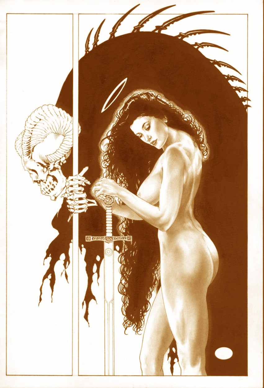
 MichaelBair — UNADORNED_Sepia
Published: 2007-03-17 23:47:41 +0000 UTC; Views: 5792; Favourites: 34; Downloads: 0
Redirect to original
Description
Most people only know my work in pen & ink, not tonework.The originals have an almost silver quality to them........
________________________________________ ________
This and many other of these drawings are in my
"Sketchbook-Doodles,Drawings,& Dames" / 2003
for copy go to............ [link]
Related content


Comments: 11

Just beautiful and compeling. Nice use of the model there.
👍: 0 ⏩: 0


I have been thinking about this drawing for a while, lol, i think another thing that realy attracted me to it in the first place was the repititon of lines between the staff and womans sword makes some realy interesting negative spaces , the harsh solid - crosshatched character in the background next to the softly shaded woman adds some realy nice contrast of textures, and the emphasis on the spines of the skelital figures back , since there the only ones that break the border ")
👍: 0 ⏩: 1

WarGamesWolf.
Thank you for the very kind words....
you know it's like "the Who" said in a song.....
"all the simple things are complicated"
____________________________________
I remember an old art teacher telling me that it's easier to hide drawing mistakes with alot of unnecessary detail........
that's why artists like Alex Toth are amazing.
Bair
👍: 0 ⏩: 1
My pleasure, ill be watching 

👍: 0 ⏩: 0

Compaired to the previous one, the Sepia tone adds alot more warmpth. I realy like the way you devided up the white space too, the way the staff of the skelital dude cuts the composistion realy draws your eye into the woman. I think this is fine without the mature content raiting. The woman is showing abit of breast and butcheek but theres nothing realy erotic or suggests eroticism lol The textures in the heavy areas of Sepia is just awsome
👍: 0 ⏩: 0

Well done, but probably deserves a mature content marking.
👍: 0 ⏩: 1
I thought about that.....
but any number of ads that run in Women's Magazines have pictures equally posed, maybe more so......
and those are sold on newsstands....
to all ages.
and there isn't anything really showing....
just abit of cheek.....
and thanks for the kind words.
👍: 0 ⏩: 1
Usually I see magazines with some mature content as being placed behind other magazines. But still, they're sold to the general public. However, some popular magazines that usually don't contain mature things may one day have something big in there. The merchant can't read through each one and make sure that all with dirty things are in the back.
As far as things that are shown... Well, yeah, there's cheek, but I was thinking a little more north. If I'm not mistaking, there's a little bit of bare breast in there, too.
👍: 0 ⏩: 1
well......
we see what we want to see....
I was going for a strong woman, with a graceful
& defiant flow to her attitude.
The angle wasn't such as to titilate...
a straight on shot might have done that.....
and I really don't think it's more provocative....
than say an ad for ........
sun-tan lotion, or skin cream....
but again....
we see what we want to see....
Thx.
again for your comments.
👍: 0 ⏩: 0