HOME | DD
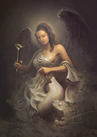
 MichaelO — Angel In The Making update

Published: 2014-02-07 02:04:57 +0000 UTC; Views: 12785; Favourites: 421; Downloads: 0
Redirect to original
Description
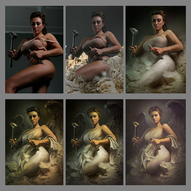
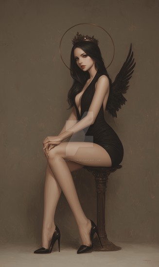
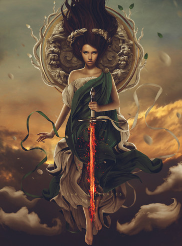
Made some major changes to this one... I really liked the overall look but the angle and head felt off to me. So, i put in a new head and did a whole lot of changes to the proportions.Full size:
Related content
Comments: 39

Definitely like the second version. I like all the changes you've made, her new face, the body proportions, the tilt of her head, and I particularly like the new tunic. Your work is brilliant!
👍: 0 ⏩: 0

these are pretty awesome but I think the thigh should be close to the same color as the shoulder
👍: 0 ⏩: 0

Yeah, I kind of like the old one a little better, it has more of a classic look to it. Maybe it is because of the high contrast. The newer one just looks too teeny bopperish IMO. But still a great job nonetheless.
👍: 0 ⏩: 0

I love both of them, as to me both look angelic but in a different way, although I prefer more the expression of the first one.
My only suggestion would be to just add a few more shadows maybe on her face, as it seems much more shiny (maybe more vibrant?) compared to the rest of the body, but maybe it is just me 
👍: 0 ⏩: 0

Amazing. Lost my belief in angels a long time ago. But still a brilliant idea. And very much needed today, yesterday and tomorrow. We all can't be deviants. Balance
👍: 0 ⏩: 0

I'm kinda torn. The proportions are better, but the original had a lovely "larger girl" angelic feel to it that I kinda miss. Sort of symbolizing that even Angels are larger but lovely and made to be lovely. Beautiful either way!
👍: 0 ⏩: 0

That is great improvement. Really looks a lot better
👍: 0 ⏩: 0

I really like the updated version, gives off more of an angelic feel with the new face and tunic.
👍: 0 ⏩: 0

i loved your first version when it came out and this version didn't disappoint at all nice improvements as always
👍: 0 ⏩: 0

While I see the corrections in the anatomy you made for the second one, I think the less conventional face of the first version was more interesting. 
Altogether a fantastic work. 
👍: 0 ⏩: 0

I love the head of the 2nd one but overall I think I like the 1st better. Especially the curve around the waist/back.
👍: 0 ⏩: 0

I prefer the first one too. She looks a bit dizzy and I think it normal being in the middle of carving herself out from that block of stone. We can se as she slowly awakens to her complete conscience.
👍: 0 ⏩: 0

I think the first version has a bit more character to it than the second one, mostly because of the face.But that is a subjective view. Both of them are really nice though ^^. great job
👍: 0 ⏩: 0

The short-haired angel has a fiercer look to her, as if she is a warrior angel, while the other woman is softer. But with them side-by side, I see the wonky proportions on the left you were referring to.
👍: 0 ⏩: 0

I like the improvements, you're correct that to porportions needed to be fixed however the hair and the expression on the woman I'm not so sure were needed to be changed. To me the woman on the right looks like a beautiful model someone put wings behind. The woman on the left looks like she's got a background, a history and she's on a mission. AS if she is not molding herself but freeing herself, being released to go out and do some bizness and save some damned souls! 
👍: 0 ⏩: 1

i see what you are saying and lately i have been transitioning my work from 'pretty model' to more gritty, realistic versions of the human body. I do wish this one kept that feel.
👍: 0 ⏩: 1

It's alright, I'm sure you had the best intentions. It's still a beautiful angel, the wings are superb and truly make their claim to realistic. ;D
👍: 0 ⏩: 0

I think you should have kept the dramatic lighting that was in the first piece. Also doesn't look right that the hands and arms would have such lighting and the face/hair doesn't match with it.
Excellent work though! I do like the changes with the proportions.
👍: 0 ⏩: 0

personally, I like the first version more because of the way the woman's head look much more sturdy than the soft looking face in the second, as well as the details on the fist of the first one as well. However design-wise i can appreciate the new version, especially your corrections to the anatomy
👍: 0 ⏩: 0

I prefer the 1st version 
👍: 0 ⏩: 0

I like the dress more on the new one now that it's finished up on her shoulder
👍: 0 ⏩: 0
