HOME | DD
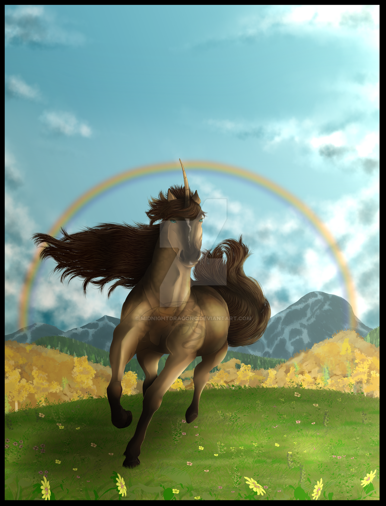
 MidnightDragonC — The calling
by-nc-nd
MidnightDragonC — The calling
by-nc-nd

Published: 2016-01-13 15:40:23 +0000 UTC; Views: 340; Favourites: 6; Downloads: 0
Redirect to original
Description
Update 1/27/16: Edited it some things were not good looking like the background and made some edits. Also, edited some things from the critique I got for it. I have to say it looks so much better now.")
Video: www.youtube.com/watch?v=OKarQh…
"Should I heed the call and let the world find another way, or should I stay?"
This is where you find out where your life will begin
Discover where your road lies
This is where you see how much you're made of within
And with the stars we will rise
Enjoy!
refs: thumb7.shutterstock.com/displa…
cache4.asset-cache.net/gc/5819…
artwork, Momo © me
Related content


Comments: 7

Epic! The expression and pose of the character is amazing and the sky looks absolutely beautiful!
Even though I'd critique some little parts of it (But I'm not going to unless you want me to), I want to let you know that you did an amazing job with it, so keep it up!
👍: 0 ⏩: 1

Thank you!
You can critique me that's fine. I'd like to hear what others think about my work.

👍: 0 ⏩: 1
Okay, just remember that I don't want to sound rude, I just want to help because you certainly have got some potential :'3
When I saw the picture, I thought the wolf looked very realistic. I don't have really anything to say about it, other than the wings look kind of like they are floating in the air?
I'm no wing expert, but I'm not sure if they bend like that. Maybe putting them a bit lower would help? Otherwise the wolf is all good and looking amazing.
But then there's something with the background that... kind of doesn't... fit?
I watched the speedpaint and I saw you use a lot of reference, which is of course good. There's just something with the sun and the mist.
Of course, I like the fantasy-like feeling the sky gives, but I realized that when the sun is that low and the hills in the back look so dark, it loses the depth.
Usually, when hills are further away, they are lighter. Especially if the landscape is misty. Here's an example taken from google supermanwah.files.wordpress.co…
And the sun just looks like it doesn't fit, I don't know why :0 I think that maybe adding more shadow to the character and around the hills would help, and making the color sceme a bit bluer (depends how easy it is to do that on the program you use)
The sky usually gets reddish when the sun sets/rises, but as I said, I actually like the blue sky because it seems like it's from another world XD
Oh, and, I don't know if it's just in your style, but the hills and rocks look a bit bubbly? Maybe you could smoothen the shadows the further away the hills are.
But then again, you put more effort in this whole picture than I ever would, so you get a lot of credit to that. I see you're trying to improve and that's just the best thing an artist can do, seriously ^^
Sorry for this long text, I hope it helps a bit and doesn't make you feel all that bad ;-;
👍: 0 ⏩: 1
Thank you!
Wings are quite difficult to get just right. 
I was going to try having the sky more blue, but it didn't quite fit fully for some reason..maybe since it's more a fantasy themed image 
Yeah..I really need to practice rocks more...
Don't apologize for the long text it's great for a critique
It doesn't bother me at all. It's really great to hear what I need to improve more on!
Sorry for a late reply.

👍: 0 ⏩: 0