HOME | DD
 Migdul — Pursuing The Colour
Published: 2008-03-25 19:30:34 +0000 UTC; Views: 1183; Favourites: 35; Downloads: 43
Redirect to original
Description
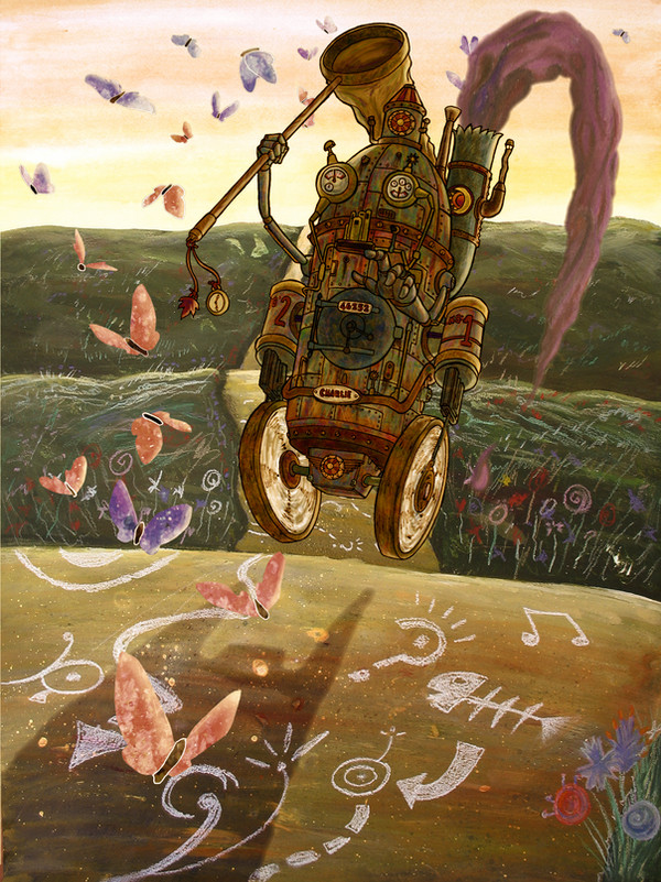
Another piece for my portfolio done! Created in the following stage:- Sky painted in watercolour.
- Grass painted in acrylics, then flower details added with pastel pencils.
- Road painted in acrylics, splattered with acrylic ink, then painted over in thin watercolour. Details drawn in white pastel.
- Robot character drawn and inked on A3, scanned and coloured with photoshop.
- Butterflies drawn and inked, scanned, then coloured using a previously created watercolour textured background.
- Smoke from robot drawn in pastel, scanned and tinted in photoshop.
- Coloured and tinted final image using photoshop to give it its warm appearance.
Phew! Hope you all like, C&C welcome!
Edit - I removed the white trim on the butterflies in the foreground and shaded the wheels a bit. Also made the pic slightly greener.
Related content


Comments: 14

I love the contrast between the robot and the background - the two materials compliment each other nicely. the butterflies look really cool as well, I like how they're not outlined or anything. I would say however that the smoke looks a bit solid...I'd have been inclined to smudge it a bit, but then that's just me. otherwise, this is pretty friggin' awesome.
👍: 0 ⏩: 1

yeh I suppose it wud look more realistic (heighten the sense of movement, etc), but its done now. I have other projects which need my attention more, including previously 'completed' pieces that need revamping to bring them more inline with my more recent work.
👍: 0 ⏩: 0

wow, amazing job!, a mix of techniques are really nice.
a perfect work

👍: 0 ⏩: 1
Nothing's perfect! Except maybe George Bush's foreign policy...........!
Thanks very much for the fave!
👍: 0 ⏩: 1

argh, you're gonna hate me but im sure you'll also listen to an opinion. i much prefered the orange tint mate. it really gave the feel of heat on a summers dawn. i know its mean to be sylised but as you probably know, the sun never makes green look 'green', it adds a yellow to everything so to me, its now bringing out too much detail in the robot chassis. also been thinking about the smoke, have you tried making it blur towards the end? and/or giving it a bit more of a 'trail' of where the robot has come from? anyway, thats it, other than that, i'll let you off. weirdo.
👍: 0 ⏩: 1
hmmm I did line up the orange one next to the green one. I do get the whole 'sunlight makes things yellow' thing, but the greener one actually looked better and was closer to the image in my mind's eye. In the current image there is a better balance of cool greens against the warm oranges and yellows - in the orange version the warmer colours were a little too dominant. As for the smoke - it probably would look better if i blurred it, but I can't be bothered just yet, I have other projects to move onto.
👍: 0 ⏩: 0

Wow. This is a wonderful picture! I don't really have any crits at all here. I don't think I'd change anything, even the butterflies. I rather like the texture you have with them.
I think this is my favourite work thus far.
👍: 0 ⏩: 1
excellent! Thanks for the feedback!
👍: 0 ⏩: 0

brilliant.. . i love your more definitive emerging style. if anything not orange enough. i want this as an a2 print.. ..mm
👍: 0 ⏩: 1
hopefully ppl who pay money for art will love my new emerging style too!
👍: 0 ⏩: 0
fully awesome dude. probably my fave of yours. i like your new approach to a colour pallette.
👍: 0 ⏩: 1
im thinking about re-doing the butterflies in pastel, so it sorta fits the mood of the pic more. Also reckon it might be a bit 2 orange. what do you think?
👍: 0 ⏩: 1
dont think its too orange, just change the harshness of the white like we discussed and maybe add a teeeny hint of white elsewhere on the robot, like cezanne did with his paintings to balance things out.
👍: 0 ⏩: 0