HOME | DD
 Mihew — Web icons
Published: 2007-10-15 02:26:42 +0000 UTC; Views: 28606; Favourites: 52; Downloads: 5875
Redirect to original
Description
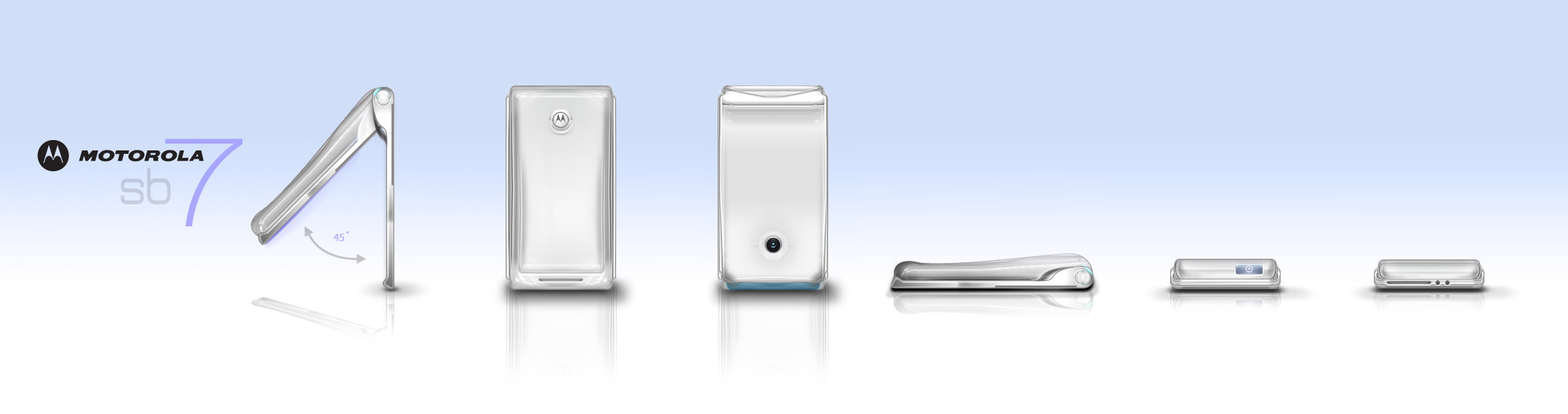
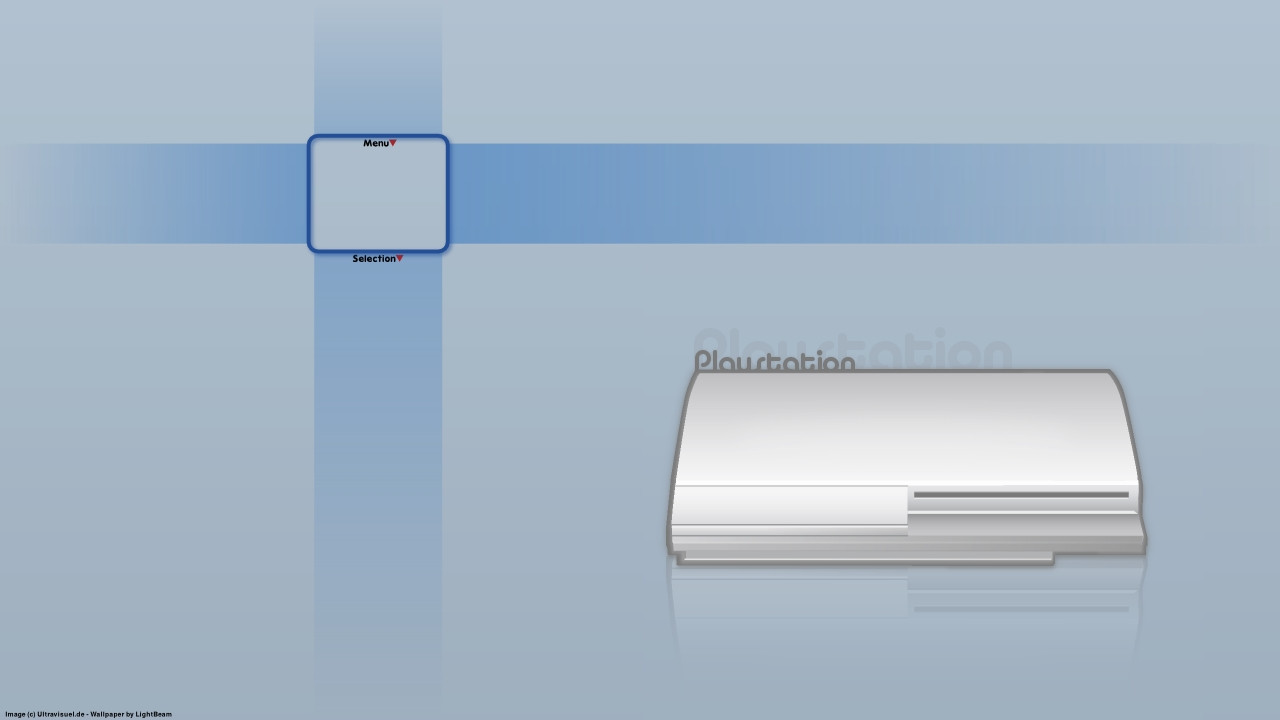
A set of 4 web-icons for a project im working on, they wanted a colour choice, though personally im set on the green version.These took a couple of hours at most, but where good fun to do.
What do you guys think?
Edit: There was alot of noise on the previous uploud, in the end they wanted a strong blue. So after some PSD digging i mocked up a set which hopefully sorts the noise problem.
Thanks.
Matt
Related content


Comments: 15

I really love that phone icon, Ive been looking for something like this in a darker blue, any chance you could make me one? If so email me at rebecca.81.turner@gmail.com. Thanks!
👍: 0 ⏩: 0
I love these, The phone icon is exactly what I am looking for in a darker blue, any chance you can make me one?? If so email me at rebecca.81.turner@gmail.com
👍: 0 ⏩: 0


Nice images - only 1 thing - the reflections are wrong - might need to play with the orientation of the reflections
👍: 0 ⏩: 0

really like the style. are they vector based or bitmap based?
like it
 (Smile)")
👍: 0 ⏩: 0


Much better now, good job
👍: 0 ⏩: 0
They look good but because of the noise they look really bad quality, good job anyway just fix the noise
")
👍: 0 ⏩: 0

Looks great mate!! Nice colors and proffessional presentation!!
👍: 0 ⏩: 0

Aye, the individual icons seem fine, but i must have messed with something when making this preview.
👍: 0 ⏩: 0
