HOME | DD
 mike-hege — Digital-Creative Portfolio
by-nc-nd
mike-hege — Digital-Creative Portfolio
by-nc-nd
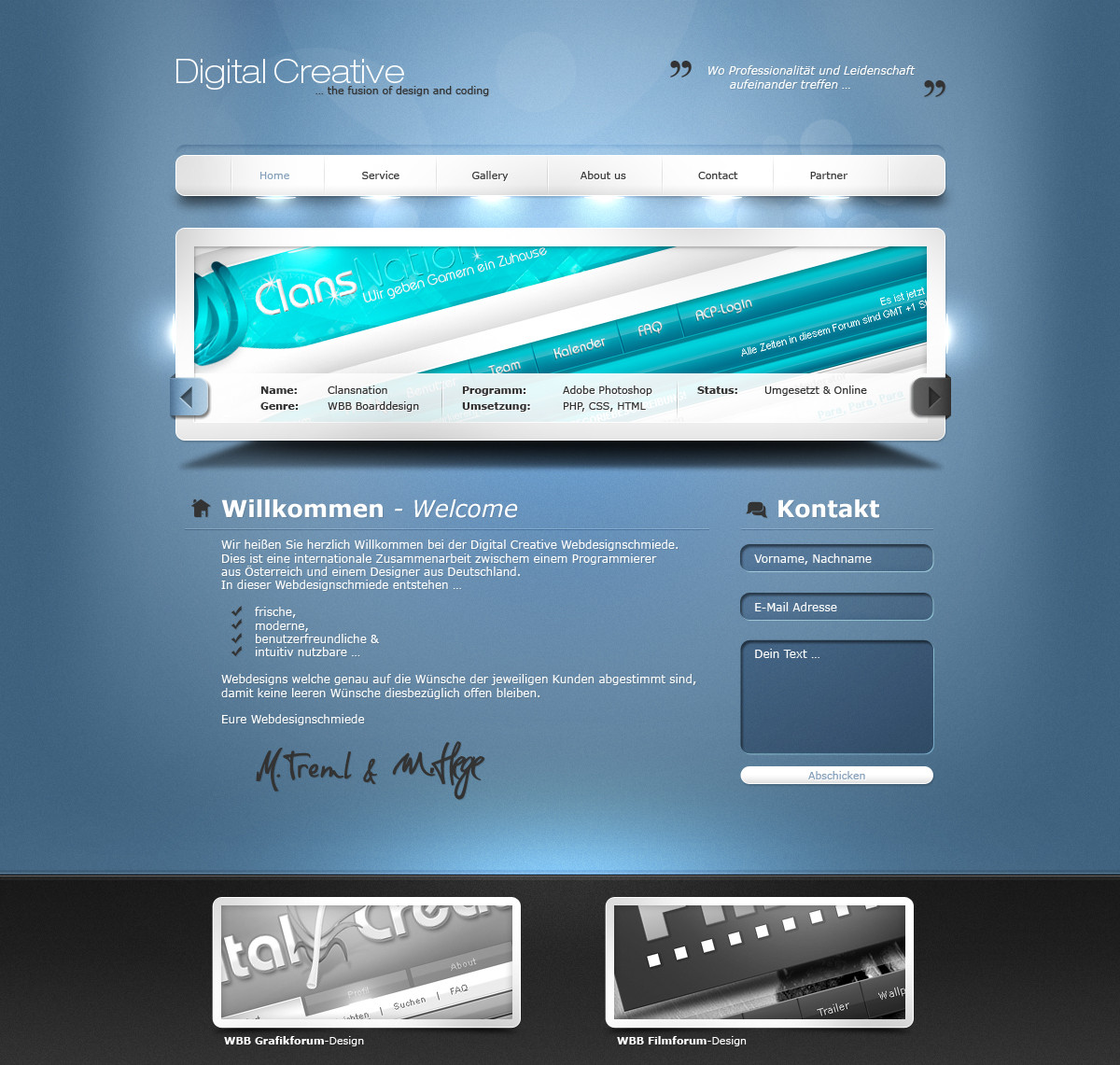
Published: 2010-07-27 16:51:49 +0000 UTC; Views: 49729; Favourites: 441; Downloads: 0
Redirect to original
Description
…Related content


Comments: 164


wow sehr schön und die lichter gefallen mir!
👍: 0 ⏩: 1


yeah i fergott it... >.< xD
i will make it on friday.
👍: 0 ⏩: 0

Ok, little less shiny would be nice. How about using those lights only for active menu boxes?
👍: 0 ⏩: 1
no, the lights shinin' for ever...
thx!
👍: 0 ⏩: 0

WOW man, this one looks very nicely done.  (Wink)")

Let me know when it will be online...
👍: 0 ⏩: 1


Schönes Portfolio
Die Navi ist sonst recht trüb, aber du lässt es durch die Lights im unteren Bereich der Navi sehr edel aussehen und hast dort schon den ersten Eyecatcher gesetzt.
Außerdem hast du ein gutes Gespür für die Typographie
Was soll ich sonst groß dazu sagen, ich will jetzt nicht ins Detail gehen, aber du hast echt Talent. Es wirkt alles sehr harmonisch, greifst manche Dinge noch einmal auf, sehr strukturiert und vor allem übersichtlich.
Bleib bei diesem Style und mach weiter so schicke Designs^^
Daher
👍: 0 ⏩: 1
Das geht runter wie Öl.
Danke dir für dieses klasse Feedback! Rewatch kommt gleich.
👍: 0 ⏩: 0

no problem ! realy good work ! especially i like top area, clean menu, nice bukohens and lighting. In bottom part i think that shadows in contackt form are to strong and big, but overal this is very solid work !
👍: 0 ⏩: 1
thank you for your feedback m8
👍: 0 ⏩: 0


Smile -.-
sollte eigentlich  (Smile)")
👍: 0 ⏩: 1
Joa smile
Wie man es von dir gewohnt ist smile
Du arbeitest extrem sauber und ordentlich. smile
Die Effekte stimmen aufjedenfall, es ist aber auch nicht zu überladen.
Wüsste jetzt nicht was man daran noch verbessern könnte . smile
Meiner Meinung nach, eins deiner besten Designs.
Ich werde es gleich faven Wink
👍: 0 ⏩: 1

Ganz nett! Effekte find ich gut gesetzt, obwohl mich etwas stört das kein richtiger Footer vorhanden ist mit Copyright. Also wenn es einfach mit Bilder abschließt.
👍: 0 ⏩: 1
Copyright... ")
Danke für dein Feedback.
👍: 0 ⏩: 1
Das meinte ich auch eigentlich nicht damit, mir fiel nur zu dem Zeitpunkt nur nicht ein wie ich es nennen sollte. Auf jedenfall meine ich, dass es irgendwie stört, dass das Design mit einer Übersicht von Werken endet und nicht mit einer Extrafußzeile.
Trotzdem beachtliche Leistung und seit langem was richtig geiles
👍: 0 ⏩: 1
Danke dir.
Ja wollte damit einfach mal aussa Reihe tanzen... ich mags nich designs wie der Mainstream sie baut zu erstellen - also gabs nen Galleryfooter. ")
Thx.
👍: 0 ⏩: 0


<= Prev | | Next =>