HOME | DD
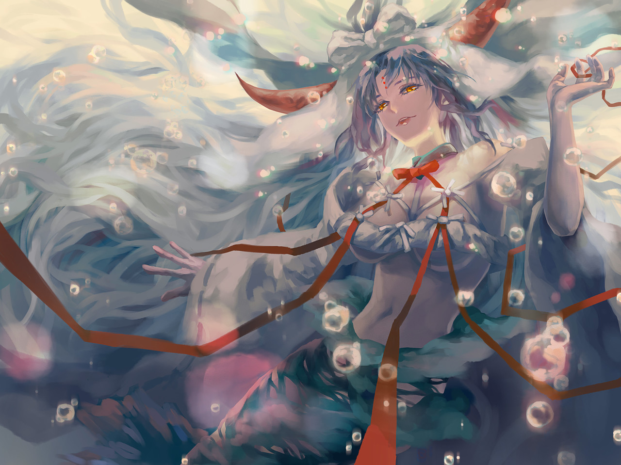
 Mike-MM — Siren

Published: 2012-10-07 15:29:40 +0000 UTC; Views: 2442; Favourites: 18; Downloads: 23
Redirect to original
Description
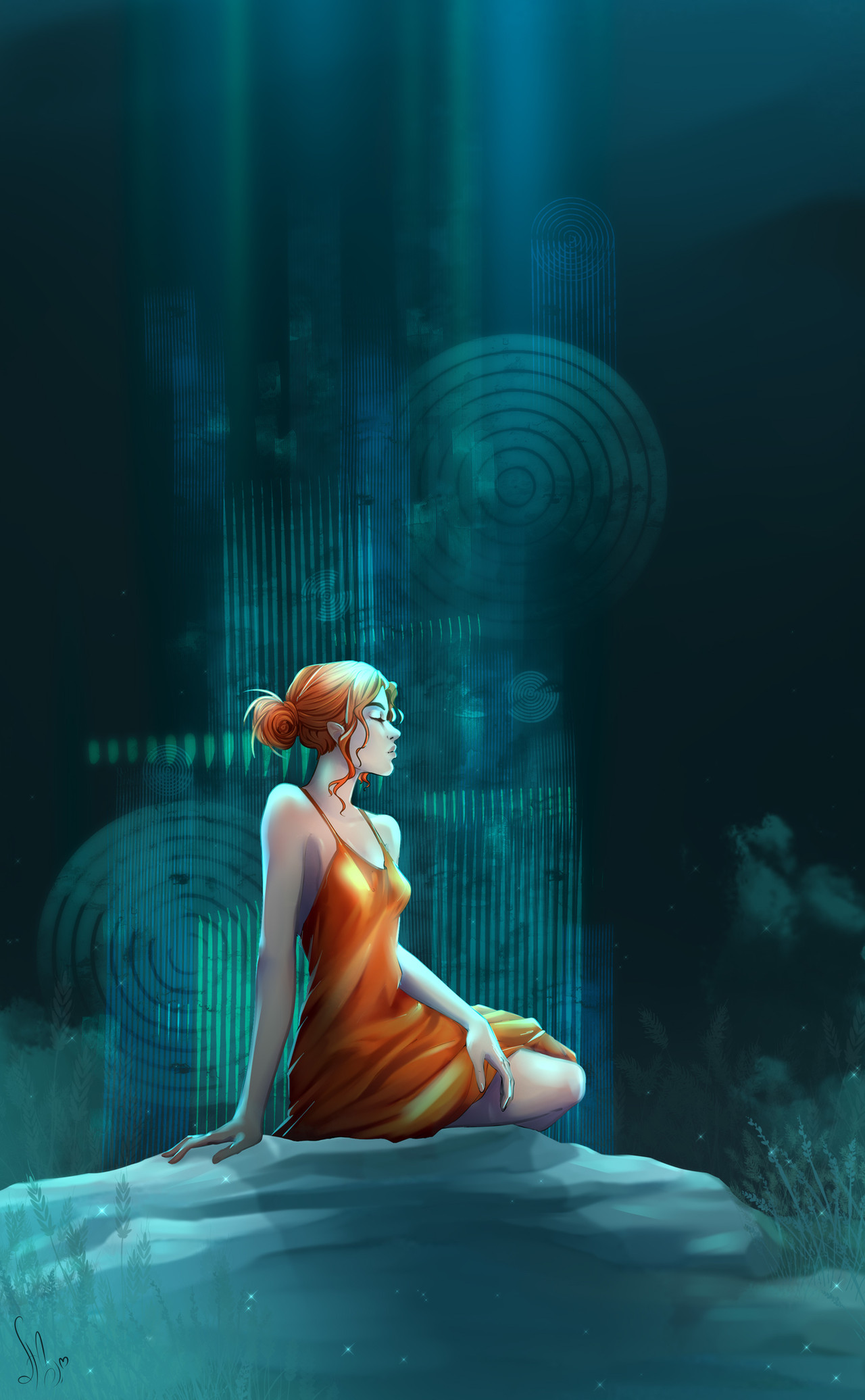
ERMAHGERD MAH TERTLERS ER SER CRERTERVERSSo, yeah, it's a Siren
I did this based on a short story written by my friend
it supposed to be a siren getting in the water while take her dress who starts to disappear 'n shit
")
i tried some new things with the coloring and hair and was quite happy with it still i tried to do the background...
god, the background... OTL
why i just can't to what i tried to do?
but i guess i should keep trying, maybe some day it will get better... and i keep saying that to myself lol
constructive criticism is welcome
no need to hold, just tell me what you really think and how i could improve
that's why i joined DA in the first place xD
Edit: Changed the background and some other things thanks to
here's her awesome redline [link]
i think it's really better now, but still not sure if i did her breats right. maybe they're too apart now? that's probably just me.
but they definitely seem way natural than before, so that's good
Old version: [link]
And that's the drawing process, because i always wnated to do this xD
[link]
Related content


Comments: 13

The Lady of the lake, such a dangerous beauty and conveyor of temptation.
👍: 0 ⏩: 0

Nice effect with the dress <3 Looks likes it's the moon :3
👍: 0 ⏩: 1

Ilove the way tou did the dress. By that i mean that you still can see her dress under the water. It gives a nice effect
👍: 0 ⏩: 1

i'm really glad you liked, thanks
👍: 0 ⏩: 1


Wow, what a big improvement! The background is nicely done and simple enough to make the highlighted Siren pop out at you. I think you did a great job adjusting the chest area and she definitely has a softer, feminine feel to her. I think the breasts only appear to be too far apart because the shading in between them is rather dark and the two lines defining the top inner curve of the breasts should be implied rather than defined. Try painting over these lines with your base skin tone and you'll see a big difference.  (Smile)")
👍: 0 ⏩: 0

Wow, I am really impressed with her face and hair. And to contrast Uyllstide, I think her neck and shoulders look alright, haha. I do agree about her breasts though, they seem a little *too* pushed up to be..held up by nothing. Or maybe it's magic? She is a siren after all. You could always use that excuse
I like the effect with the water, too. I don't imagine this reply is very helpful, sorry. :c

👍: 0 ⏩: 1
yeah... it's magic, i was thinking that since the beginning 
i'll try to make it all look softer and natural, though
thanks for the comment

👍: 0 ⏩: 0
This is very nice! I think the background is a little -too- detailed that it takes away from the very simple focus of this picture. It's okay to tone down the background by using more muted colors, blurring, or even leave an implication of a background. It will help to attract the eye where is most important. As far as your siren goes, she's turned out wonderfully. You've really improved on placing the facial features and emphasizing that CURVE. Breasts are difficult to get right and I think it might help to look at how they fall while unclothed. Here they look like they're being squished together to create cleavage while there's little to hold them up like that. Women can only achieve lift like that with a pushup bra or corset...or with enough plastic surgery. ")
👍: 0 ⏩: 1
You're not a jerk, that was an awesome critique
i agree with everything you said
in my head the background should be waaaay simplier and discrete(?) but i wasn't getting the effects i wanted. i was actually thinking of just paint the water around her to don't loose the focus or something like that, i'll see what i can do xD
the breats shouldn't be that way either. they turned out bigger and faker than it should be
i'll try to keep all that in mind next time, thank you so much
👍: 0 ⏩: 0