HOME | DD
 mikemaluk — Cover Test
Published: 2012-10-24 18:54:23 +0000 UTC; Views: 2217; Favourites: 55; Downloads: 0
Redirect to original
Description
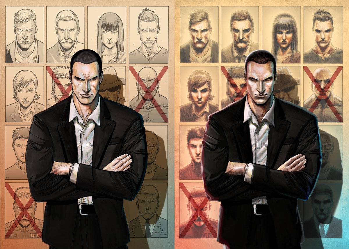
Hey,LEFT OR RIGHT?
I made two versions of the same cover.
If you`d have to choose one of these for a cover, which one would you prefer?
The first pages of the interior are here: [link]
To know more about this project please visit the kickstarter page: [link]
Comment much apreciated!
Thanks
Related content


Comments: 86


I vote both! combine the image of the left with the background of the right, i think the dark shading of the posters on the right one give it a darker more ominious look while the hard lines on the left make the main character stand it and look very sharp, that's my opinion
👍: 0 ⏩: 1

Thanks a lot for your feedback friend. I guess the secret is allway in balance
👍: 0 ⏩: 0

Tough call! I love the lighting on the right, but the sharp lines on the left give it a slight edge for me. I guess that makes my vote left!
👍: 0 ⏩: 1
Thanks a lot for your comment.
So this makes it:
Left 12 - 15 Right
👍: 0 ⏩: 0

I love the nice clean look of the background on the left, but I feel that the shading and light of the right wins out.
👍: 0 ⏩: 1
I guess you feel like me hahahah
👍: 0 ⏩: 0

I would make it whichever one matches the interior art.
👍: 0 ⏩: 1
Well, the colorist from the inside is another so it doesn´t quite mach the interior, but I get what you mean, thanks for your feedback!
👍: 0 ⏩: 1
I meant if the inside is clean and inked I would go with the right, if it looks more like a painting I would go with the one on the right.
👍: 0 ⏩: 0

 (Smile)")
Left 11 - 15 Right
👍: 0 ⏩: 0

Right, have more impact an more darkness in my opinion, and fits better with this dude's machiavellian gaze.
👍: 0 ⏩: 1
Thanks a lot!
So that makes it:
Left 11 - 14 Right
👍: 0 ⏩: 0

i prefer the background on the right but the main guy on the left.
👍: 0 ⏩: 1

Thanks a lot! This is almost a tie here hahaha:
Left 11 - 13 Right ")
👍: 0 ⏩: 0

the left look a little anime-ish. kinda reminds me of golgo 13 but still pretty american comic-ish. the right is totally american ish. if any of that make sense. it's still up to you both look great
👍: 0 ⏩: 1
hahaha, cool, I didn´t know that, had to google it. Thanks for the feedback man! You would prefer the anime-ish or the american-ish?
👍: 0 ⏩: 1
well both really looks good I guess it depends on what kind of vibe you're going for
👍: 0 ⏩: 0

That's hard, but I think I'm gonna go with the right one.
👍: 0 ⏩: 1

The guy looks better on the right, but the posters look better on the left. I would go with the one on the right.
👍: 0 ⏩: 1
Thanks a lot!
Left 10 - 12 Right
👍: 0 ⏩: 0

The one on the right makes him look rather more sinister, and also makes him look just a little bit like Christopher Eccleston. It also, I think, makes the game of assassination-tac-toe behind him (more specifically, the pictures) look a lot better, or at least a bit more realistic, as the style of the drawings on the left doesn't fit what would be expected for wanted posters, police sketch-artists, or photographs, especially considering the difference between the man in the front and the greyscale comic-style sketches behind him. That particular aspect is much better on the right, though I think his belt buckle turned out better on the left.
👍: 0 ⏩: 1
Thanks a lot for the awesome input on this.
Left 10 - 11 Right
👍: 0 ⏩: 0

Left if the characters in the background play a significant role in the narrative.
Right if not.
👍: 0 ⏩: 1
hahaha, some of them do
So that makes Left 10 - 10 Right
👍: 0 ⏩: 1
I just noticed the difference between how the characters were portrayed on each cover. I learned about this theory when it comes to relating to characters and the eyes are one of the most relateable things about them.
In this case, the shadows darkening the eyes of the BG characters on the right cover had me assume they were all part of some bad legion or group while the left leaves more to wonder about as far their intentions go.
It all depends on how you want readers to think when they see the cover.
👍: 0 ⏩: 1
Cool feedback friend, thanks a lot!
👍: 0 ⏩: 1

I would say the right one. I like the more realistic looking artwork because of the shadowing and the eyes in the background not being shown as much makes the hitlist (I assume thats what it is) more ominous to who the guy is taking out. Gives them more of a bad person look. also, possibly feather the main guys shadow some more. It will look better over all if it wasn't as hard of a line for his shadow.
👍: 0 ⏩: 2
Thanks for your input friend!
Left 10 - 10 Right
👍: 0 ⏩: 0

what about putting the outlines from the left picture over the right picture and correct it after?
👍: 0 ⏩: 1
Thanks, thats a cool idea, the best from both worlds
👍: 0 ⏩: 0


Both are obviously amazing, but I prefer the one on the left.
👍: 0 ⏩: 1
Thank you so much
Left 8 - 9 Right
👍: 0 ⏩: 0

It´s kind of a cop, an alien finder cop
Left 7 - 8 Right
👍: 0 ⏩: 1

ooo nice
👍: 0 ⏩: 0

i like the right one it has les detail on faces which makes it look more realisitic by not seeing all the lines idk i least thats how i think
👍: 0 ⏩: 1
Thanks a lot for the feedback!
Left 7 - 7 Right
👍: 0 ⏩: 1
| Next =>