HOME | DD
 mikemayhew — Spidey Test B
Published: 2009-06-05 21:28:07 +0000 UTC; Views: 4819; Favourites: 90; Downloads: 218
Redirect to original
Description
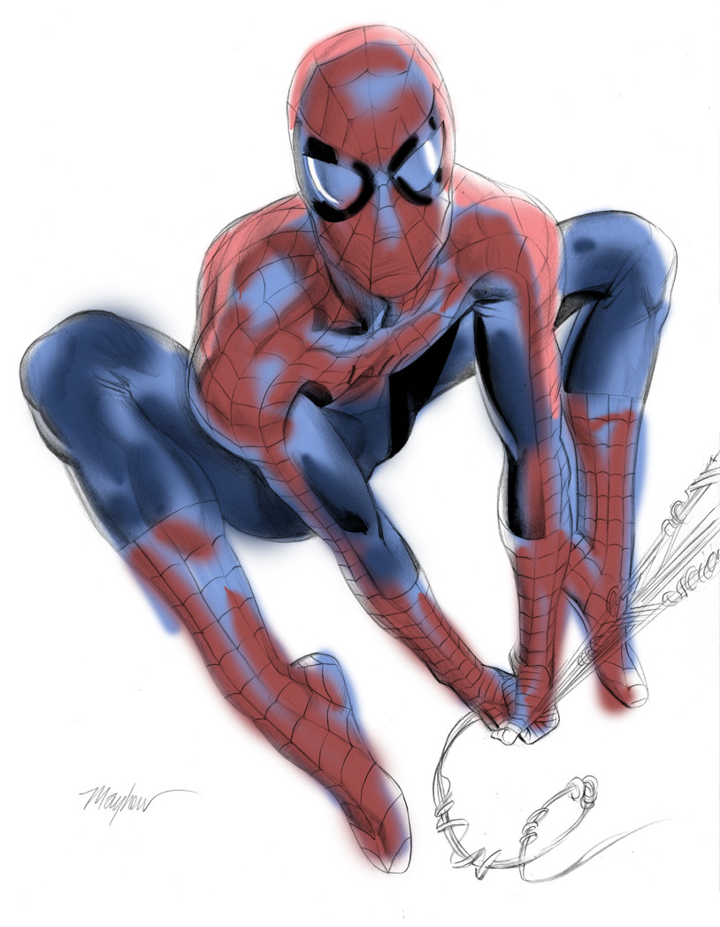
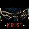
9X12 in pencil with ink wash.Trying to work out the bugs with getting my Spider-Man down for some new projects. Love to know what you all think.
Related content


Comments: 18


I like it. I'm into realism and think you hit it on the mark. The only two suggestions I might make is to thin out the black portion of the eye slits to more of a point towards the center of the face and a little more meat on his left hamstring. I wouldn't want to see spidey to thin, but that's just my personal taste. Great job.
👍: 0 ⏩: 0

oh god.
i love everything you do.
you're one of my favourite people on da

👍: 0 ⏩: 0

So what's the deal with this project? Are you responsible for drawing and colouring the art? Would it be something you would consider to open this up as a challenge, in order to find a new colourist? Someone (like me for example) that is looking to break into the comics industry as a colourist.
The challenge could be open ONLY to non-professionals. I think it would be hugely popular with DevArt. Plus, it would mean that you could concentrate on making the linework absolutely perfect and not worry about having the added pressure of colouring everything aswell.
All you would need to do, I guess, would be to post a couple of high-res poses for peeps to choose 1 from, and give about 2 weeks for us to come up with something.
What do ya say??
👍: 0 ⏩: 0

Spidey looks great, definitely dig the web and the pose. As mentioned in other comments the left leg looks like it has less mass than the right. I'd love to see you do some more action-oriented poses. Spidey is probably one of the toughest draws of the male super heroes because of his acrobatic nature.
Make sure the action line of your poses have some real life to them. I hope to see your next draw of him soon.
👍: 0 ⏩: 0
The draw is great, I think looks a bit weird the blue bright and maybe if the colors are paint with much care could look better, but I can tell you: This is a great draw.
👍: 0 ⏩: 0

Those blues on the red parts of the clothes are really strange to me... Doesn´t seen quite right...
👍: 0 ⏩: 0

the colors look great, i'd like to see them tightened up
👍: 0 ⏩: 0

the area in between his arms is a little off...wheres his left ass cheek? i think the pelvis needs to be adjusted, whatever "bump" that is needs to come down lower...hope u see what i mean.
i love ur style! ur amazing!
👍: 0 ⏩: 0

The blue highlights on the red sections of his costume don't look right to me. His left thigh might be a tad skinny, and the perspective of his upper body and right leg seems a little off; maybe his torso should be coming forward more? Also, the black shadow at the top of his left thigh seems odd. I like the pose and body shape in general, however, and the webbing and other details of his costume are excellent.
👍: 0 ⏩: 0

this is sweet, man. the only thing i would say is don't do the black line in his eyes too thick. really like the palette you're using here.
I love your art, man! but sometimes i do think you should mix your colors a little more. This looks great so far!
👍: 0 ⏩: 0

I like the pose and the overall bodytype of your spiderman, athletic and not overly muscular, I always had that vision of Spiderman, he didn't need to be jacked to be strong. I don't think you're asking for a color critique, but since I'm not sure I'll just say that muted blue hilite on the red really throws me off, but besides that great anatomy. I'd recommend trying an extended pose that's stretched out then you'll really get to feel him out
👍: 0 ⏩: 0

I like the way you are drawing Spiderman, his eyes look like the classic Spiderman but they are a little bigger and so manage to retain a new fresh take. Its like the movie Spiderman. Personally I prefer huge eyes on Spiderman like McFarlane used to draw but this is rad.
👍: 0 ⏩: 0

The pose looks dynamic, the only thing I would argue would be his left leg, that looks kind of odd anatomically at the knee, and perhaps the thigh needs more volume.
On the other side, I think that regarding the storylines currently used by Marvel, Spidey will most probably have a darker and more harsh spirit coming from the writers...so it might give you the edge to show depictions of a darker side from our friendly neighbour...
Anyway, thanks for delighting us with your work and overall, for constantly asking for feedback, that talks a lot about your level as an artist!
Later!
👍: 0 ⏩: 0

pose is ok. as the first comments said. try him fighting and also when he is fully extended swinging thru the city.
👍: 0 ⏩: 0

This looks great. Love the body type and pose just be careful not to make the pose too girly dancer like. It's an easy line to cross with Spiderman being the slender body type and all the gymnist poses he tends to do. And just my taste but I dig the bigger eyes on Spidey like the old Mcfarlane stuff or the new Stuart Immonen work on Ultimate Spiderman. Hope that helps at all.
Love your work.
👍: 0 ⏩: 0


lol ok, you got the way to draw Spider man, But you should try to draw him fighting! Thats when everyone fails!
Just bend his back and let his head looking like it wants to get away from his body.
Good Luck, awesome job!
👍: 0 ⏩: 0