HOME | DD
 mikemayhew — Vampirella 12 Cover Painting

Published: 2009-05-02 16:15:37 +0000 UTC; Views: 20474; Favourites: 372; Downloads: 7070
Redirect to original
Description
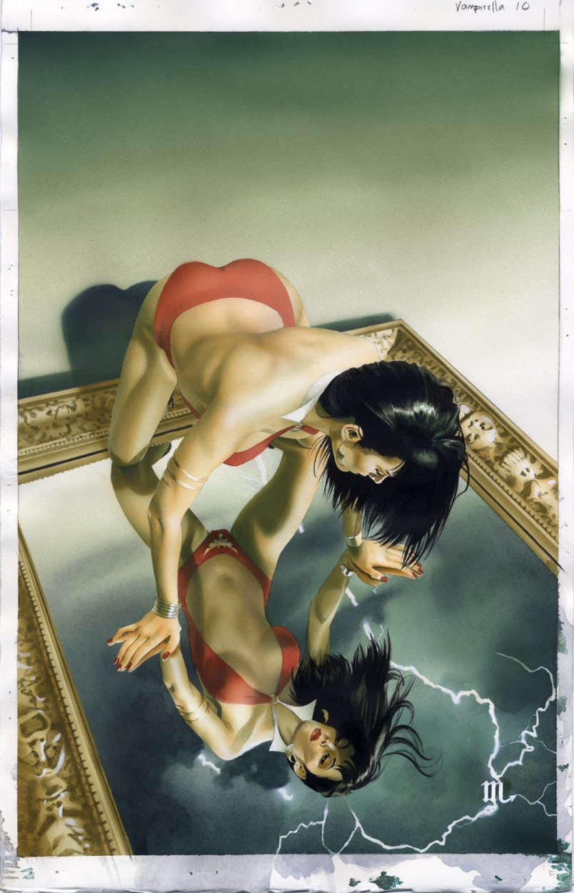
11X17 on 140lb Fabriano artistico hot press paper in acrylic.Related content


Comments: 14

👍: 0 ⏩: 0

Overall

Vision
Originality
Technique

In preparation for critiquing this work, I took a look at Mike's other works since I believe art work is best judged in context.
This Vampirella cover is designed to grab your attention and draw you in (the main purpose of a cover). Vampirella is the clear focus of the compostion and her direct gaze draw in the viewer—as do the sinister eyes in the background.
The composition is very symmetrical and somewhat reminiscent of the one-point perspective used on other works such as Rough Stuff 8 , Jean Grey page 19 and Women of Marvel 2 . Personally, I would prefer to see Mike move away from this style to something more challenging. He is certainly capable of it as shown by the beautifully dramatic compositions of She-Hulk 7 and Wizard Watchmen Spread . These two are compositionally rich and rewarding, making the others feel a little formulaic.
Back to Vampirella 12, the static, symetrical composition is given energy through the diagonal positioning of the arms, the diagonals of the star and the organic shapes of the flames. Vampirella's arms and head are carefully framed inside the circle and her breasts perfectly fill the missing link in the circular frame.
When evaluation a composition, I like to step back from the art work (or partly close my eyes—or both) to see if the composition remains clear. This cover (and most of his other works) easily passes the test.
As far as his technical ability, Mike has great skill at drawing/painting people. If I didn't have other works to look at, I might think his skills were restricted to people. Given the superb detailing in works such as She-Hulk 7 and some of his interior comic pages, I can see that this assumption is wrong.
I do feel his detailing feels a little thin. The astrological ring and the flames seem a little flat. Even the body seems somewhat simplified (the face, thank goodness, is well detailed). The work lacks the richness one sees in, say, Alex Ross's paintings. Mike certainly has similar drawing and painting skills. I would like to see him push the detailing and texturing up a notch. I would offer the same observation of some of the other works he's posted on DA. The simplifications might work fine for smaller, interior panels, but the covers (or larger spreads) deserve more.
Overall, I'm impressed by Mike's skill and talent. His control of the medium (specially watercolors or acyrlics used like watercolors) is amazing. I'd like to see him push himself just a bit harder, particularly on the covers.
I found it difficult to rate the work using the star system that DA provides. The problem is that Mike is working at a level far higher than many of the other DA artists. If the star scale has to include the range of works found on DA, Mike's rating would be pegged at 5 for everything. This would be strange considering I listed some areas for improvement. So I adjusted my ratings for a scale that applies only to the best of the DA artists.
👍: 0 ⏩: 0


")

It's awesome to see Vampirell with some decent occult symbolism,
like the proper versions of Vampi back in the 1970s...Nice work.
The eyes in the pentangle are chilling and sinister too!
 (Smile)")
👍: 0 ⏩: 0


The shadows under her breasts are actually the shadows on the top of her ribs as the ribcage tilts slightly backward, and lit from the fire below. And they make her boobs stand out too
👍: 0 ⏩: 0

coooooooooooooolllllllllllllllll ,sorry where is the niple?
👍: 0 ⏩: 0

im thinking the shadows under the boobs are there for a reason....they are there to make the boobs stand out.......they are very nessecary....
nice work once again.....
👍: 0 ⏩: 0

wait, how much did you say the paper weighed?!
very awesome.
👍: 0 ⏩: 0

Yay! Amazing piece! Great fire effect and vibrant colors and a superb rendering all around! Excellent work!
👍: 0 ⏩: 0


mice looking piece mike. If the fire is in front of her would the shadows be under her breats the way they are. The hands the pentagram the colors all sets this macabre mood. Good job.
👍: 0 ⏩: 0

wwwwwwwoooooooooooooooooooooooooowwwwwwwww
really cool work!
awesome!
specially liked the light and shadows and the fire
great!
👍: 0 ⏩: 0