HOME | DD
 mikkeh —
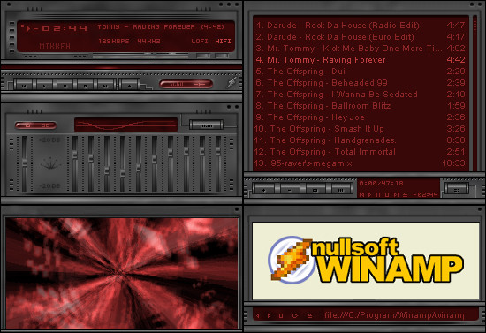
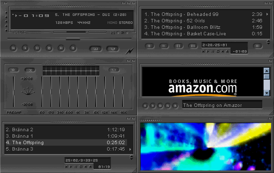
Construction
mikkeh —
Construction
Published: 2001-07-22 19:05:22 +0000 UTC; Views: 2194; Favourites: 10; Downloads: 516
Redirect to original
Description
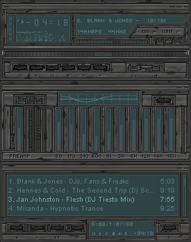
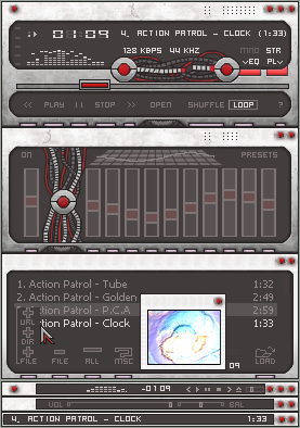
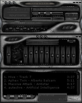
I think you have seen very much on this skin before, but not like this!I hope you gonna like it and please give me some comments.
> mikkeh
Related content


Comments: 40

Damn I haven't commented on this skin either? Shame on me.
Well, this skin is inspired by some other skins wich is really good. Looks like some texture out of an Alien movie
:-Þ J O C
👍: 0 ⏩: 0


lol vegaOne, try making one for yourself. Afterall you know yourself better, so stop whining. Well i still think this skin is worthy of praises.
👍: 0 ⏩: 0

This is quite nice. Your work resembles monaux's (and that's a compliment). Keep skinning!
(¯`·.,¸¸,.·´¯`·.·• blueNINE
👍: 0 ⏩: 0

Why is there nobody who does a skin that i am actually able to USE? WTF, I wanna see if WinAmp is set to Shuffle or not... I think skinning apps to unusability is AGAINST the original idea of makin different "interfaces" Nothing against this skin in general, but I've seen something like this way to often and now that reminds me of the old "usability VS looks" debate...
-=vega0ne!=-
👍: 0 ⏩: 0

yeah i've seen this style over and over again.... it's quite boring now. very dark, 0 points for usability. otherwise it looks very slick. well done with sotd.
👍: 0 ⏩: 0

antimatter: really? i thought i was pretty damn close
.: when i find a philosophy that functions properly, it shall go here :.
👍: 0 ⏩: 0

i think its too damn dark and dull, can't see what the hell im pressing...
º¤~tùñä~¤º
👍: 0 ⏩: 0

I gotta comment! I gotta comment!...hmmm....Okay, okay I forgot...I'll get back to this(hmm..next summer) when I got something better to say! Meantime..is "NiCe" enough?
----oOo-| Axis000 |-oOo----
👍: 0 ⏩: 0

It looks nice, resembles your old 'Horizontal' skin more than anything else I've heard. Regardless, its an impressive skin, if not an unorignal one.
👍: 0 ⏩: 0

it seems like all the nicely detailed skins are too dark...someone make a sweet light colored skin please..
nonetheless, nice work mikkeh.
:: C.arpe D.iem ::
:: p.hant om2oo0 ::
👍: 0 ⏩: 0

it's nice... detail looks like it took a while.. looks like a monaux/deviantart skin... which i suppose is good
[ idlejam ] [ iji ] [ elle ] [ tha pimp slave ]
👍: 0 ⏩: 0

eh...it looks pretty damn ugly i think a lot like the deviantAMP only....not 3D but rather stenciled out in an....ugly way....
sorry bro
[juz]
👍: 0 ⏩: 0


Great skin, but i think i`ve seen too many skins like this.
--==[3ch0]==--
👍: 0 ⏩: 0

This thing is pretty bad ass, I think i'll download it
Dustin (Flesh)
bledtolife.com http://www.bledtolife.com
👍: 0 ⏩: 0

Not exactly too original.. heh, reminds me a little too much of the official deviantAMP.
Also too dark for my eyes.
The grades say the rest
Plastik v.2 = www.plaztik.f2s.com
Mail = zkreso@yahoo.no
👍: 0 ⏩: 0

I think the buttons need to be easier to see. Other than that its a very nice skin.
-Dark
👍: 0 ⏩: 0

I don't like the one toned gray much, but I guess that's how you wanted it to be. It's just bot my taste. Nice work anyways.
My >> http://www.smar.nl
👍: 0 ⏩: 0


um.. congrat to the DS... ahh great work your loser,,,, bah
::[Jag är Miljöskadad]:: http://www.miljoskadadgfx.cjb.net ::
👍: 0 ⏩: 0

Very nice.....
only complaint... way to dark.... :/
.:defining reality:.
👍: 0 ⏩: 0
personally, reminds me of "Construction by Mikkeh"
.: when i find a philosophy that functions properly, it shall go here :.
👍: 0 ⏩: 0

Reminds me of Greased Metal.
Dont Dream It, Be It
👍: 0 ⏩: 0

excuse me for having an opinion...
quit your whining-if you want a comment...ask...
👍: 0 ⏩: 0

reminds me more of plasma by misery than anything monaux made, not that that's a bad thing. but the colors are nearly identical.
👍: 0 ⏩: 0

very nice skin, every thing looks very good on it
👍: 0 ⏩: 0

Wow, beautiful, I like it a lot, the dark colours and great looking design. A WB skin would be awesome too if you make such a thing.. though still, awesome work.
__ ___ __ _ _
las ranas fritas
¯¯ ¯¯¯ ¯¯ ¯ ¯
👍: 0 ⏩: 0


Excellent work. I'm using this... first one that appeals to me after the official devart skin!
- Never succumb to the minds of the many. -
👍: 0 ⏩: 0
looks kinda hard on the eyes.. at least mine. maybe its the close contrast, like a buncha scanlines all going in different directions.. you know what im saying? but other than that there really isnt any contrast. im sure its just a matter of personal opinion.. other than that its pretty well done. im sure it takes plenty of skill and thought to create a skin like this.
.: when i find a philosophy that functions properly, it shall go here :.
👍: 0 ⏩: 0

Nice work there!
.:/MASA/:. .:/fk4976@icqmail.com/:. .:/MASAflash/:. .:/ http://www.icqmail.com/:.
👍: 0 ⏩: 0

Great skin, don't let the naysayers bring you down buddy.
--more wasted keystrokes--
👍: 0 ⏩: 0

would you believe itirep, some people arent good enough to make even something like that
👍: 0 ⏩: 0
ahh... sweet as hell,,, ´great work... I like it alot..
::[Jag är Miljöskadad]:: http://www.miljoskadadgfx.cjb.net ::
👍: 0 ⏩: 0
looks like a bad remix of a monaux skin...
quit your whining-if you want a comment...ask...
👍: 0 ⏩: 0

great skin, it looks wounderfull
-- Dredwerk
MSN IM: Dredwerk
AIM : dredwerk123
Your bound to catch me sometime!!
👍: 0 ⏩: 0

mmh, with tooltip activated i could even spot the buttons
👍: 0 ⏩: 0
