HOME | DD
 MikkelSorensen — exc.dk content changed
Published: 2007-07-24 13:55:43 +0000 UTC; Views: 6150; Favourites: 61; Downloads: 187
Redirect to original
Description
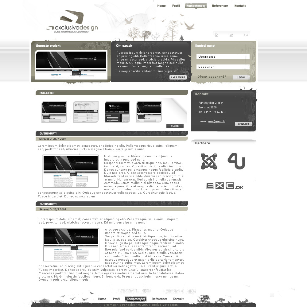
I recently posted this design and i got some critic on the content part. So i decided to change it up a bit. I hope you like this, and plz give crtic againRelated content


Comments: 27


 (Wink)")

yeah maybe. Its an old design, and i am never gonna use it. But thanks for your comment.
👍: 0 ⏩: 0


Rigtig lækkert design man  (Smile)")
👍: 0 ⏩: 1
")

really nice colors, and the design looks great also, I have to 
👍: 0 ⏩: 1

I liked the colored version better, but this still looks great! Keep up the good work!
👍: 0 ⏩: 0


aewsome logotype, and neat top. GJ!
I would like some improvement on the maincontent side
👍: 0 ⏩: 1
I have improved it a lot since the first time i posted, i dont know what more i can do with it.
👍: 0 ⏩: 0

")


there was a similar layout in the web design section these days
However nice layout
👍: 0 ⏩: 1
ye he got inspiret by me
👍: 0 ⏩: 0

imo this design is awesome
clean, professionell and looking good
gj mate
")
👍: 0 ⏩: 1