HOME | DD
 Mimoly — Captain and Me
Published: 2010-01-20 11:48:31 +0000 UTC; Views: 944; Favourites: 36; Downloads: 36
Redirect to original
Description
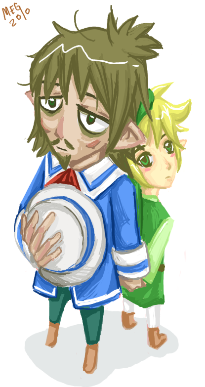
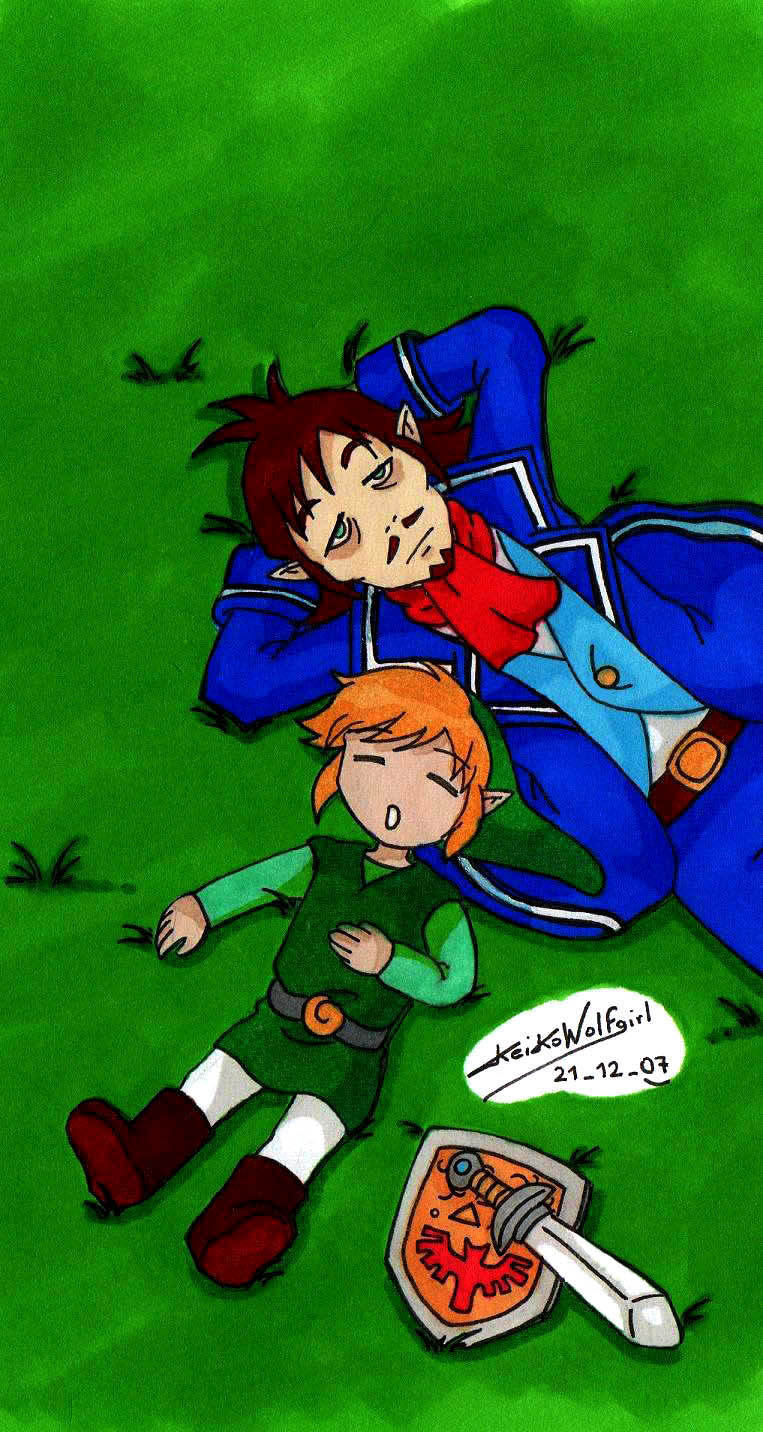
I just wanna try brush tool without opacity on The Gimp *3*I love ST Linebeck... because of his hat!! *3*
I asked for critique..... cuz I never got one in DA ages
I'm so proud on this work.
Gimp / 1 hr 25 minutes
Related content


Comments: 13

Overall

Vision
Originality
Technique

You want a Critique Reyson? You get it. Croy is always at your Service!
At first I have to tell you that I seriously love that friggin awesome perspective you did. Okay L-E-Madness has already mentioned the mistakes you did, but still I love the perspective, I bet I never could do such perspective. *cough* The coloring is very neat and I love your style, especially how you drew Link and Linebecks face, they both look really adorable! The shading style you used fits very well in this Picture, and also al shades are right!
The only things I could complain about, are the stuff L-E-Madness has already mentioned. Linebecks fingers, Links head size... and the only thing I would add to it is the Highlight in Linebecks hair. The Highlight really fits to Link, because he has such a bright haircolor, but Linebecks hair is dark, and it kinda look like he would have some sort of confetti snake in his Hair. ^^" Maybe you should try making it more... uh smooth, or more zig-zag? But it isn't important at all.
I really love this Picture, and I think even a dumb one can see how much effort you put into this piece! It's totally adorable and awesome all at once. e.deviantart.net/emoticons/b/b… " width="15" height="15" alt="
")
👍: 0 ⏩: 1

I got Croy's critique Dahnahnahnahhhh XD
Thank you so much X3
👍: 0 ⏩: 0

Overall
Vision
Originality
Technique
Impact
Firstly, I have to get this out of the way; Link and Linebeck are just so adorable! They get me every time. e.deviantart.net/emoticons/b/b… " width="15" height="15" alt="
...Though, I should probably get to the actual critique.
I'd like to state that even without the opacity being reduced, the shading is accurate, considering the light source. Also, I like
how you've made the brush strokes flow with their overall shape, adding a contour to them as a whole. When I looked at this in my
inbox, I wouldn't have anticipated that you had skipped out on the opacity meter at all.
However, I do want to comment on some of the anatomy. I know they're chibis, but I still want to mention a few things that could be fixed.
Firstly, Linebeck's hat, it seems his hand is a bit large. It seems that his fingers alone are the size of his face. This is making me wonder how large his palm is underneath it...which it probably large, too. I think shrinking Linebeck's fingers would be a good idea.
Secondly, it seems that Link's head is presenting two problems: the first thing I noticed about Link's head in particular is that it seems rather large for the perspective. I'm assuming you were trying to draw them from the top-down perspective, but it looks like Link's face is level with me as opposed to being at from above. (However, I like that he's looking at the viewer. It really brings you in.)
Another thing I'd like to mention is that Link's neck seems bent over his shoulder a but unaturally...it seems that he could possibly snap his own neck, with how it's turned. Perhaps it would be good to turn his torso and legs a litle closer to the viewer so that his pose seems more natural. Lastly, back to Linebeck. Linebeck's eye's look nice, shading wise, but the left eye isn't parallel with the right eye.
I actually like if when you draw backgrounds, too, so it would have been nice to see them with a background, instead of a white space.
Anyhow, I like the overall perspective that you've used; it's a sort of top-down perspective that makes them pretty cute together.
(as if they weren't already. e.deviantart.net/emoticons/b/b… " width="15" height="15" alt="
Lastly, I like the colours you used (especially on Linebeck's coat. It really pops out here!)
Overall, the drawing itself is actually pretty good, and you did a good job, even without any smooth blending.
👍: 0 ⏩: 1
Thanks so much for the critique *3*
I agreed that the the perspective is hard to draw.. I have many mistakes on it *A*
maybe next time.. I can make it better XD
*hugs*
👍: 0 ⏩: 1
No problem.
Ah, I can agree with you on that. 
I'm sure you can do it!

👍: 0 ⏩: 0


It's splendid pict!!
But, I'm sorry. X(
I can't ritiques.
👍: 0 ⏩: 0


Cute Daughter! >W<
Maybe change Link's head shape a little :S it looks a little off with the perspective. and also Linebeck's hand ^^''
But furthermore really good
👍: 0 ⏩: 0
